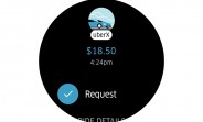
Uber rebrands itself
Uber has done a complete rebranding, with a new design, new logo typeface, new icon, and some backstory about bits and atoms that we don't need to get into.
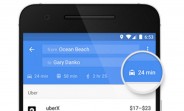
The first thing you'll notice is the new app icon after you update the app. It might seem like an inverted U at first, but that's not it. At the center is what Uber calls the Bit. The consumer app will have one line joining the Bit at the center. The partner app will have two lines joining the Bit at the center. Since Uber now does more than just run a cab service, difference services in future will have different icons, all with the Bit at the center.
The logo typeface has also been changed, with the curved ends giving way to a bolder, more prominent typeface with rounded corners.
Lastly, the company is also exploring color schemes for different regions. Although not available right now, in future the apps will have a color theme and color palettes specific to your region.
The updated app is available on iOS right now.
Related
Reader comments
- ThatMPCSGuy
- 05 Feb 2016
- Pq$
They are still far away from any the number of crimes from taxi drivers
- Anonymous
- 03 Feb 2016
- mTe
You must be crazy as Uber seems to hire sexual predators and/or convicts who have assaulted various people. Is that really the future?


 Samsung
 Apple
Apple Apple
Apple Xiaomi
 Samsung