vivo V15 Pro review
Design and build
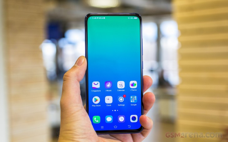
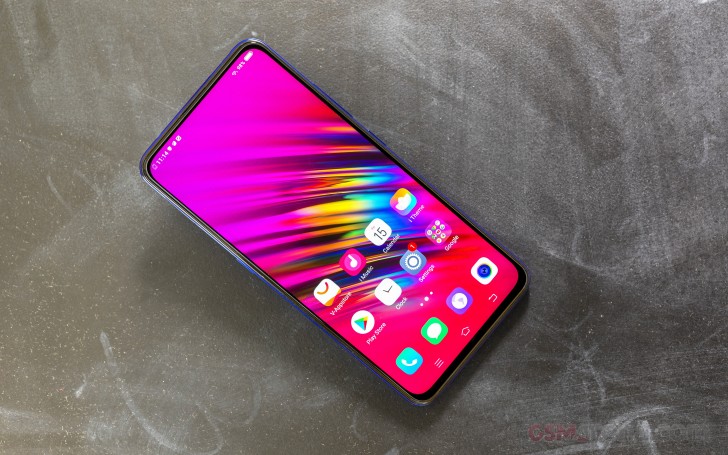
The vivo V15 Pro is definitely a nice-looking device. It follows all the new trends in the smartphone world - gradient color, glass-like back design and a full-screen display without notches or cutouts of any sort. We said glass-like because it's most probably made of plastic - it doesn't feel like glass and vivo didn't say anything about the materials used. We reckon that if it were glass, they would have bragged about it.
And yet, the plastic doesn't take away the good feel of the phone overall and it's supposed to be more resilient to cracks. On the other hand, expect it to scratch easier. That's just the nature of plastic.
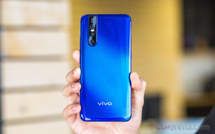
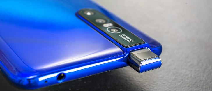
Design-wise, the back has a big blocky bulge that accommodates all three cameras along with the pop-up selfie mechanism. Perhaps the size of both modules required a big bulge like the one here. It definitely gives the device a distinct look but it won't be everyone's cup of tea for sure.
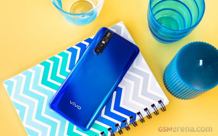
The color, on the other hand, is hard not to like. We got the Topaz Blue and it's mesmerizing. It also features a subtle stripes pattern that can be seen at a certain angle.
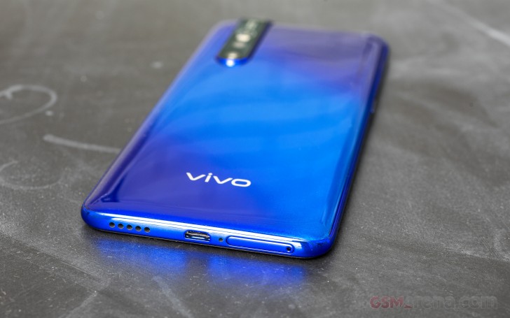
Moving to the sides, we can't help but notice not one but two trays - one on the bottom taking up to two SIM cards and another one on the left side reserved for the microSD card. That's pretty neat as you don't have to trade in the dual-SIM functionality for expandable storage and vice versa. A dedicated voice assistant button keeps company to the microSD card and on the right are placed the power button and the volume rocker. The buttons feel a bit wobbly but are clicky but that doesn't get in the way of usability.
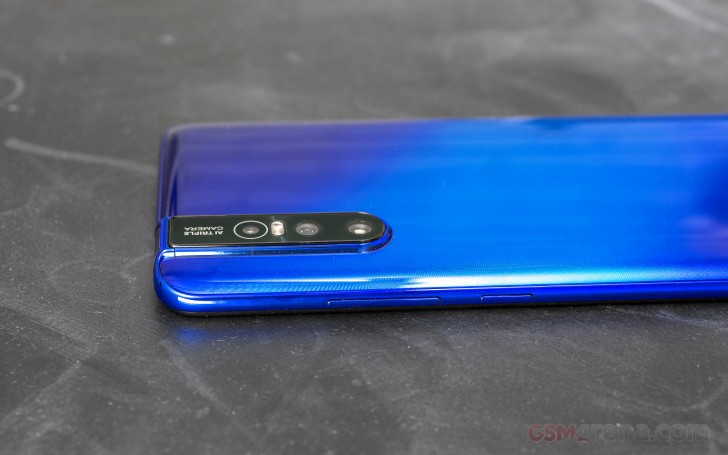
We have some good news and some bad news about connectivity. The 3.5 mm audio jack is placed on the top - cool to have that nowadays - but we also have a microUSB connector on the bottom for charging and data transfer. It sits right between the SIM card tray and the loudspeaker grille.
What's left is the front. There's no Gorilla Glass and instead, vivo says it's regular 2.5D glass panel. However, the panel looks almost completely flat with no noticeable rounded edges. In fact, there's a noticeable gap between the panel and the side frame.
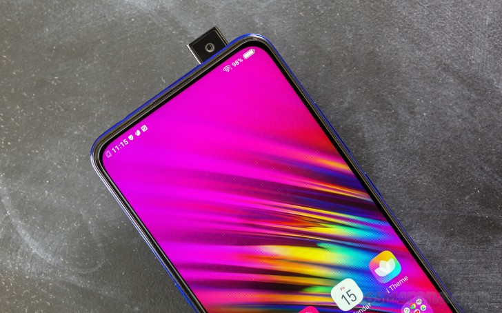
The thinness of the bezels, on the other hand, is pretty impressive. The side ones are 1.75mm while the top one is 2.2mm. It's not the skinniest one around but it's enough to accommodate the earpiece. The ambient and proximity sensors are placed under the OLED screen in the upper left part of the panel. The chin also appears to be pretty minimal considering the price point of the V15 Pro.
Although the handset feels solid in the hand, the overall handling leaves more to be desired. The sides are a bit sharp and the finishes used are quite slippery. That last one was to be expected but vivo could have done a better job with the ergonomics. One-handed operation is out of the question with this extra tall 19.5:9 6.39-inch display. Then again, users with big hands probably won't complain about that.
Now let's talk about the motorized camera. It's fast to appear when summoned or needed. In fact, it pops up measurably faster than the NEX S. It seems that vivo has worked on that motor and it's now considerably more reliable. In terms of longevity, well we couldn't test it so we would have to take vivo's word on that.
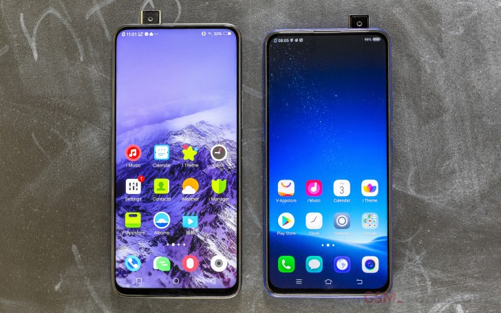
Still, we do have some concerns about it. Dust will probably build up over time, which could jam the unit or scratch the camera. But if you are one of those people that bring out the selfie camera once in a full moon, then maybe it's safe to say you will be fine. You get rid of the useless selfie cam and get to keep all the screen for you. Win-win situation right there. Also, the motor works a lot faster than the NEX S' periscope. Maybe vivo took the time to perfect it.
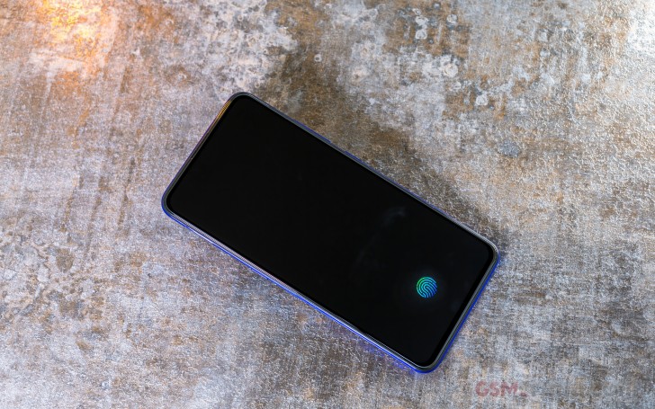
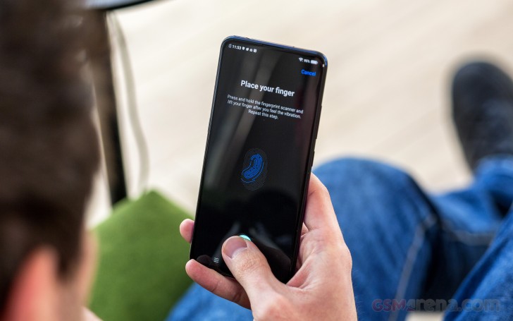
The same applies to the fingerprint reader. Although it's still optical, it works a lot better than the one found on the NEX S. It's pretty reliable and unlocks fast enough. It's one of the better implementations of under-display fingerprint readers but it's still not as fast as conventional ones.
Here's how the phone looks from all sides in our 360-degree view. You can even take a closer look at the periscope-like mechanism.
Reader comments
- Rasel
- 02 Dec 2024
- X{X
This phone all over very fine speacilly both camera is the best . i love vivi v15 pro
- lamb
- 26 May 2023
- jaT
phone pop camera was not working properly.
- Siddhesh
- 16 Jan 2022
- s8H
Very nice phone look display and smart phone