Vivo X5Max review: Asian shadow
Asian shadow
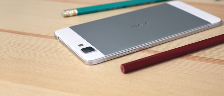
Android KitKat 4.4.4 with a highly-customizable Funtouch layer on top
The vivo X5Max runs on the company's proprietary thoroughly reworked Funtouch OS, based on Android 4.4.4. The dated OS version is a typical source of complaints we've been having with smartphones originating in China. Although some users prefer to stay away from Lollipop, the general scarcity of OS updates usually means you're left with the version you had out of the box, which is never the best treatment.
With this minor rant out of the way, there's actually a lot to like about the Funtouch OS. Though you'll instantly be able to tell it takes its clues from iOS, the interface is not a direct copy, but an Android overlay with its own character.
The Jelly Bean based Funtouch on the vivo Xshot we reviewed a while back was a little different in certain elements, but what we said then, largely holds true for the version, which is installed on the X5Max. The menu tree is entirely different from the stock Android arrangement and finding the option you're after may take some sifting through the menus. The lack of a search feature doesn't help either.
On the positive side, there's no bloatware to be found, and the phone comes with only a handful of apps preinstalled, nicely covering the basics.
The lockscreen is the first modified design element you're greeted with. There's a standard issue clock widget on top, followed by a customizable signature, where you can set up an uplifting quote of sorts. In the bottom half there's an avatar box and you can assign a number of different animated ones or choose a photo from the gallery.
Unlocking only works with an upward swipe, while swiping to the left launches the camera.


Lockscreen with avatar and motto
Past the lockscreen you get the same single-tiered interface like on iOS with no app drawer. The number of homescreen panes doesn't appear to be limited to a single page of thumbs (which holds 9) and we gave up trying to create more after the 11th. You can rearrange the homescreens any way you like and the one you place first is the default one that appears when you tap the Home button. The panes can be cycled though, so in effect there's no first and last one.


Practically unlimited homescreen panes
The homescreen is where all your apps will show after installation in a grid of 4x6 icons. You can group them in folders and tapping on a folder shows its contents in a nicely animated popup on a blurred background. There's a dock on the bottom of the homescreen, which takes up to 5 icons, folders included, and redistributes them evenly, depending on the number.
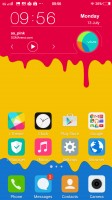
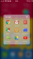
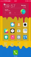

Homescreens with folder support and auto redistribution in the dock
The Menu button brings out the widget library, as well as the option to select a transition effect for the homescreen panes. You also get the option to hide apps you don't want displayed on the homescreen.
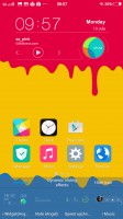
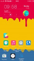
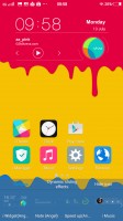
Menu button gives access to widgets and transition effects
A major difference to your average Android interface is vivo's separation of the notification shade and the quick toggles for changing settings. Swiping down from the top brings out the list of notifications where you also get the carrier's name and reminders for upcoming calendar events.
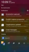

Notification area with quick access
Meanwhile, swiping up from the bottom edge brings out a combined toggles/brightness/tasks drawer, reminiscent of the iOS Control center. Closing apps works with an upward flick, but there's no Kill all button.
The brightness slider doesn't take taps if you want to jump straight to a specific position, instead you need to grab it by the handle each time. There's an Auto switch too.
The toggles offer the expected functionality and aside from the simple on/off action work as shortcuts to the respective setting upon a long press. All of them are listed in a singled side-scrollable row, and you can rearrange them or hide unused ones.

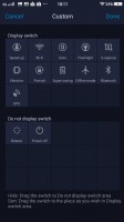
Task switcher and quick toggles from the bottom drawer
vivo has also devised a nifty and often useful screen-grabbing utility called S-capture. Chief among its features is the ability to capture long screenshots, for example an entire webpage or a conversation in a messaging app. Alternatively, you could record a video of what's going on the screen, like gameplay or instructional videos. The Funny screenshot option lets you crop a part of the screen with a freeform or preset shape, of which there are a few.
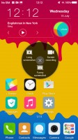


S-capture is a useful screen-grabbing utility
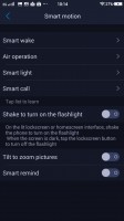
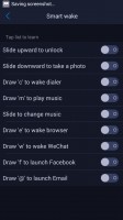
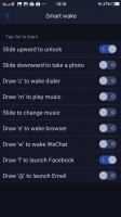
The vivo X5Max comes with extensive gesture and motion functionality, found in settings under Smart motion. Smart wake works with the display off and lets you draw letters to launch specific apps, unlock with an upward swipe without lighting the screen beforehand or launch the camera with a downward swipe.
Air operation holds options for a quick status glance or air unlock, both triggered by a hand wave at the front camera. The very same gesture works for switching homescreen panes as well as shuffling the gallery images.
Then there's smart light which covers three features. One claims to wake up the phone when you take it out of your pocket, next is the familiar double-tap-to-wake in a different wording, and Smart keep bright uses the front camera to detect you're looking at the phone so it doesn't go into standby while you're reading.
Smart call contains the gestures for picking up and muting calls, while Smart remind will vibrate when you pick the phone off the table to indicate you have pending notifications.
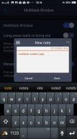
Multi window is similar to Sony's Smart apps and pop's up a tiny window where you can watch a video, create or view notes and access your messaging inbox.
Reader comments
- Just a dude
- 24 Mar 2024
- 4c4
I am going to make a 4.0mm smartphone. There not dead yet. not when my phone comes out
- mockingbird
- 18 Oct 2022
- vGF
since this phone is too slim, eminem has withdrawn his title as slim shady
