vivo Xplay5 Elite review: Edging in
Edging in
Marshmallow and Funtouch OS
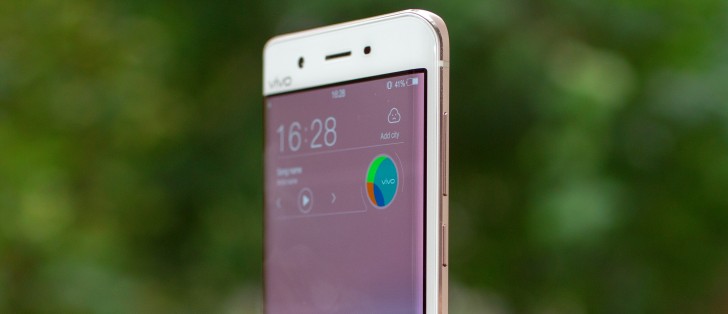
Marshmallow finally makes it to a Vivo smartphone with the Xplay5 Elite. As usual, there's a proprietary Funtouch OS layer on top making it look and feel a lot like any other Vivo model, which means its vibe is not far removed from Apple's iOS.
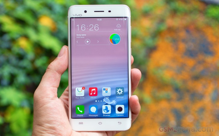
The lockscreen can be heavily customized. Besides showing your notifications, there are two shortcuts in the bottom corners - dialer and camera by default, but you do get to assign any other app of your choice to either one. Lockscreen themes are also an option for further customization.


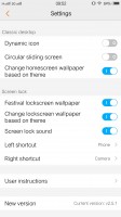


Default lockscreen • Lockscreen settings • Lockscreen themes
Chances are, however, you won't be seeing much of the lockscreen if you enable fingerprint unlock. The recognition is instantaneous, there are no animations and you're at the homescreen before you know it. It works virtually every time.
Past the lockscreen you get the same single-tier interface with no app drawer as we're used to see from most Chinese manufacturers. The number of homescreen panes doesn't appear to be limited to a single page of thumbs (which holds 9) and we quickly concluded you won't be left without room for new apps.
The homescreen is where all your apps reside after installation. You can group the app icons in folders and tapping on a folder shows its contents in a nicely animated popup on a blurred background. There's a dock on the bottom of the homescreen, which takes up to 5 icons, folders included, and redistributes them evenly, depending on the number.
You can rearrange the homescreens any way you like and the pane you place first is the default one that appears when you tap the Home button. The panes cannot be cycled, which can prove a problem if you have a large number set up.




The homescreen doubles as an app drawer • Folder view • Managing the homescreen panes
Meanwhile, swiping up from the bottom edge brings out a combined toggles/brightness/tasks drawer, reminiscent of the iOS Control center. Closing apps works with a cheerful "Speed up" button, which then pops up a message informing you of the resources freed up.
The brightness slider doesn't take taps if you want to jump straight to a specific position, instead you need to grab it by the handle each time. There's an Auto switch too.
The quick toggles offer the expected functionality and aside from the simple on/off action, work as shortcuts to the respective setting upon a long press. All of them are listed in a single side-scrollable row, and you can rearrange them or hide the unused ones.

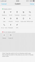

The Quick settings toggles and the task manager • You can customize the Quick settings toggles • Notification
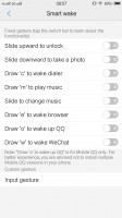
The Vivo Xplay5 Elite comes with extensive gesture and motion functionality, found in settings under Smart motion. Smart wake works with the display off and lets you draw letters to launch specific apps, unlock with an upward swipe without turning on the screen beforehand or launch the camera with a downward swipe.
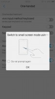
There's also a one-handed mode for easier operation, which shrinks the UI to one of the lower corners. It's activated the Samsung way - swiping in from one of the edges and back out. You're also given the option to resize the window, depending on how long your digits are.
Vivo has also devised a nifty and truly useful screen-grabbing utility called S-capture. Chief among its features is the ability to capture long screenshots, for example, an entire webpage or a conversation in a messaging app. Alternatively, you could record a video of what's going on the screen, like gameplay or instructional videos. The Funny screenshot option lets you crop a part of the screen with a freeform or preset shape, of which there are a few.
There's also a rather limited multi-window implementation. Basically, if you're watching a video, and a message comes in, a notification pops up on the side and you can expand it to view the message without switching back and forth between the apps.
Reader comments
- AnonD-594446
- 07 Oct 2016
- 4$u
I finally have this phone available for my online shop n the price is $689. The next question is is that worth it? Well since the American people have Samsung S7 I'm not so sure that they would go out of their way to check out this Vivo phone no matt...
- Anonymous
- 30 Sep 2016
- PTG
Bro the camera is much better than xperia xz.look at the picture.the sky looks more better than the cold xperia xz.the dxomark is just a hardware score not real life performance.if u thinking to buy xperia xz just think twice just buy another flagshi...
- Aasis
- 04 Sep 2016
- 6iU
its camera is not so good....its must be like sony Xepria XZ


