Vivo Xshot review: Shot in the dark
Shot in the dark
User interface - Funtouch OS is sleek but a little disorganized
The Xshot runs on vivo's own custom OS - Funtouch. It is essentially a heavily-modified version of Android and thus supports all of its apps. Sadly, it is still based on Android 4.3 Jelly Bean, which is now quite dated.
Other than that, the UI is very slick with a distinct iOS vibe, especially in various menus. There is, however, no blatant copying. And, while a lot of Apple style and GUI elements are easily detectable, vivo has created a feel it can call its own.
There are a lot of interesting features thrown on top of Android by the manufacturer, but there are also some rough edges. Menu arrangement is quite chaotic in the Xshot and a lot of options are hidden away in obscure places, you wouldn't think of looking. Like the accessibility settings, for example, which are tugged away under "more settings", while the one-handed operation, smart motion options and even "Glove mode" are placed in plain sight on the main settings screen.
On the upside, Funtouch is definitely clutter free and comes preloaded with only a few essential applications and a set of Google apps with no bloatware in sight. All the additional functions work nicely and the phone really offers a smooth and pleasant user experience.
Check out a quick walkthrough of vivo's custom android work in the video below.
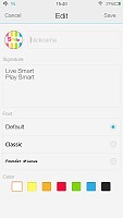
Funtouch is definitely big on customization and when we say big, we mean that there is an almost unbelievable amount of things that can be tweaked about the way the OS looks. Starting from the lock screen, the factory default option offers a slide-up unlock and is complete with a clock widget as well as a little animated avatar, nickname and slogan. The last three are completely customizable down to the text font and color.
Swiping left on this screen brings you to a music interface, while swiping right, fires up the camera.
This, however, is only one of the countless lock screen options. Each choice comes with a different unlock option, widgets, shortcuts, fonts, as well as little settings under the hood. If the built-in options are not enough for you, there is a vast online library. The sky is the limit, when it comes to lock screens and variants range from very traditional and straight-forward, all the way to childishly cute ones, like a happy bunny, throwing its carrot in the air when you unlock the screen.
Beyond the lock screen, we find swipeable homescreens, complete with widgets. vivo has opted out of a dedicated app drawer, so adding new screens is the only real option for storing more apps. With no app drawer, anything you install pops up on the homescreen.
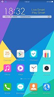
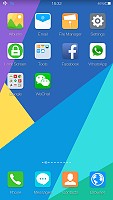
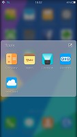
The homescreen doubles as an app drawer
You can group the apps in folders, which come with a very nice transition and background blur effect.
Anyway, a long press on the homescreen gets you to the management screen - from there, you can rearrange, delete and add panes. There are no dedicated add or delete buttons in the menu. Instead, there is always an extra empty screen that appears in the management area and if something is placed on it, it becomes active as a new screen. Removing it is the reverse procedure.
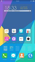
Managing the homescreen panes is rather difficult
Managing applications can also be done from this mode, which is made apparent by the slight jitter that is applied to all the shortcuts, much like the one in iOS. Icons can only be rearranged, there is no shortcut for actually uninstalling an app. That is done only through the app manager.
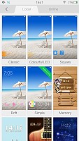
Tapping the Menu button on the homescreen gives you quick access to color schemes, wallpapers, effects and widgets. It turns out. The lockscreen customization was just the tip of the iceberg. Themes, wallpapers and slide effects are all customizable and there is even something called scene. It is essentially a separate interactive desktop interface, which artistically rearranges your widgets and app icons and creates a beautiful live scene from them.
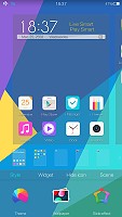
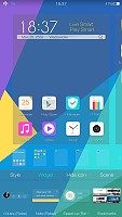
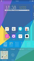
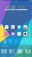
Quick interface settings can be applied straight from the home screen
The settings menu has a separate section entirely devoted to this kind of customization. It is called "mix-match" and it is a central hub, from which you can tweak all of the aforementioned aspects, download new content and simply make your user interface as personal as possible. We really see all this freedom easily appealing to a younger audience.

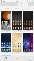
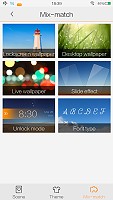

If you want to dive further into customization there is the dedicated "mix-match" hub
The notification area on the vivo Xshot is slightly different from the stock Android one. Here, it is all white and pretty clean from clutter. Pulling it down once reveals the notifications. Right above them there is the standard time and date widget along with a shortcut to the settings menu.
There are also two small buttons in the top-right corner. One of them clears all of the notifications, while the other can be used to block certain apps from throwing notifications in the first place. In reality, the button is nothing more than a shortcut to the app manager, along with an explanation of how to take away notification privileges.
It becomes immediately apparent, that something is missing from the notification shade. It is simply too clean. Mainly because the quick toggles have been moved to another shade which can be pulled up from the bottom of the homescreen.
It holds the brightness slider, and various toggles, which can be customized. Quick settings can be rearranged and added or removed through a dedicated menu, so you are free to move things about as you see fit. Among these is a "speed up" function, which frees up resources on the phone almost instantly.
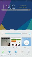
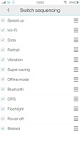
Separate shade for toggles and brightness, which doubles as recent apps
Quite cleverly, this interface also doubles as the recent apps switcher. So, when you hold the home button, the same shade pops up to switch between applications. To close a recent app, you just swipe it up. Sadly, there is no close all button.
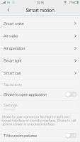
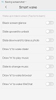
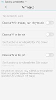
Besides the standard navigation scheme, vivo has thrown in an elaborate array of special motions and gestures to control the phone. Options are so plentiful, that you can easily get confused by the menus themselves, let alone remember every shortcut you set. But if gestures are your thing, the Xshot definitely has you covered.
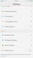
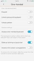
"Smart motion" and "One-handed" options in the settings menu
You can wake the vivo in by tapping the screen, swiping it or even simply looking at it. There are also gestures to fire up a specific application upon waking the device, like drawing a "C" on the screen to open the dialer or an "M" for the music player. The list goes on and on.
Most of the above functionality can also be achieved by drawing different letters with the phone in the air or simply shaking it. Launching custom apps is also possible with these shortcuts. There are also quite a lot of multimedia control shortcuts, both in-app and while the screen in off. Zooming images, for example, can be achieved by tilting the phone and songs can be skipped by swiping on the display, even when in is turned off.

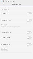
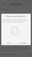
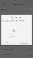
Even more customizable "Smart motion" gestures
All of these extra control schemes take customization to a whole new level. The vivo Xshot can not only look precisely the way you want, but also behave accordingly. The only grudge we have with the gestures is that, once again, their settings menus are a mess and getting around is quite hard.
Funtouch does not include a dedicated button shortcut for accessing Google Now, like most current Android phones have, but it is still thrown in the mix. It can be set as a widget for quick launching, or perhaps, even assigned to one of the aforementioned gestures, if that is your thing.
Google Now is executed in beautiful material design style. You can manage your daily routine and all your interests by using the service.
Overall, the vivo Xtouch runs very smooth and behaves will with vivo's own Funtouch OS. One thing is for sure, though - it is definitely not the Android most of us are used to. It is clear that the company has put a lot of thought and effort into the OS and in a lot of aspects, it does make for a better-than-stock experience. However, getting around the veritable mess in menu placement is quite hard, so the GUI is definitely not for seasoned Android users, who are accustomed to Google's own layout and structure.
Reader comments
- paresh mmaheshwari
- 03 Jan 2017
- wdU
Phone is best but software problems is new version massmello is upgrad plzz my problems to fast and solutions is vivo all mobile update to plz slave this problems to better than better vivo mobile's 1 problem is not velu
- AnonD-614878
- 28 Nov 2016
- 7kM
How to root my Vivo Y51L.....
- sidb
- 31 Oct 2016
- uti
Lots of software issues. U cannot retrieve contacts through search. I hate samsung but am missing it now.


