Xiaomi 13 Pro long-term review

MIUI 14, bugs
MIUI has always been a heavy skin atop Android, and that's fine with us - some people like them lighter, others prefer them thick and all-encompassing, nothing wrong with having a lot of choices in the market. But even lovers of Xiaomi's skin have to admit, MIUI 14 looks like MIUI 13 which looked like MIUI 12. It's been a long time since the skin got any sort of substantial style upgrade, and while it doesn't necessarily look dated in any way, it doesn't scream 'fresh new design' either. It can't, since it isn't.
That said, it does work, and most of the idiosyncrasies that were part of MIUI in recent years have thankfully been dealt with. Most, not all. The 'System apps updater' that takes up an entire section in Settings is still alive and well and not actually updating all of the system apps, since some go through the Play Store instead.


MIUI 14, Settings, System apps updater
A bug we've seen in many recent Xiaomi, Redmi, and Poco devices is unfortunately present here too, and we're talking about the fact that the Do Not Disturb mode simply doesn't work as it should. On or off, notifications are still coming through. We've checked all of its settings multiple times to ensure we haven't missed anything, but it's not us - it's the bug.
And it's frankly a little bit ridiculous that this went unnoticed for so long, on so many phones, but that's how things stand. Pairing this situation with the fact that there isn't a separate volume setting for calls and notifications makes life unnecessarily hard if you, like us, enjoy sleeping at night without constant notification chimes but would like to hear calls ringing.
Another bug is that with every reset of the mobile network state - so, when turning the phone on, restarting it, inserting a SIM, or when coming back from airplane mode - a Wi-Fi Calling Quick Settings tile appears on the leftmost spot in Quick Settings. Every. Single. Time. This is infuriating and completely pointless, but it still does happen, so if you don't care to have it in that position, you'll do a lot of Quick Settings tile editing.
Weirdly enough, you only need to enter the Quick Settings editing mode, not do anything else, just hit Done, and the Wi-Fi Calling tile will magically go away. On other Xiaomi / Redmi / Poco phones we've reviewed recently, you had to actually drag it out of the way, but not here. So this is also a bug, hilariously enough - it's a bug that helps you more quickly get rid of the consequences of another bug. Way to go, MIUI.

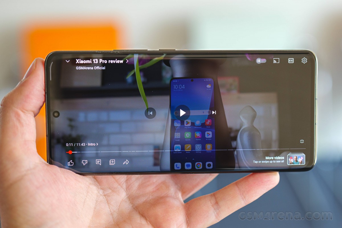
Okay, next bug. YouTube stutters during playback, constantly, no matter if it's in the foreground or background. The fix for this is disabling memory extension entirely. Why? We can't tell you and we've always maxed out memory extension on any phone that we've reviewed long-term which has that feature, and something like this has never happened before. So, clearly a bug somewhere - the point is, if you have this phone and are frustrated with the constant YouTube playback stutters, turn off memory extension and breathe a sigh of relief like we did.
Finally, this may not be a bug per se if you ask Xiaomi's developers, and instead could be labeled as intended behavior, but it's ridiculous. Spotify is always killed if it's in the background only a few minutes after you pause playback. The Quick Settings Now Playing tile disappears too, and when you go into the app itself it behaves as if you opened it for the first time right then and there.
Needless to say, this is frustrating if you're listening to something, pause it to focus on something else for a few minutes, then want to go back in and listen again - but every trace of what you were listening to is now gone from Quick Settings, and you have to open Spotify and wait for it to reload. Not ideal, and we're not sure enough battery is actually being saved here for this behavior to be worth it. But hey, at least Spotify isn't being killed in the background while it's playing. That used to be the norm for some Chinese skins back in the day, remember that? We wish we didn't.
Updates
Xiaomi has never been the fastest with updates, and it's still not. So it hasn't changed, but the world around it has. Most of its competitors are doing better now, so it's definitely time to step up - especially for flagship devices like this one. The 13 Pro gets a security update every two months, but not necessarily on time. So in July you might receive the June security patches, and then in September the August security update and so on.
Why can Samsung deliver these security updates monthly and Xiaomi can't? We don't know. The price argument, though, is out of the window with the 13, 13 Pro, and 13 Ultra. These are not cheap devices. You're not 'paying' for the affordability in terms of receiving less software support. It's just a worse experience than what the competition provides, and that should quickly be rectified. Otherwise, it's hard to take the company's top of the line devices seriously when they don't provide on the software front what they do in terms of hardware.
More updates and quicker updates should also fix bugs, not just deliver security patches, and fix bugs quicker and not let them linger for months on end (and sometimes years). But so far, that's not been the case, so this is something you need to keep in mind. We were satisfied with our experience with this phone overall, but the bug situation - try finding another recent long-term review which has so many obvious bugs listed. We'll bet you the device in question was a Xiaomi, a Redmi, or a Poco.
This unfortunately has become the norm in that stable, and if we can't influence a change on this front (not for lack of trying), you definitely have no choice but to make an informed decision and take all aspects into account when doing that, including this one.

When it comes to big yearly Android updates, Xiaomi is also slow, though arguably this is a bit less of a problem since MIUI is such a heavy skin that most of the time, you won't even see the majority of the UI improvements touted by Google. Still, faster is better and again, over the past couple of years or so, all of Xiaomi's competitors have stepped up their game in this area. It's high time it joined them.
Launcher
The Xiaomi 13 Pro's launcher is the standard fare MIUI launcher, complete with a decent amount of customization options and a bug that's been in there for years. A niche bug, but one nevertheless. We're talking about the inability to add a shortcut to the home screen that points to a specific part inside of an app. You get a 'menu' of these when long-pressing on an app's icon on the home screen, and then theoretically you should be able to drag whichever you want out from there and onto the home screen. Except you can't do that in MIUI, even though you can in every other Android skin out there.
Also, if you have a lot of apps to transfer over when you're first setting up the phone, and don't want all of them spread across a myriad home screens, find the "Add to home screen by default" option as fast as you can and turn it off, since it's on by default for whatever reason. Finding it might be quite a feat in itself, since it's not in the home screen settings where you may expect to find it, but in the app drawer's settings.
And if you let it be, this means every single app your phone installs (when switching from another Android device or restoring from a Google backup in the cloud) will be added to your home screens. If you have over 300 apps like we do, that's an unnecessary pain, which also makes little sense - if you want all your apps on your home screens, then you'll go with that way of displaying them. Who in their right mind would choose to have an app drawer in the first place, only to then want to have all of the apps in the drawer also show up on home screens?
The launcher does support some interesting features like automatic app categorization, and it has the Google Discover feed if you want it to show up to the left of your leftmost home screen and give you news and other relevant information. Aside from the aforementioned issues, we had no problems whatsoever with the MIUI launcher, it was always very fast and never stuttered once.
Recents, gestures
As has been the norm in MIUI for quite some time now, you get to choose how the Recent apps are shown. By default MIUI goes its own way, with a vertically scrolling list of two screenshots in a row, but you can thankfully switch from this to a horizontally scrolling list, which is akin to what you can find in all other Android skins. Both options work well, we just prefer the latter.
We want to point out a specific small touch that we really appreciate. When you enter Recent apps, the previous app is automatically highlighted, and this is an amazing time saver if you just want to go back to it. Some other skins highlight the app you were just in when you enter Recents, which never made much sense to us - why would you want to see the app you were already in first?
This is even more useful since unfortunately it's the best way to reasonably quickly switch to the previous app if you, like us, don't want to have the white pill bar abomination at the bottom of your screen at all times. We love that you can get rid of it, but that apparently also gets rid of its functionality, which makes no sense since there are a lot of other skins where you can delete the bar and still swipe across the bottom of the screen to quickly switch between apps. Not here, though, and there's also no "swipe from the side as if to go back and then hold for a little" gesture. This used to be in past MIUI iterations, but it's gone now.
You can also try and 'quickly' switch to the previous app by swiping up as if to enter Recents, and then, without lifting your finger, swiping to the side. Maybe it's us, but we've had terrible success getting this to work frustration-free, so in the end we always ended up preferring simply opening Recents and then tapping the previous app which was already highlighted, as described above.
Since we've talked about some gestures already, let's continue by saying that, aside from the issues we described above, we had no qualms with how gesture navigation is implemented on the Xiaomi 13 Pro. It works perfectly, as it should after so many years of course.
Control Center, Dark mode
The Control Center is, by default, separate from the notification area, and obviously heavily inspired by iOS. You can keep it like that if you like your toggles not touching your notifications, or you can switch to the traditional way in which Android has been doing things - Quick Settings tiles on top, notifications underneath.
We tried MIUI's 'new' Control Center when it came out and found it perfectly fine (if a little bit too Apple-vibed) but for us the 'old' style works much better in a few subtle ways. First off, we can just swipe from the top and not pay attention to which part of the screen we're on (with the Control Center, swiping on the right side brings it down and on the left side shows you notifications). This in itself is a huge time saver.
Then there's the fact that having the Quick Settings up top pushes the topmost notification down, to a spot where it's actually easily touchable with the thumb of the hand we're holding the phone with, without a need for crazy finger gymnastics or readjusting the way we hold the phone. These might not sound like huge reasons to stick with the 'old' style, but we feel like its small advantages compound over time and so for us it's no contest. But, if you prefer the Control Center, you can have it.
The Dark mode is present, as you'd expect in this day and age, and it's good, and it works, but it's not as customizable as the one found in ColorOS and OxygenOS, where you can pick from three different intensities to the darkness. Here, just like everywhere else, it's Light mode or Dark mode and that's it.
Of course you can schedule it, either to turn on at sunset and off at sunrise, or according to your own custom times. The "Adjust wallpaper to Dark mode" and "Adjust text and backgrounds automatically" toggles are better left on if you use your phone with the Dark mode on in very dark environments usually, since they help with reducing some eye strain.
Finally, you can force Dark mode onto apps that don't support it yet - and yes, there still are a handful of those, we find, at least among the ones we use. So with that in mind, this is a very welcome feature, one that is present in a lot of phones but doesn't always work when you flip the switch or sometimes only lets you pick among a very short list of apps.
We're happy to report that we encountered neither of those issues here, forcing Dark mode works as intended and it's off by default - so you only need to concern yourself with this if you discover an app that still doesn't have a dark theme.
Reader comments
- Anonymous
- 17 Sep 2024
- LbT
Funny you dont have the same concerns about google or apple
- Joseph Etugbo
- 08 May 2024
- Nu7
That’s Untrue!!
- noname
- 31 Oct 2023
- skK
If you like that your fingerprint is somewhere stored and all your possible privat data,be my guest.Does your state you live in have all this data!?


