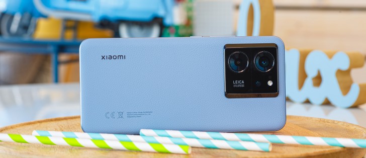
Xiaomi 13T Pro long-term review
HyperOS, updates
"HyperOS" sounds cool and is a much better brand than "MIUI", we'd wager, but - if you expect it to be radically different from MIUI, you're in for a disappointment. The best way to think about it is as the next iteration of MIUI, and not something new altogether. MIUI 15, if you will - though even that is being optimistic, as MIUI 14.5 would definitely be more accurate.
Whether that's a good thing or a bad thing entirely depends on your perspective. Every Android maker out there has focused on polishing and incrementally updating their skins over the past couple of years or so, without coming out with anything revolutionary. All the skins are also closer in looks and functionality than they've ever been - that's not to say there aren't still differences between them, there are plenty of those, but the basics seem to be more and more similar as time goes by.
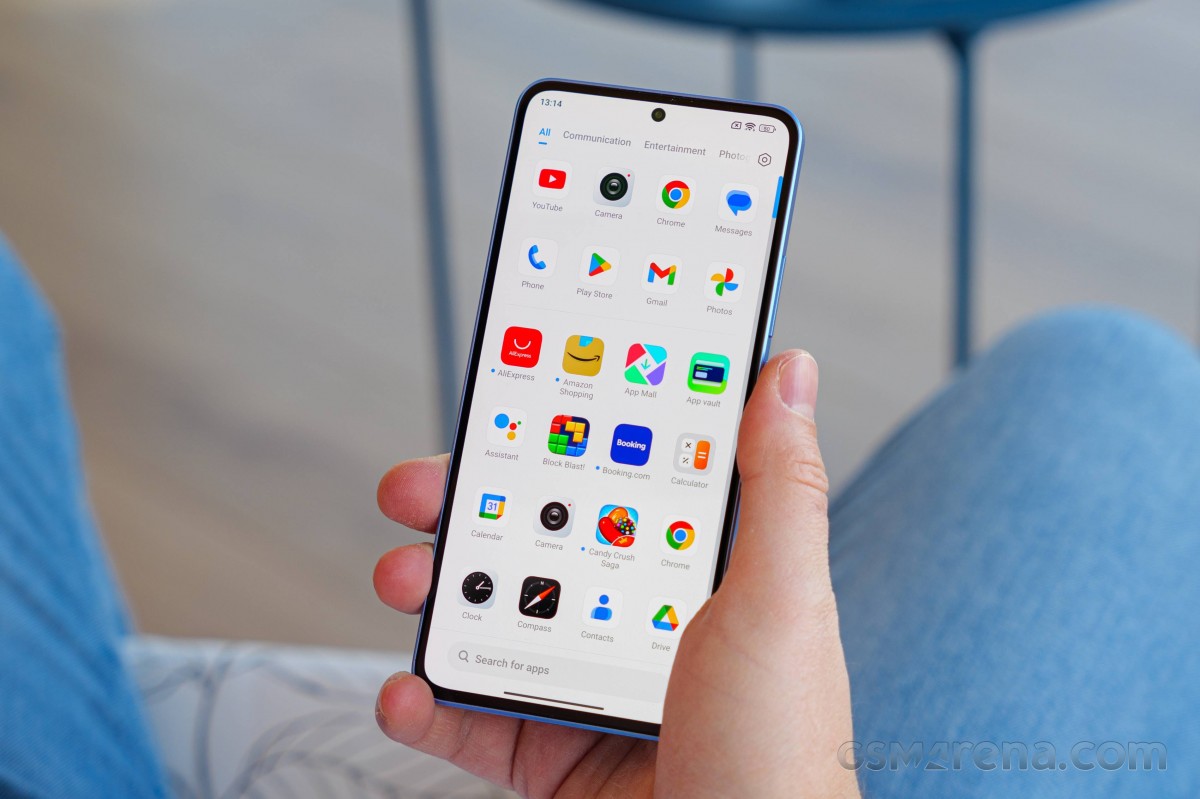
Perhaps that is because after a lot of trial and error, all of them are converging towards what works and what people like and appreciate, which is undoubtedly a good thing, but the flip side of that is all of these skins are less unique than before and can start to feel a bit stale after years and years of iterative updates and nothing transformative.
That's also the tale of MIUI, now called HyperOS in its latest version, and how it presents on the Xiaomi 13T Pro. It's still definitely recognizable as a Xiaomi skin, and it's kept everything that made MIUI 14 stand out from the competition - by keeping most of MIUI 14 intact, as it turns out. There are a lot of under-the-hood improvements, which all sound very good, but in day-to-day use, as we've already mentioned in the previous section of this review, the 13T Pro doesn't feel faster or smoother than the 13 Pro.
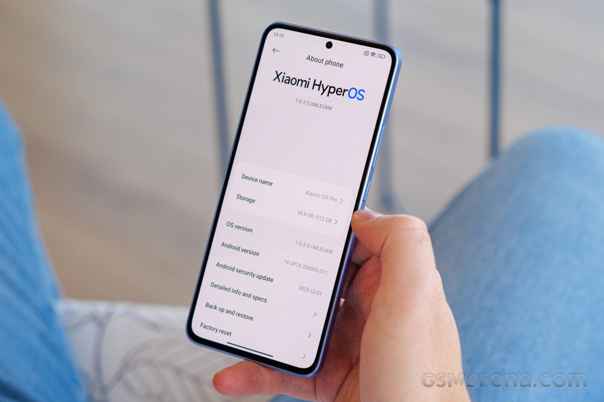
So it's mostly more of the same here, but with a much catchier name. In the same vein, updates come precisely as slowly as they have on previous Xiaomi high-end devices, which is to say, you get one roughly every two months, and it's not unheard of to get an update this month with last month's security patch level. If you've had a Xiaomi or Poco or Redmi device recently, you're used to this for sure, we're just saying nothing has changed on that front.
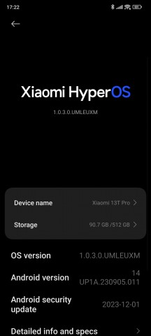
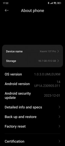
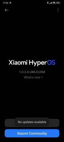
Current software at the time of writing
On the other hand, Xiaomi has promised four Android updates for the 13T Pro, and five years of security patches. That matches what a lot of its competitors are now offering, and so it's not record-breaking but still nice to have. Note that the 13T Pro launched with Android 13 and so one of those four Android updates has already happened. It should thus go all the way to Android 17, and not further, while security updates will end around October 2028. That's plenty of time to use a phone, and we assume most people would have switched to something else by then.
So you have the peace of mind of knowing your shiny new 13T Pro won't be left behind in terms of software anytime soon. Then again, you also need to be okay with the cadence of the security updates, and the fact that Xiaomi's skin sometimes has bugs that can go multiple months without being fixed.
Bugs, quirks
Speaking of bugs - once we set up the phone for this long-term review, we noticed something weird. Most apps had notifications turned off by default. This definitely seems like a bug because it's been many years since we last had such behavior on a phone - back in the day international versions of Chinese skins used to do this a lot, but they have all thankfully moved past this behavior which is more adapted to the local Chinese market and its myriad app stores than usage outside of China where the Play Store is the main source of apps.
Of course this was an easy fix once we noticed it - but that's the thing. If you don't notice it, your banking app might not notify you about a strange transaction and you may only see that the next time you intentionally load it. Or an important email might get missed because Gmail had notifications turned off by default. We're hoping this was just a fluke on our review unit (which is the European one, in case you were wondering), but it probably wouldn't hurt to check from the get-go just to be on the safe side.

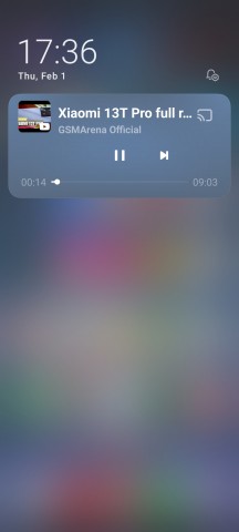
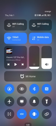
A quirk that may or may not be a bug is that the Now playing widget shows up both in the notifications pane and the Control Center area - we're pretty sure it should be one or the other, but this might have something to do with how Xiaomi has decided to 'emulate' Apple by separating the two.
This isn't new, it's been like that by default ever since MIUI introduced its Apple-aping Control Center, but you used to have an option to go back to the Android way of doing things, with Quick Settings above notifications. Well, not anymore. For whatever reason, you don't get that choice in HyperOS, and it was actually even removed from MIUI 14 on the 13T Pro before.
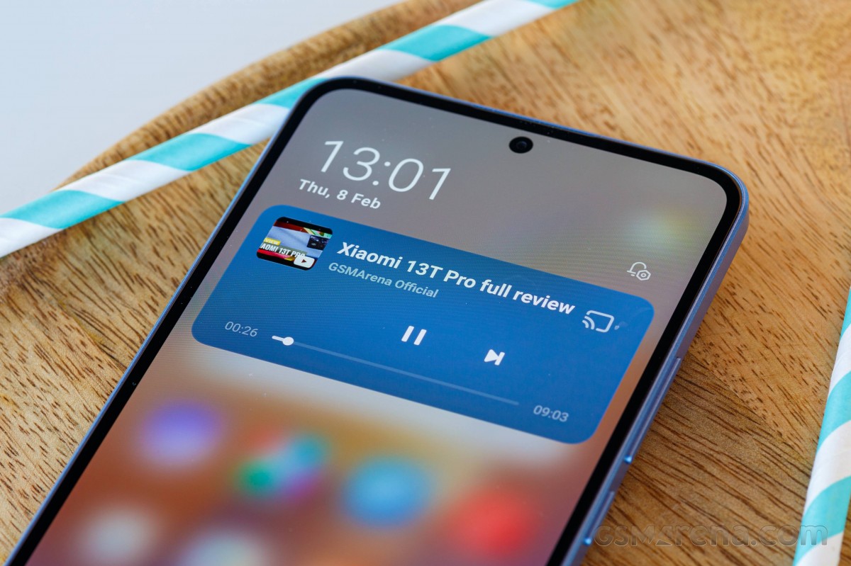
This, to us, is a baffling move for a skin that otherwise prides itself in giving you an amazing number of customization options. Now, it's the Apple way or the highway, basically. To add insult to injury, the Control Center has become even more iOS-like in that the bottom half of its quick toggles don't have any text under the icons anymore by default. Sure, some of the icons are pretty obvious, but others aren't so you'll probably be jumping into Settings, like us, to turn the text labels back on.
None of these changes seem very user-oriented in this reviewer's opinion. Notifications are now harder to get to because you need to remember to swipe down from the left side of the screen to see them, and because there are no more Quick Settings toggles above, the first two notifications from the top are also very hard to reach one-handed without any finger gymnastics.
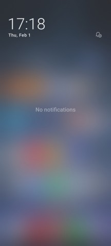
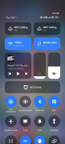
Split notifications and Control Center with Wi-Fi Calling tiles bug
A Control Center-related bug is the presence of not one, but two Wi-Fi Calling tiles at the top, which can't be moved or deleted. Finally for our roundup of bugs, the launcher still contains a longstanding MIUI bug which doesn't let you add specific sections of apps to the home screen. To do this, you long press an app's home screen icon and get a list of stuff you can pin directly to your home screen - on other skins, you then move that to the home screen and voila, it's now there.
Long-pressing the app's icon still works the same way in HyperOS, but if you then try to move one of the sections that show up to the home screen, nothing happens. If you want to try this on your Android skin, long press the Play Store icon and then move My Apps to the home screen - see? That's what should happen here, but doesn't.
None of these are huge show stopping things, at least not for us, but we've listed the bugs and quirks we've encountered in order to give you an accurate impression of what it's like to use HyperOS in day-to-day life. For some, these will be mere annoyances, for others they won't matter at all, but the overarching point here is that quality control should also apply to the 'little things' like these, not just to performance in games and behind-the-scenes optimizations and stuff like that.
Launcher, Recents, gesture navigation, Dark mode
The launcher seems unchanged from MIUI 14, and if we're honest that one seemed unchanged from MIUI 13, and so on. It does its job perfectly well, without any bugs or issues aside from the one we've already mentioned in the previous section. To get the smoothest possible feeling out of it, we suggest going into its settings and switching the Animation speed to Fast.
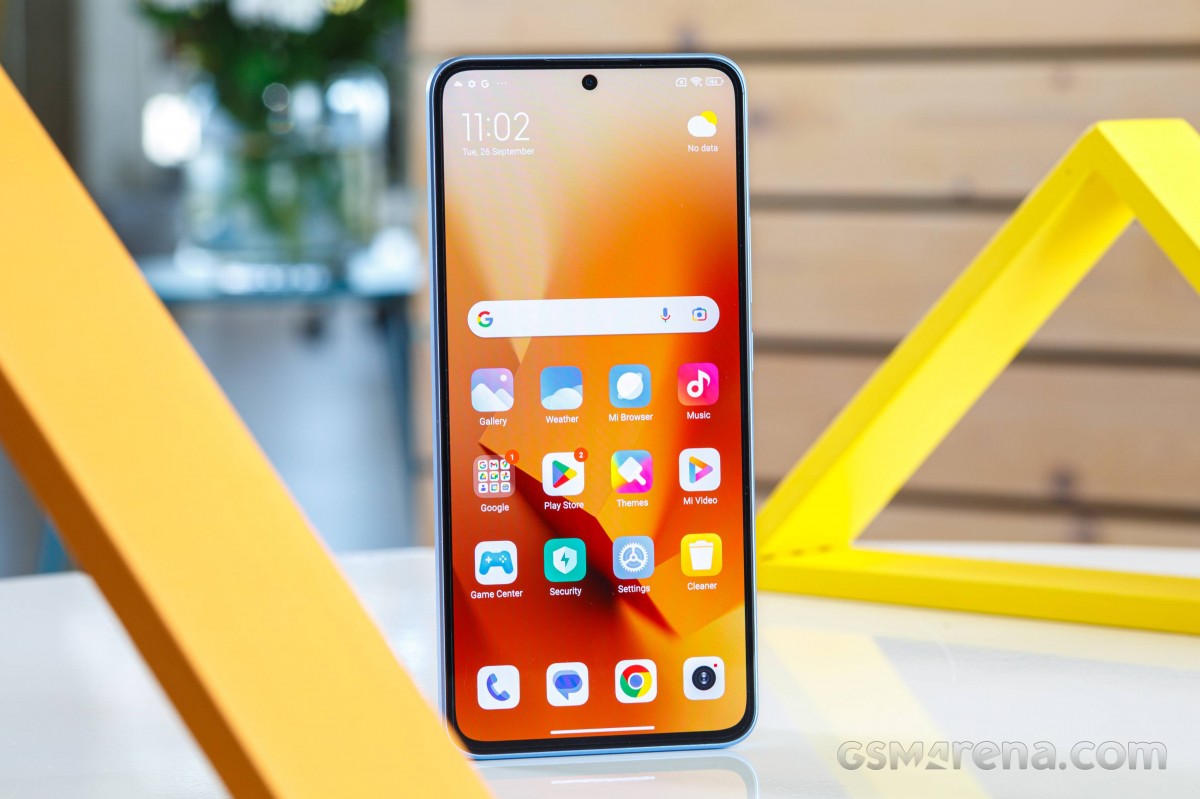
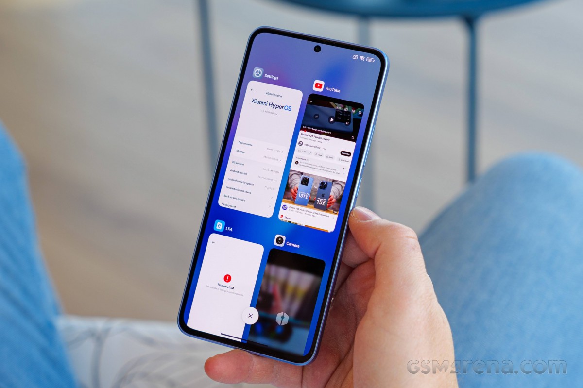
Interestingly, despite the option to not use the Control Center being gone, you can still pick between two ways of arranging items in Recents - the old default MIUI style which scrolls vertically and shows two apps in a row, or the way basically every other skin out there does it, which is horizontally scrolling. Here's hoping the latter doesn't get removed in future iterations of HyperOS just like the Quick Settings option was.
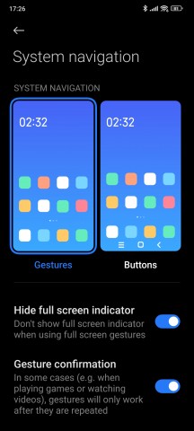
And while we're on the hope train, let's also mention that you can still, thankfully, hide the pill gesture bar at the bottom of the screen when using gesture navigation. We hope this won't go away too, as it has in One UI recently. Then again, if Google's Circle to Search feature will ever make it to non-Pixel non-Galaxy devices, then it will probably mandate the presence of the pill bar, since you need to long-press it to invoke that feature. Finally, after many, many years, Google's actually found a use for the bar - yay.
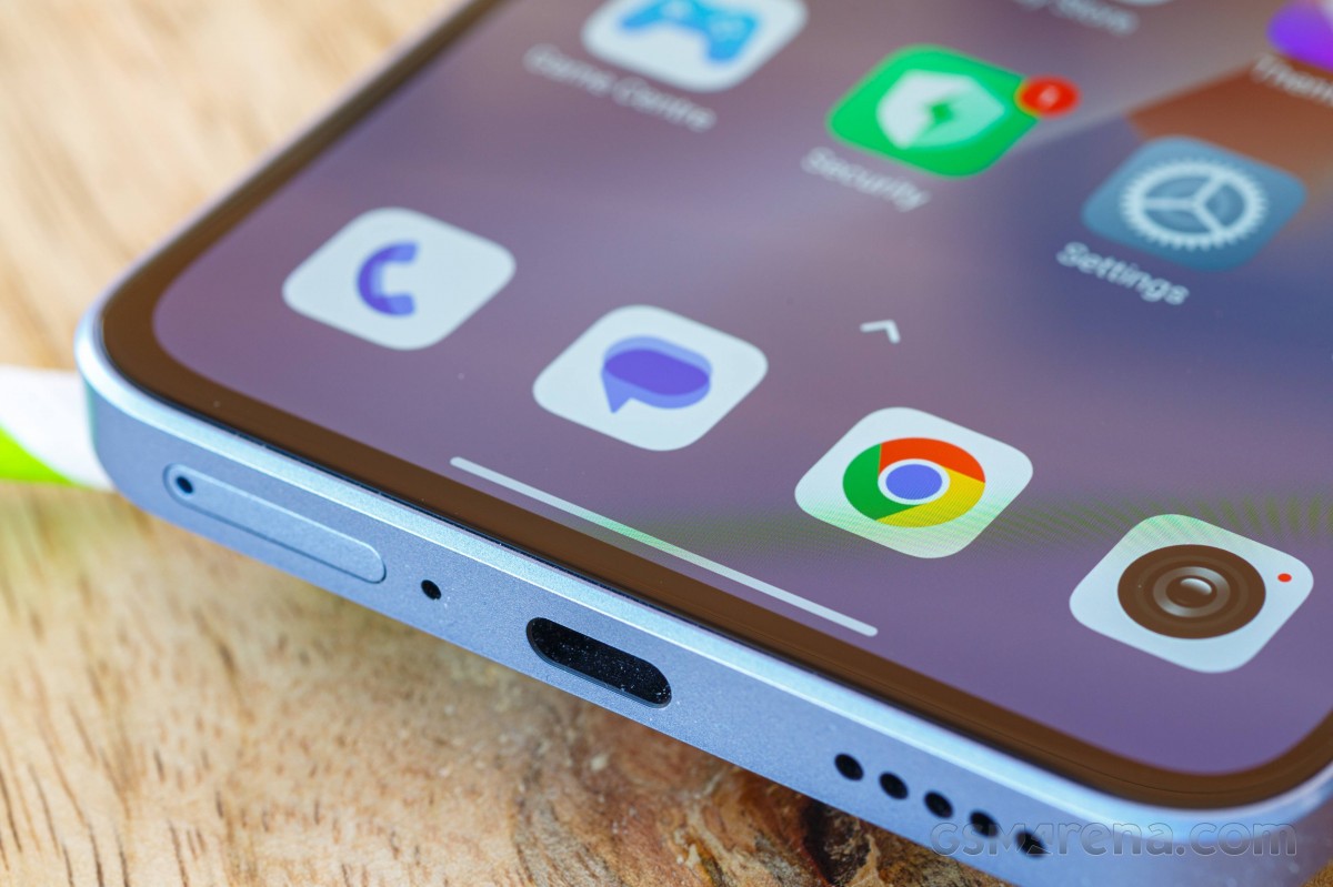
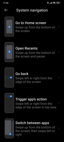
Now, while you can delete the pill, if you do so, you won't be able to quickly switch apps by swiping across the bottom of the screen. This is a pointless feature removal that we assume is meant to nudge you into keeping the bar visible at all times. There's otherwise absolutely no reason to tie the quick switching gesture to the presence of the bar, but this is the way things are.
If you get rid of it, then quickly switching between apps can only be done by swiping up as if to go to Recents, then, without removing your finger from the screen, swiping to a side. This works better for us on the 13T Pro than it recently did on other Xiaomi / Poco / Redmi phones with MIUI 14, but it's still not as quick as swiping across the bottom would be.
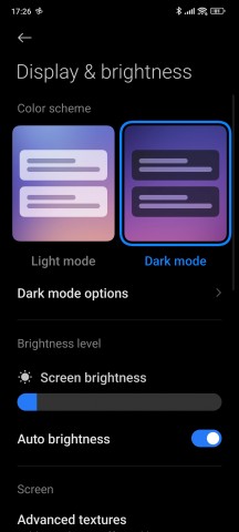
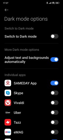
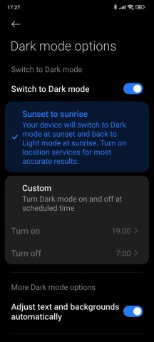
The HyperOS Dark mode is basically identical to MIUI 14's Dark mode, in that you can set it to be on or off, schedule it, and "Adjust text and backgrounds automatically" which we assume plays with the contrast of the former and darkens the latter - thus we've always left this on. It should be mildly helpful, especially on this phone when using it in pitch darkness since the screen is otherwise so bright on the dimmest level.
You can also force Dark mode onto any app you wish, and thankfully the list of apps is sorted chronologically starting with the last one you've used - so if you go into an app and it is retina-searingly white, you can just quickly jump into Settings to force Dark mode upon it as it will be at the top of the app list over there. We've tested this with a few apps, and it seems to work just fine.
Reader comments
- Kevin
- 20 Nov 2024
- sR1
I also have the mi10t Pro. I would not have upgraded to 13t pro if it wasn't for the software update which they stop for mi10t Pro. I would say the changes from the upgrade is that it is faster and better camera and of course, OLED screen. Hype...
- NoOne75
- 12 Sep 2024
- HK4
Yes, but i can't update - no matter what i do. It's crap. Poco M6 Pro is acceptable. I will watch the 14T Pro again - but it's the same main camera, like on the Xiaomi 14 "Light hunter 900".
