Xiaomi Mi 10T Pro long-term review
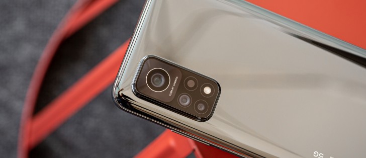
Software issues, updates
The Mi 10T Pro runs MIUI 12 from the day it launched, but the underlying Android version has recently changed on our review unit. Initially it was Android 10, but then in early March we got an update that bumped it up to Android 11. Because of how heavy a skin MIUI is and has always been, don't expect to see any big changes between Android generations. Think of these updates as improving things that are beneath the surface of what you can see - which is MIUI.
While many people seem to dislike MIUI because of its looks (the Theme store exists, though, for what it's worth) or just overall clutter, this reviewer's problem with this particular skin is different. Actually, it's two things, not one.
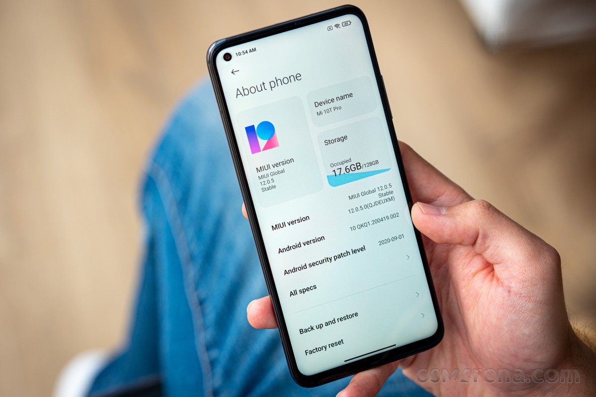
First, updates are few and far between, it usually takes months to get a new update, and while we could whine about Android 11 only arriving on our unit (intended for the EU market) in March, about half a year after Google initially released this version, as we mentioned above that's less of an issue than with other skins because of how little of the changes actually make it to the user experience. The problem with each update arriving a few months after the next is that random irritating bugs that are present in one build are taking months to get fixed.
For example, before the update to MIUI 12.1.2 (based on Android 11), the Mi 10T Pro had this very annoying bug that didn't let you change volume unless the screen was on. Cue a lot of irritation on phone calls when we had to take the phone away from our ear for the screen to come on to then adjust the volume and finally put it back on the ear - a lot of times when this was intended to drive the volume up, we had missed part of what the person we were talking to was saying. This is in all likelihood a very small and easy to fix bug, but it was there for months, until the latest version arrived and triumphantly fixed it.
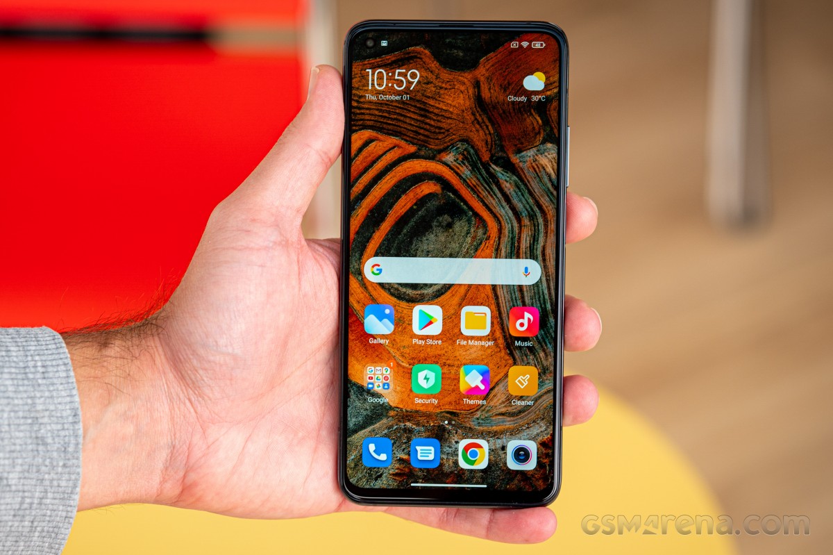
Want another example? The gesture navigation system reliably crashed around once every few days on the MIUI build based on Android 10, randomly and seemingly out of the blue. The only thing that would fix it was a reboot. It too is thankfully a goner now.
Another obvious problem with few and far between updates is that you're constantly missing out on the latest security patches, you're almost never current with those even when you do receive a new build. Case in point: the update to MIUI 12.1.2 (based on Android 11) arrived in early March with the January security patch. That's bad no matter how you look at it, and it's up to you to decide if the price savings you're getting from choosing this phone over another one with similar specs is worth this experience.
In its defence, Xiaomi usually fares much better with sending out big MIUI updates even to phones that are quite old, so you will be getting the new features these introduce in a reasonably timely fashion. You just have to hope the first build you receive is flawless and doesn't have any bugs, because if it does, well, you're then playing the waiting game again.
Second, the way MIUI treats background processes has always been bad, but it's especially so on the Mi 10T Pro running Android 11. Let's list a few (rage-inducing) examples: Spotify randomly being kicked out of memory while it's playing something (or the progress bar in the notification randomly not... progressing), notifications disappearing after just looking at the notification pane once or twice (although in most cases the icons are still shown in the status bar, which is probably a bug but adds to the annoyance), and most irritating of all - delayed notifications.
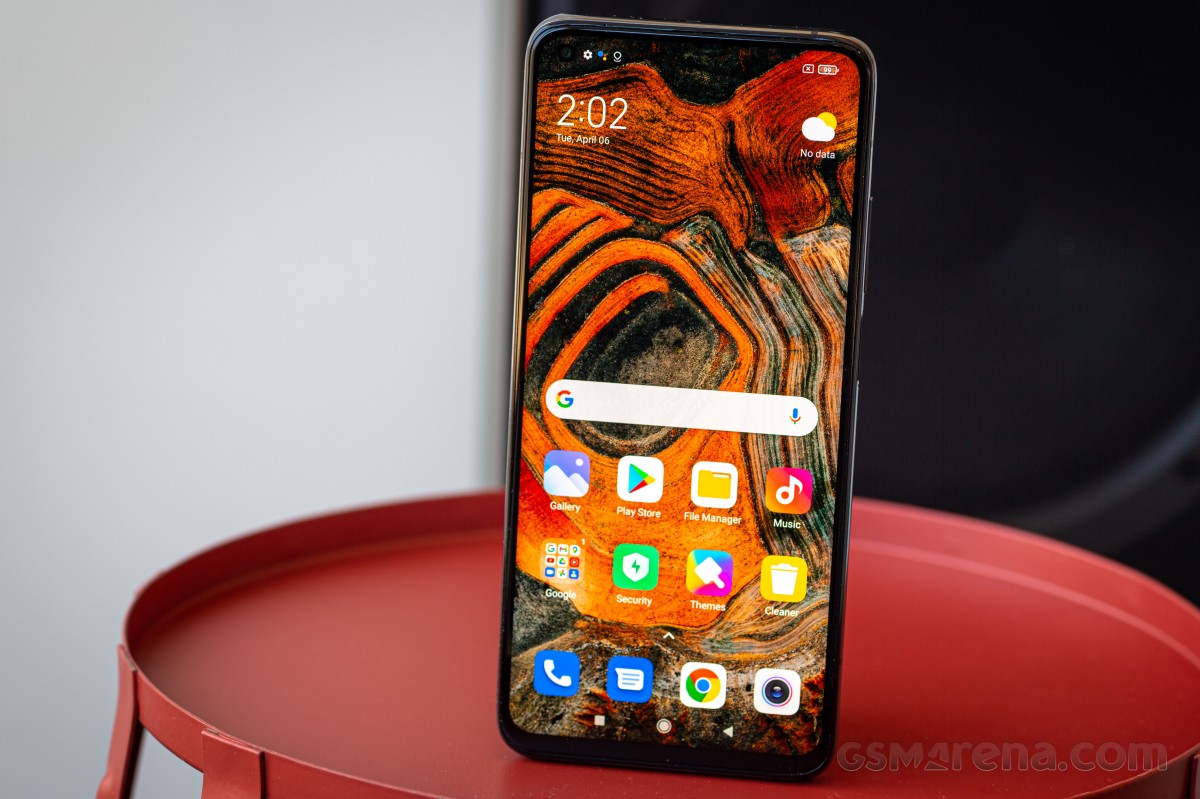
This seems to affect Facebook Messenger the most, sometimes we won't get any notifications from the app at all, for many hours after having received messages. Only manually starting the app helps, but even that's a short-term thing - the behavior reverts in a few hours. We haven't seen anything quite so drastic with other messaging apps, but WhatsApp's notifications do seem to disappear from the notification pane almost always - if we swipe it down and ignore a WhatsApp notification, with the next swipe it's gone with no manual dismissing on our part.
When we praise Xiaomi phones for their battery life (as we do), keep in mind that this is an integral part of what makes that so outstanding (for the capacity). MIUI is and has always been among the most aggressive skins when it comes to dealing with background processes, and MIUI 12.1 on the Mi 10T Pro takes things to a level we haven't seen in years. Hopefully all of these are bugs that will be fixed - in a few months' time, whenever the next update arrives. Which may then introduce some fresh new bugs. Rinse and repeat.
Software look and feel, Settings, Dark mode
MIUI 12 is an evolution of previous versions, and so nothing about it is incredibly revolutionary. Its looks are getting slightly dated now, but its main redeeming factor, at least for us, is the way it uses gentle 'nudge' vibrations throughout your interactions with the UI. No other Android skin does anything like this, and it makes the experience of using MIUI an absolute joy, day after day - despite what you may think about the looks per se.
Unsurprisingly, you get a ton of customization options everywhere, and the Settings menu is thus incredibly crowded (and not a breeze to navigate through intuitively - thankfully there's a handy search box at the top for when you get lost). The System apps updater still updates some, but not all, of the built-in apps, while others use the Play Store, in a 'logic' that completely escapes us.
The Privacy protection section in Settings nicely collates every single option that may impact your privacy, and allows for quick control of high-risk, sensitive and special permissions for apps. The Digital Wellbeing section, on the other hand, is all about giving you easy-to-read stats about your phone use and helping you curb that or simply unwind when you need to.
There's a dark theme too, of course, which looks slightly worse on this LCD screen than it would on an OLED. It's still there if you want it, but keep in mind that using it might negatively impact battery life by a tiny bit (LCDs use the most power when showing black, whereas OLEDs use none). We like dark themes so we chose to go with it, and didn't look back.
The nifty thing about it (aside from the fact that it's scheduleable) is that you can force-apply it to third party apps that don't yet have support for a dark theme of their own (looking at you, Facebook), and this mostly works very well. Do note however that this setting seems to default to On, and it seems to apply even to apps that do have a built-in dark mode. If the forced dark theme is applied on top of the app's own theme, weird things could happen, visually, so maybe it's best to go to Settings > Display > More Dark mode options and disable the effect for every app that you know has a dark mode of its own, and only let it do its thing with the stalwarts.
Gestures, Recents, Launcher, Control center
Xiaomi's gesture navigation system is among the best out there. It employs the usual actions - swipe up for Home, swipe up and hold for Recents, swipe from the sides to go back - but with a simple twist that Google has yet to learn. The Back action is only triggered in the bottom two thirds of the sides, while the top third will allow you to trigger an app's slide-out hamburger menu, if it still has that.
Additionally, you can disable the annoying 'pill' bar at the bottom of the screen, that only takes up space for no good reason. If you want to quickly switch between apps, you can swipe across the bottom of the screen to achieve that - the gesture of sliding from the sides and holding is gone. You may not miss it, but this reviewer does. Alas, progress sometimes has its unintended consequences (and collateral damage).
The Recent apps menu in MIUI, for many, many years, has done things differently compared with every other manufacturer, opting to display the apps in a vertically scrolling two-column view. That's still the default, but now you can also switch to a horizontally scrolling list that looks similar to what everyone else is doing. Could it be that Xiaomi got bored with our incessant nagging about the former option being anachronistic? We like to think so, but whatever the reason, you can pick your poison now.
The built-in system launcher has an app drawer, and it borrows a lot of features from the Poco Launcher seen on Xiaomi's Poco-branded smartphones. It can suggest apps for you in the drawer, and auto-categorize apps too. The scroll bar is customizable, and you even get the option to show the Google Feed to the left of your leftmost home screen if you want.
An issue that hasn't gone away with the latest update is that you can't place in-app shortcuts on a home screen. Normally you long-press an app's icon, get the shortcuts you can use in a pop-up, and then simply drag these to wherever you want them placed. That last step has never worked for us on the Mi 10T Pro. So if like us you like to have a direct shortcut on the home screen to a specific area of an app (say the My Apps section in the Play Store), it's a no go for now - hopefully the next update will fix this.


Home screen, app drawer, Google Feed, launcher settings
While we're on the topic of small issues, YouTube's Picture-in-Picture feature seems to work around 10% of the time on this phone, despite us not having any problems with it on other devices. If enabled, this lets you play the video in a small window on top of everything else, which is great for multitasking but less great if it almost never works.
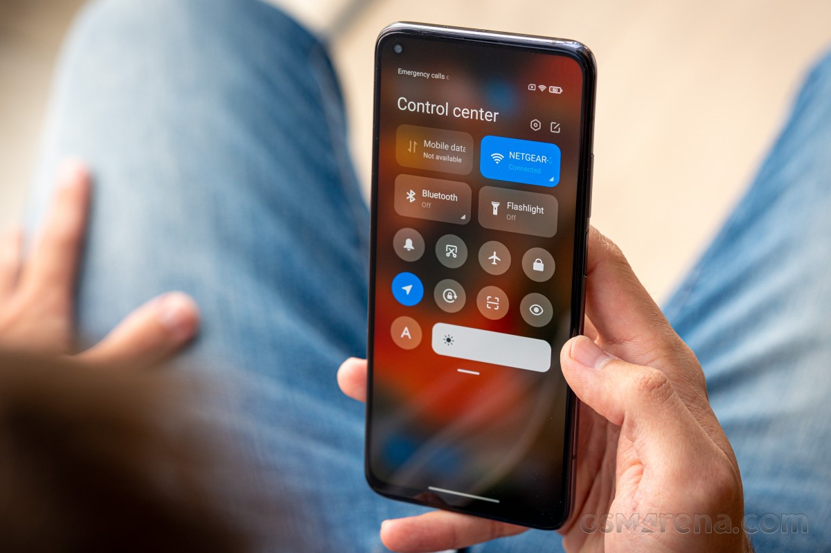
Xiaomi couldn't help drawing some 'inspiration' from iOS and in this version of MIUI you can pick between seeing Quick Settings icons at the top of the notification pane (like in Android) or use a new Control center that is entirely separate. If you enable the new feature (it's off by default), you will swipe down on the left side for the notifications and on the right side for the Control center. We chose to stick with the "old version" but if you've always liked the way Apple splits notifications and the Control center, you now have a very similar option here too.
While on the home screen, you can choose to have a swipe down from anywhere bring down the notification pane, and if you enable the New Control center then you can choose whether this gesture triggers the notifications or the Control center.
Reader comments
- Anonymous
- 29 Sep 2023
- Ld5
You are obviously trolling. You've never even seen this phone in real life, let alone used it long term. I've had it for more than 2 years - battery life is still superb, photo quality is excellent and its processor + RAM combo handles ever...
- Andrew
- 26 Jul 2023
- iis
I have Xiaomi 10T Pro. And its awful. Camera quality is just 0. Refresh rate of screen is auto dropping to low by itself so for games its useless (for other goals u dont need 144hz). Battery is also quick getting out after a year of using. Also very ...
- Anonymous
- 17 Jul 2023
- tZ0
Your comment is suspiciously similar to the comment by 'Ihtisham Sulehri' below. Please dont spread lies


