Xiaomi Mi Max 3 review
Design and 360-degree spin
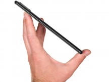
Running the risk of re-stating the obvious yet again, the Mi Max 3 is big. Like, really big. It is the definition of a two-handed device, if we ever saw one. Even so, it's not nearly as big as it could, or rather would have been a few years ago.
For instance, let's take a fairly standard tablet from a few years back - the Nexus 7. As the name suggests - it has a 7-inch, 16:9 panel and about two fingers worth of bezel on every side of the screen, totaling a footprint of 198.5 x 120 x 10.5 mm and a weight of 340 grams. Mind you, that's with a smaller battery pack than on the Mi Max 3.
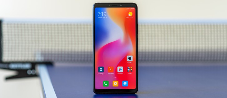
The point we are driving at here is that the screen size on the Mi Max 3 has been made possible by the advancements in modern smartphone design. The 18:9 aspect ratio doesn't make for a skinny look at this display diagonal, but it is still narrow enough to at least fit in an average hand. The slim side bezels help in this regard, as well.
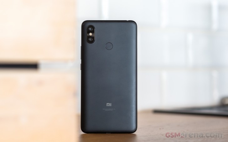
Moving past the size of the Mi Max 3, the overall design language is pretty standard, even if a bit dated and has Xiaomi written all over it. A nicely rounded metal unibody holds all the internals and makes for a smooth and uniform look and feel, only disturbed by the antenna lines.
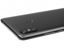
On the back - an iPhone X-like vertical dual-camera module and a fingerprint reader in the usual shape, size, and location. On the front, the top and bottom chins aren't as impressively thin as those on the sides of the panel. Still, they don't feel large at all, and the top one provides ample room for the selfie camera and sensor array, as well as a notification LED, without resorting to notches.
Some might call the Mi Max 3 look retro, but we would rather refer to it as a tried and true classic.
Materials and controls
This no-frills approach to design has spilled over to the bill of materials and control scheme of the Mi Max 3, as well. We already mentioned the tried and true nature of the metal unibody.
The only other construction piece, here, is the front glass, which, unfortunately, Xiaomi isn't formally referring to as Gorilla Glass. Hopefully, that's just a PR omission, rather than a reason to search for a screen protector, immediately after the purchase.
On to the topic of controls then - another standard affair. On-screen controls or gestures, as per your preference naturally handle the in-OS navigation. The only physical buttons on the Mi Max 3 are a power button and a volume rocker.
Both are huddled up on the right side of the phone and frankly look tiny. That's just an optical illusion brought about by the overall size of the phone. In reality, the buttons are standard size. Still, Xiaomi could have spread the pair out a bit better to utilize all that bezel space. Perhaps, flip the volume rocker to the other side.
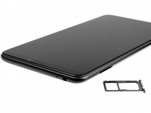
Currently, it only houses the SIM card tray. It is a hybrid affair, so, a pair of nano-SIM cards can be inserted at the same time. Or, you can swap one out for a microSD. We wish Xiaomi had gone for a triple-slot tray since we can't imagine the engineering department was too pressured by size constraints on this particular device.
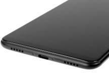
The bottom of the Mi Mix 3 houses a Type-C USB port. Although, only capable of USB 2.0 speeds. Also, a single speaker and the other grill is for the primary microphone.
On the top of the phone, we find the corresponding noise-canceling microphone and right next to it - a good old 3.5mm audio jack. In keeping with some of its more pleasant traditions, Xiaomi also threw in an IR blaster here. That's a kind of a unicorn on today's smartphone scene.
Reader comments
- happy owner
- 03 Jul 2024
- iAF
very true! same here
- Haywhy0071
- 31 May 2024
- r39
Best phone ever! 5 years plus and still good as ever. Still better than most phones labeled 'latest phone'


