Xiaomi Mi Note 10 long-term review
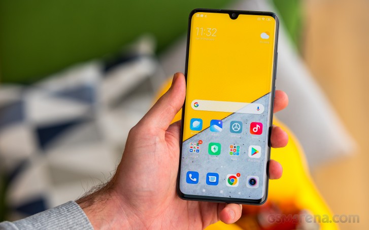
MIUI 11
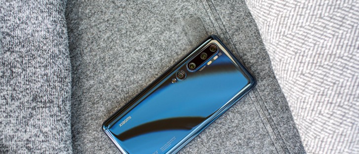
Our review unit has MIUI 11 on board, but still based Android 9 Pie, so keep that in mind while you read our thoughts on the software experience.
MIUI 11 is prettier and feels lighter than its predecessor, but it's no huge overhaul by any stretch of the imagination. The changes are mostly cosmetic and it sure looks more modern. On the other hand, we can't quite wrap our heads around the fact that this phone launched with Android 9 on board, when Android 10 was released months before.
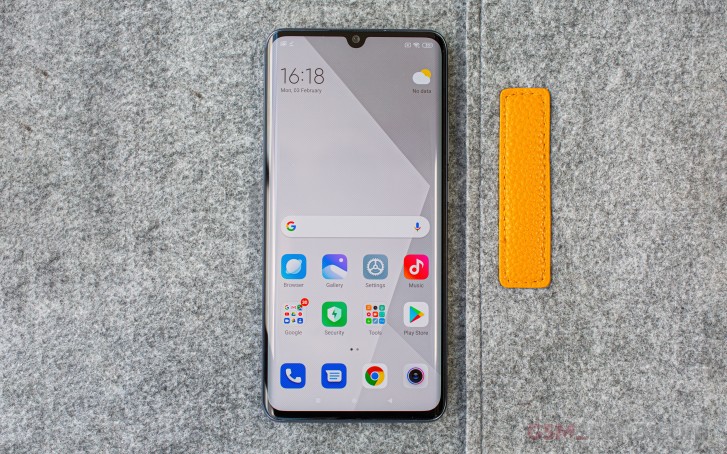
And even now, more than a month into 2020, there's still no sign of Google's latest and greatest. Sure, that's much less an issue with a Xiaomi phone than any other, because of how heavy MIUI is as a skin, but we'd still like to see more timely updates here. Over the course of our long-term review we haven't received one update, of any sort. The phone is also still on the November 1, 2019 security patch level, which just isn't good enough. At least the security updates are supposed to be monthly.
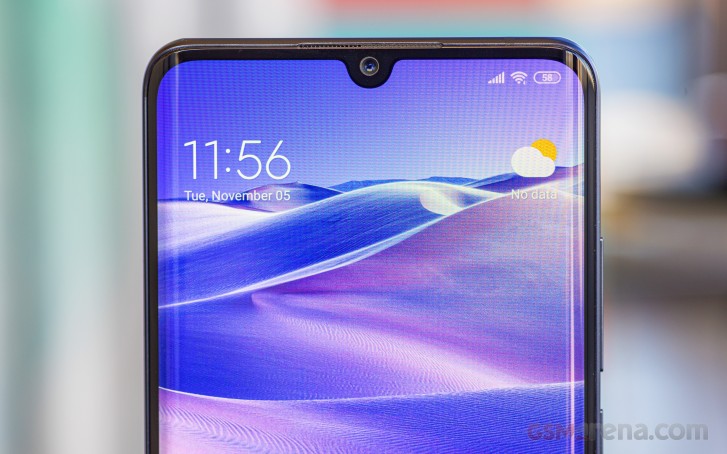
All that aside, MIUI 11 doesn't feel very different in use than MIUI 10. There's some added polish here and there, for the dark theme among other things, but this is still not a finalized work it seems - just diving into the Battery subsection of Settings will throw a white background at you out of nowhere. Perhaps that will be sorted when Android 10 arrives with its native dark theme, we'll have to wait and see.


Dark mode, still white in the Battery section
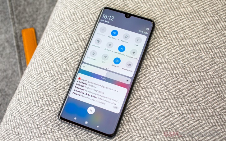
Most of MIUI's annoyances are still there too, like only being able to swipe a notification one way to dismiss it, the weird small font in the status bar, notifications disappearing from the lock screen after a subsequent unlock (if you simply ignored them the first time), memory management being overly aggressive at times - all that jazz.
Thankfully the biggest usability issue with notched Xiaomi phones last year was fixed, so notification icons do show up to the left of the notch, and stay there for more than a couple of seconds. It's that last part that wasn't previously the case and proved to be a huge annoyance.
You get the opportunity to 'optimize' your phone even though you shouldn't have to, and are treated to a ton of bloatware and/or duplicate apps as usual. Most of these things you can safely ignore, and as always if you have a wearable the app that manages it will need to be granted 'special' status in a bunch of different places in Settings so that it can be allowed to run in the background for things like showing you notifications and such.
None of these things are deal-breakers for using MIUI, and overall the skin has its own consistent design language, with no obvious issues there (aside from the aforementioned work in progress status of the dark theme). Whether you enjoy these looks or not is another discussion, but hey - theming is coming back to Europe, so at least you'll once again be able to change things up to your liking.
The Settings menu is long and it's not always easy to locate things (we recommend you use the search bar up top), because they may not be very logically placed. However, it's not a huge deal and you'll probably get used to it in no time. The traditional MIUI quirk regarding the order of things in Settings is alive and well - the first item on the menu is actually About phone, which on most other skins out there is usually last. This however does mean you get ever so slightly faster to the Software updates section, if you're inclined to manually check for those very often. Not that it necessarily matters for the Mi Note 10 specifically, because as we said it doesn't seem to get a lot of updates anyway.
Be careful about backing up stuff to your Mi Account, though - only 5GB of space is free (Hi, Apple!) and if you go above that you'll get a notification from time to time reminding you of that fact. Then again, aside from the backing up of your home screen layout and browser stuff (if you're even using Xiaomi's), there's not much point using Xiaomi Cloud since there's a free Google solution for everything else.
Speaking of the home screen, Xiaomi is currently testing a launcher that finally supports an app drawer, but it's not finalized yet. Because we have over 200 apps installed, that meant sticking with the built-in launcher would've pretty much made the phone unusable, so we did what we always do in this case and installed the POCO launcher and used that. It's also made by Xiaomi, it has an app drawer, it's fast and doesn't seem bloated with millions of settings that you might not even know what to do with.
Xiaomi's counterpart to OnePlus' Shelf is called Vault and it's similarly useless to us, but hey, you may find more value in it. The important thing to note here is that the Vault works in the POCO launcher too, no need to stick with the default app just for that. And while Google's Pixels and Android One devices house the Google Feed (or is it Google Explore this week?) to the left of your leftmost home screen, that's not an option here. You need to go into the Google app to see it, basically.


POCO Launcher Home screen, app drawer, Vault
MIUI has long been infamous for intrusive ads in certain regions, but we don't happen to live in one of those so we've never gotten them in the notification area or on the lock screen and can't attest to how they influence the user experience. We do see ads in Xiaomi's built-in apps, but we can't say we've been bothered too much, as mostly we just use each default app once to see what it's like, then end up settling for something similar from Google or other companies.
It just doesn't feel very logical for us to invest time in using one manufacturer's specific app for something, given that there are more universal solutions out there, and as we switch phones across manufacturers multiple times a year, it would prove a hassle to, for example, not go with Google Keep and instead have to transfer notes over and over again.
The built-in apps mostly update through the System apps updater which lives in the Settings, and not the Play Store. This is a strange halfway solution between Xiaomi having its own duplicate app store (like Samsung, for example), and what companies such as OnePlus are doing - having all of their apps in the Play Store. And honestly we fail to see the point of this state of things that is just going to create some confusion for normal consumers. You can set the built-in apps to auto-update and then basically just forget all about this System apps updater, and we'd very much recommend you do that.
Gestures and Recents menu
Now that even 'vanilla' Android has a half-decent built-in gesture navigation system, we're wondering if it still makes sense to talk about this at length in a long-term review. Xiaomi's system has always been among the best out there, and it still is. It's very similar to what Google came up with in Android 10, except the 'back' gesture animation is much better in MIUI, and it has an easy solution for the conflict with hamburger menus on the left side. You swipe inwards from the top ~25% of the screen, you get the app's slide-out menu. You swipe from the bottom ~75%, you go back. That's it, and this works the same on both the left and right sides.
Furthermore, MIUI's gesture system optionally has a way to quickly switch to the previously used app without the need for an ugly 'pill' at the bottom of the UI. You just hold the 'back' gesture for a tiny bit, then you're taken to the last app - and this is indicated by the arrow icon turning into the icon of the app you'll be taken to once you lift your finger. Very well implemented system, very reliable, much better than Google's.
The multitasking menu, though, is exactly the opposite. For reasons that are beyond us, Xiaomi insists on a vertically scrolling list of apps - but not just that, it's rows of two. This at first blush feels like it would be useful because you have more than one app in sight when you enter the Recents menu, but in practice it just forces you to pay extra attention to what you're about to tap. We think there might be usability-related reasons why every other manufacturer has settled for a horizontally scrolling list of apps that only has one in view at a time, so maybe it's time for Xiaomi to get with the program in MIUI 12.
Bugs
With every new big software revamp, we've grown accustomed to seeing some random bugs here and there, and MIUI 11 is unfortunately no exception. We're hoping these will get fixed in subsequent updates, but for now we're going to quickly list the bugs we've encountered. None of these severely detract from the overall experience of using MIUI 11, but we would have liked not to have come across them.
First off, if you have a scheduled Do Not Disturb mode (Downtime, for example, so that your phone won't pester you with notification sounds while you're sleeping), prepare for things to randomly ignore it. We have gotten notification sounds from WhatsApp as well as Facebook Messenger, randomly, on some nights - but not all, mind you. And sometimes only one of them had this behavior, sometimes both, and then sometimes neither.
This could actually be an issue with those apps and not MIUI 11, and yet we've never encountered something like this before - on any phone that we've had for a long-term review. The unpredictability of the scheduled DND mode not working as intended was most baffling, because when it works as it should, this is a feature one can easily grow to take for granted.
Next up, we couldn't find a way for vibration feedback to work on keypresses for Gboard, even though this was technically turned on in the settings. This wasn't an issue with the vibration motor per se, because it worked for everything else, so either it's a bug in Gboard on MIUI 11, or in MIUI 11 itself. Using the same version of Gboard on another phone the vibration feedback worked just as it should - we tested just to be sure the keyboard itself didn't develop a bug.
The proximity sensor, which turns the screen off while you're on a call and hold the phone to your face, also seems to enjoy randomly not working. And when we say "randomly", we mean "randomly", we were unable to figure out what might be causing this bug because it occurred so out of the blue, and went away as randomly as it came. We haven't encountered this for every single call, or even for the entire duration of some calls, but felt like it needed to be mentioned.
Finally, while this is not a bug, it was a mild annoyance nevertheless: animations in MIUI 11 are really cool, especially going back to the home screen from the built-in apps - their icons get animated for a little bit. It's a nice effect but we found the animation speed rather slow. Luckily, there's an easy fix, but it requires you to surface the hidden Developer options menu (by pressing the MIUI version field in About phone a bunch of times quickly). Then in Developer options we changed the three animation scale settings from 1x to 0.5x and things got noticeably faster, without cutting off any of the effects.
Reader comments
- Dharama raj shahi
- 22 Jan 2024
- XUe
Long range wifai not working
- Sherwin Camarao
- 07 Jan 2022
- sxs
I had this phone. The best phone I ever had.
- Omer tanvir
- 04 Jan 2022
- XND
Is there anyone face display blinding problem??


