Xiaomi Redmi Note 5 Pro hands-on review

Software
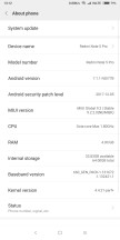
The Redmi Note 5 Pro ships with Android 7.1.1 underneath MIUI 9. Our non-retail review unit came with 9.2.2.0 Nightly build, which we hope and assume isn't too different from the version that will ship with retail units later this week.

MIUI 9 - the software version of our review subject
As is the case with MIUI devices, the software on the Redmi Note 5 Pro is more or less identical to what you get on other Xiaomi devices running MIUI 9. The differences are usually hardware specific and can be seen in things like the Camera app (which we will talk about later) but, by and large, the experience is similar. Basically, if you have used one MIUI 9 device, you have used them all.
So, we will skip the summary and talk about the general pros and cons. The pros include a lot of features and functionality built into the OS that you don't get in stock Android. Things like Dual apps (which lets you run two instances of a single app with different accounts), App lock, theme support, Second space (which creates a separate profile on the same phone), and Caller ID (which identifies some unknown numbers and also warns if enough people have reported it as spam).
Xiaomi also does a lot of localization, so you get features like a messaging app that can automatically detect SMS with train ticket info and presents it in a more readable format, ability to filter notification SMS into a separate folder and also an option to copy the OTP easily. There is also a video player built-in that could play everything we threw at it. All of these are useful additions that people have come to appreciate.
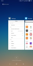
Unfortunately, MIUI still looks like something designed primarily for the Chinese market, and just like other Chinese ROMs out there, the iOS influence looms large. This means overuse of white everywhere in the UI, no app drawer and forced square borders around all the icons. Xiaomi also resolutely ignores many of the new UI features in the latest versions of Android; the notifications still cannot be expanded, many of the default apps still require you to press and hold the multitasking key to access the 'Menu' function (something that died in stock Android years ago), the share sheet is straight up ridiculous and you can't press and hold the app icons to access app shortcuts. This is just the tip of the iceberg and listing all the shortcomings in MIUI will require its own separate article.
Bottomline is, Xiaomi has done some good work to make MIUI more relevant and functional to its users. However, it is all built upon a somewhat outdated user interface that needs to be brought in line with Google's UI design guidelines, not Apple's.
Reader comments
- Vellz
- 14 Apr 2025
- thu
This phone is actually very good, but only in 2018 - 2023, after 2024, this phone experiences several things such as bugs, decreased performance, and increased temperature. If you buy this phone in 2025 and beyond, I suggest you don't, just bu...
- Jay
- 28 Jul 2024
- 05}
I've been using this phone since June 2019 and it's been a wild ride. It was a great choice and continues to serve despite being 5 years old. Volume up and power button died about 3 years ago, and the camera quality decreased. But consideri...
- Rohit
- 13 Jan 2024
- CbD
It is one of the best mobile. I said it because i am using this model from 26th Jan 2019 to today. Quality manufacturing and functioning of all the aspects are superb. It's my honest review.


