Xiaomi Redmi 5 Plus review

Design
It seems Xiaomi didn't make itself quite a favor last year with the Helio-powered Redmi Note 4. An all-metal unibody and diamond-cut antenna ducts looked cool. Maybe even too cool for the global Snapdragon-powered version, which felt almost like a downgrade when it was released. Both of them pretty much reused the Redmi Note 3 design and that wasn't such a bad thing back then. However, recycling it yet again for the Redmi 5 Plus is too much perhaps.
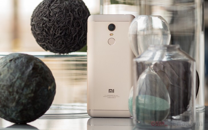
Here is an all-around view of the Redmi 5 Plus.
Perhaps, Xiaomi didn't go for a complete re-design because the widescreen gave it enough of a new look and feel. Below the noticeably bigger screen, the capacitive keys are gone for good. The subtle 2.5D effect on the front glass is still there but not too prominent.
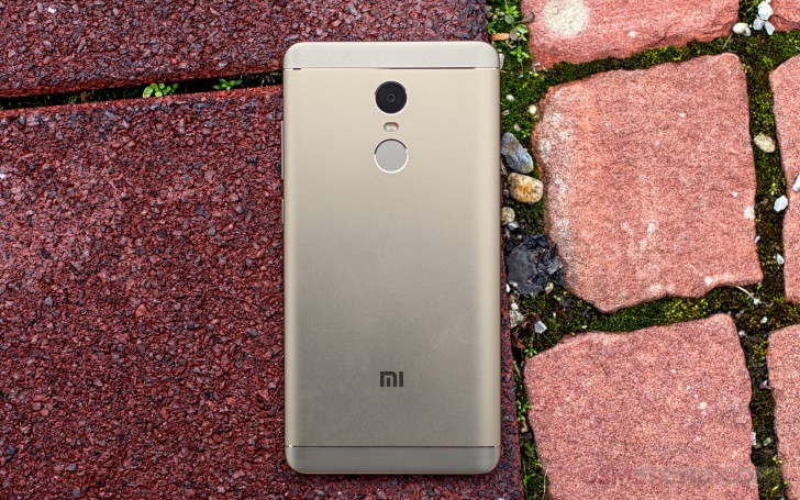
Flip the Redmi 5 Plus and you'll find a virtually identical back with the Redmi Note 4. The top and bottom antenna inlays are made of plastic, while the centerpiece is all metal as is the camera rim. If it weren't for the difference is size, the Note 4 and 5 Plus would have been impossible to tell apart.

Now take a look at the Redmi Note 4. The Redmi 5 Plus is 7mm taller than the Redmi Note 4 and weighs 180g (15g heavier).

The good news is it's really hard to tell the plastic bits of the Redmi 5 Plus, but Xiaomi could have done a better job at matching the paint with the rest of the body.
There are no surprises on the Redmi 5 Plus, new screen or not. The hybrid card slot lets you choose between a second SIM or a microSD, while the top of the 5 Plus has the good ol' audio jack and the fan-favorite IR blaster.
Over at the bottom, the single speaker and the primary mic are behind symmetrical micro-drilled grilles.

Reader comments
- Rashid hamadi
- 01 Feb 2025
- rvG
Yes
- Anonymous
- 14 Nov 2024
- r3H
Hello I have bless with redmi not 5 the problem is that not doing whatspp and other applications like tonkeepe and what spp thank you
- Myo Min Naing
- 16 May 2023
- raQ
No propel


