Xiaomi Redmi Note 4 preview: Snapdragon Inside
Snapdragon Inside
Design
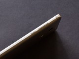
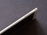
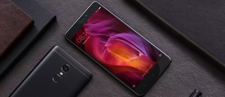
One of the improvements with the Redmi Note 4 is a new design. The new phone dumps the sloppy curves of its predecessor for more purposeful lines and flat surfaces. It makes the phone look less bulky and leaner. The sharp creases come at a cost, however, as the new phone looks much larger even though it's just taller by 1mm.
Front side
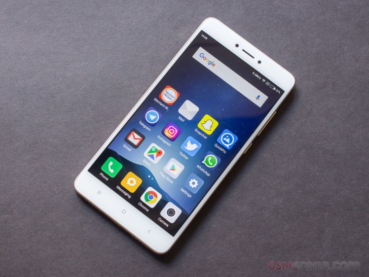
On the front things have been changed slightly. Unlike the Redmi Note 3, the gold Redmi Note 4 has a white bezel instead of gold, which looks significantly more upmarket and less gaudy than having an all-gold phone.
On stage, Hugo Barra called out the little imperfections in the Redmi Note 3 design - such as the offset sensors on the front and the microUSB port on the left at the bottom - going as far as to call them cringeworthy. The Redmi Note 4 is much more symmetrical. Above the display, we see the front facing camera, the earpiece and the sensors - all symmetrically positioned, giving a very pleasing appearance. A notification LED is hidden on the left side.
Below the display are the three navigation keys that are backlit. The backlighting is stronger compared to the keys on the Redmi Note 3 but it's uneven, which makes the key on the right look the brightest and then it fades gradually as it goes to the left, which doesn't look very nice. In fact, under most lighting conditions it looks like only the rightmost key is backlit, and only when it's pitch dark can you see that the other two keys are illuminated as well. Of course, this might be an issue with our review unit specifically.
The entire front side is covered by a scratch-resistant glass, which survived under our knife without a mark. Xiaomi is using a 2.5D glass this time that has a gentle curve around the edges. This also gets rid of the shiny chrome rim found on the Redmi Note 3, which again contributes to the overall sophisticated look of the design.
Along the sides, we find the power and volume control buttons in the now familiar location. The buttons are made out of plastic but are easy to reach and work well. On the opposite side is a hybrid SIM card tray that can hold one micro SIM and one nano sim or one micro SIM and one microSD. The tray is upside down in typical Xiaomi fashion, which means you have to remember to have the back of the phone facing towards you before opening the tray unless you want to unload the contents to the floor.
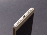
On the top of the phone is a headphone jack with a microphone and an IR blaster. On the bottom is a microUSB port in the middle, microphone on the left and loudspeaker on the right.
The back of the phone uses a similar design structure as the Redmi Note 4. It's a plastic shell with an aluminum in the middle. This makes it look like the back of the phone is made entirely out of metal and only the top and bottom has plastic caps when in reality the plastic is all around the back and is just hidden by the thin aluminum panel.
Xiaomi has done the most design changes on the back. For starters, the edges have a more subtle curve that ends in flat sides. The exposed plastic at the top and bottom doesn't try to blend in smoothly with the metal and instead, there is a thin line in the middle that's made to look like antenna bands on full metal phones but isn't actually one considering the entire top and bottom section is plastic and radio-friendly.
The loudspeaker has been moved to the bottom of the phone where it can no longer be blocked when you keep the phone on any kind of surface. The camera and fingerprint sensor array have also been shifted downwards, which puts the fingerprint sensor in a much more comfortable spot that is less of a stretch to reach compared to the Redmi Note 3. Unfortunately, much like the Redmi 3S Prime the Redmi Note 4 comes with plenty of unsightly markings on the bottom.
The build quality is a bit of a mixed bag. The Redmi Note 3 felt reasonably sturdy in hand but even a slight pressure on the back caused the display to pop out and the phone to bend like a candy bar. In comparison, the Redmi Note 4 feels sturdier with no immediate popping or flexing unless you really want it to.
However, our Redmi Note 4 produced a creak every time we used it, especially at the top and bottoms, as if the plastic shell was ill-fitting and slightly larger than it needed to be. It wasn't loud creaking but it was noticeable, and something we picked up on almost every time we held the phone, even if we weren't looking for it. Overall, it's not the best-built phone in the world but at this price that shouldn't come as a surprise.
The Redmi Note 4 comes in three colors, gold, dark gray, and a new all black color that looks cool in pictures but is bound to show nicks and dents much easier than the other two colors as the paint chips off and the inner metal shines through.
Display
The Redmi Note 4 has a 5.5-inch, 1920x1080 resolution IPS LCD. On paper, it sounds similar to the one on the Redmi Note 3, but there are some differences.
For one, the display is brighter than before. While the Redmi Note 3 did get adequately bright, the Redmi Note 4 goes a step ahead and gets really bright.
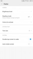
Secondly, the colors look a tiny bit better. We tested both displays at the Standard setting, which is the most natural setting available in MIUI. At this setting, the Redmi Note 4 display is warmer, which makes some of the colors look more natural and the whites in particular look closer to the ideal white point compared to the bluish whites on the Redmi Note 3.
Unfortunately, the color calibration is still not completely accurate; the whites, although better than before, have a distinct red color cast, which gives some images a pinkish look, especially when compared side by side to a calibrated display like the OnePlus 3T at its sRGB mode.
Still, this is largely nitpicking and overall the Redmi Note 4 display is really good, especially for a phone in its price range.
Reader comments
- rickzy
- 12 Jul 2018
- PB7
best phone great battery,average camera
- Anonymous
- 15 Jul 2017
- Ikg
Not one worthwhile comment posted here - unbelievable!!
- Kavin
- 09 Jun 2017
- D0e
Battery life low
