ZTE Axon 7 review: The brightest sound
The brightest sound
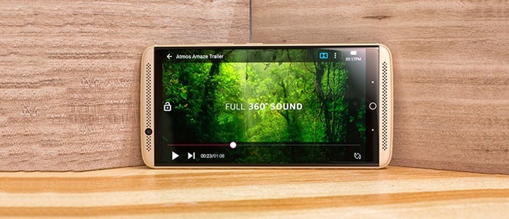
MiFavor 4.0 on top of Malvavisco
That's Marshmallow in Spanish, if you're wondering, but we digress. ZTE's custom launcher doesn't change the Android looks as much as some of the other Chinese manufacturers like Xiaomi or Huawei. In fact, with MiFavor 4.0, the Axon 7 reminds us of the latest Sony offerings in terms of user experience.
That's because ZTE has slightly skinned the vanilla Android experience without messing too much about additional functionality. There's no split-screen view baked in (that's left for the Nubia brand) or a custom task switcher, for example.
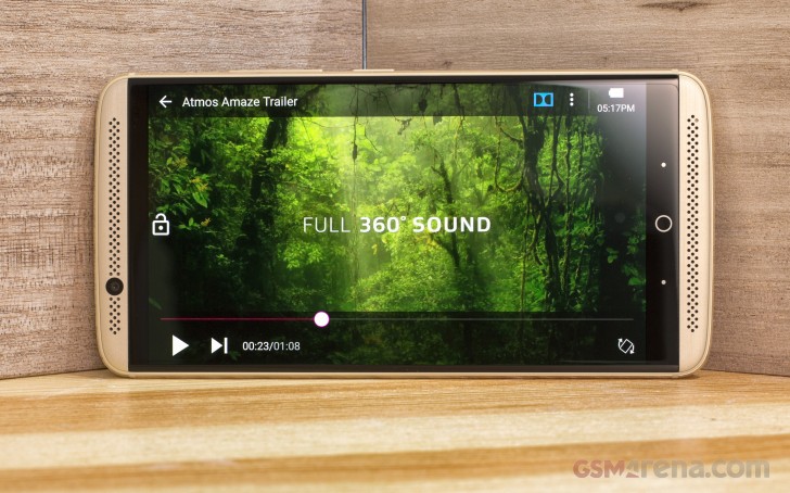
That's not to say that using the MiFavor 4.0 UI isn't a nice experience, right on the contrary. However, there are slight frustrations, which take away from the otherwise okay feel of the launcher.
Let's start with the lockscreen. It's a typical Android affair with shortcuts to the dialer and camera, but for some reason there's absolutely no way to see pending notifications. For that to happen, you have to tap on the bell icon on the top left corner - it's quite frustrating, as waking the phone is often just about checking up on the new notifications and you have to go through an extra step to check them out.
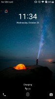
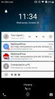

The lockscreen requires an additional step to check notifications
When you get past the lockscreen, you see a standard Android homescreen with a few customizable shortcuts docked at the bottom and visible on all panes. A pinch on the homescreen triggers the familiar menu for managing the launcher's look, widgets and apps.
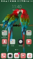
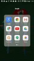
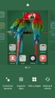
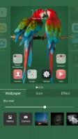
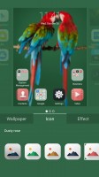
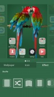
The homescreen • Opening a folder • Customizing the launcher
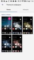
You can change the look of the icons, control the blurriness of the background and change the effect of the swipe animation between homescreens. There are also predefined themes accessible from the Settings menu, but you can't download additional ones as for all we know, there is no Theme store.
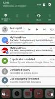
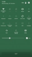
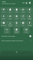
The notification area is unchanged from stock Android. You can move the toggles around or mass clear any pending notifications.
The Task switcher is also unchanged from stock Marshmallow. What's custom is the Mi-Pop shortcut button, which sits on top of the rest of the UI. Giving it a slight nudge would reveal custom shortcuts to different actions - going Home or Back, viewing Recent apps or even taking a screenshot.
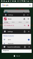
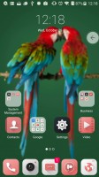
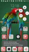
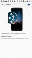
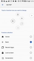
The default Task swicther • Mi-Pop shortcut button
The Settings menu is slightly customized by ZTE to offer some better organized options. There are also some interesting customizations like custom Gestures and motions setting. It allows you to answer a call by just lifting the phone and placing it to your ear or declining one by flipping the phone over. Features like that have been around for years on other phones but it's nice to have them here too.
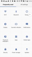
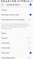
The Settings menu • Gestures and
Overall, the UI feels well made, but lacks the customization options that we've become accustomed to, especially from Chinese phone makers. We have some minor grudges with the MiFavor 4 UI, but overall it works just fine on a daily basis.
Reader comments
- Visum
- 28 Aug 2022
- XBA
I bought a fairly used one but Gets too hot when operated, and I Love The Phone,no jokes and contemplating to buy A brand New one in Nigeria
- Anonymous
- 22 Apr 2021
- j$1
How do I transfer pictures from my Axon 7 phone to my computer.
- Nomi
- 23 Dec 2020
- 6k8
I need this phone
