ZTE Blade S6 review: A sharp tip
A sharp tip
User Interface - Slightly skinned Lollipop
The ZTE Blade S6 runs the latest Android 5.0 out of the box, which is a definite rarity among Chinese devices. ZTE has slapped its own launcher on top of the OS, but thankfully, it preserves most of the Lollipop feel.
The launcher itself is very clean and simplistic. It goes for a nice flat design UI, complete with modern-looking flat icons with nicely rounded corners. The whole User experience is very straight forward and unobtrusive. Menus are not overly stuffed and well organized with almost everything where you would expect it to be.
There are a few ZTE additions to stock Android functionality, but everything is well executed with no extra clutter.
Check out a quick walkthrough of ZTE's custom android work in the video below.
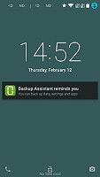
Starting with the lockscreen, ZTE has opted for a slide-up unlock approach, which moves notifications upwards over the rest of the interface. It also features a time and date widget and two shortcuts to the dialer and camera on the bottom.
Beyond the lockscreen, we find a fairly standard Android homescreen with up to 18 homescreen panes available at your disposal. That's a lot of space, but since ZTE has opted out of using a conventional app drawer, it might just come in handy. With no app drawer, anything you install pops up on the homescreen.

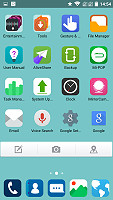
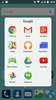
The homescreen doubles as an app drawer
You can group the apps in folders, which look a lot like stock Lollipop.
Anyway, a long press on the homescreen gets you to the management screen - from there, you can rearrange, delete and add panes. There are no dedicated add or delete buttons in the menu. Instead, there is always an extra empty screen that appears in the management area and if something is placed on it, it becomes active as a new screen. Removing it is the reverse procedure. This is kind of a chore and it definitely could use some remodeling from ZTE.

Managing the homescreen panes is rather difficult
Tapping the Menu button on the homescreen gives you quick access to color schemes, wallpapers, effects and launcher settings. The Blade S6 comes preloaded with a few wallpapers as well as a lot of nice solid-color options.
Strangely enough, there is an online library for additional colors to be downloaded. It may sound kinda odd, but it does double as a link to more wallpapers. Speaking of, you can add a blur filter if varying intensity to any wallpaper, which is definitely a nice touch.
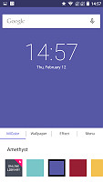
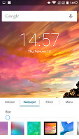
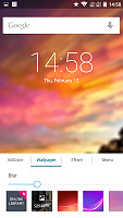
Solid color backgrounds and wallpapers with blur effect
The menu also contains an effects tab that lets you choose between a few nice transition animations between screens. Subtle and yet excellent to keep the experience fresh.
The final tab contains a link to the main phone setting as well as what appears to be a settings menu for the launcher itself, with options for backing up and restoring. This is also the home of one of three rather confusing update features.
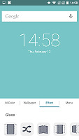
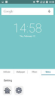
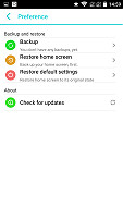
Transition animation options and one of the three update menus
While we are on the subject of updating ZTE has created a rather confusing mess of the whole process. As already mentioned, there are three separate places within the menu structure where an update option is available.
First, there is the standard System updates located under "About phone". This option, however does not connect to a remote server but instead is intended for manual updates off the SD card.
This placement is a little bit strange, but things get even weirder. ZTE offers a separate System update application which is where you want to go for OTA packages. However, it also has a backup and restore feature that works with the external storage.
Last, but not least, there is the aforementioned update in the Launcher options. We can't really figure out if this is a separate feature, which is responsible solely for keeping the UI up to date or whether it's a shortcut to the OTA center. Either way, the Blade S6's update system is a hassle.

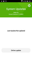
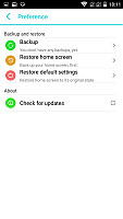
The Blade S6 is confusing when it comes to updating
The notification area on the Blade S6 is what you would normally expect from Android 5.0. Pulling it down once reveals the notifications, which are nicely animated in a list fashion. Right above them there is the standard time and date widget along with a battery indicator and what is supposed to be Android Lollipop's new profile manager and selector. However, it does not seem to do anything on the S6 for some reason. Perhaps it's just our review unit.
Pulling down a second time reveals the quick toggles, eight to be precise, selected dynamically according to usage patterns, as well as a brightness slider, as well as a battery percentage indicator.
Overall, the Blade S6 has no trouble with responsiveness whatsoever and the Snapdragon 615 breezes through menus with ease, save for one notable exception.
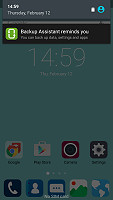
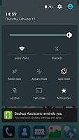
The Blade S6 has a stock Android Lollipop notification shade
For whatever reason adjusting the brightness is a very laggy process, which seems to stutter the whole UI. Perhaps it is a software issue or the hardware controller responsible for adjusting light levels is just too slow and freezes the device for a split second. Whatever the reason the bug is a fact, but definitely nothing more than a minor nuisance.
The Blade S6 also borrows the interesting Lollipop notification management and prioritizing system, which enables you to adjust limit certain types of notifications based on their source or all of them together, instead of simply turning off the volume all together.
A long tap on the Menu capacitive key reveals the app switcher. It is also stock Android all over and has a neat card interface that allows you to select the app you need by swiping up or down. You can close apps by swiping left or right, or by hitting the dedicated button on the top right corner of each card.
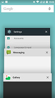
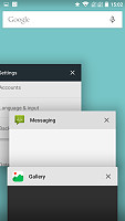
Switching between apps in Lollipop style
Besides the standard navigation scheme and Android shortcuts, ZTE has thrown in some additional Gestures in the Blade S6. They are managed through a dedicated "Gestures and Motion" app and cove a wide array of use cases. Some of these make a lot of sense and work well, while others are just plain silly.
Covering or flipping the phone can silence a notification or incoming call, which is definitely useful to have and so is the dedicated pocket mode, that ramps up vibration and ringer volume. There are however a few motion gestures that use the volume rockers and are kind of hit and miss.
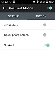
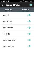
Dedicated gestures and motion application
Holding the volume up and bringing the phone horizontally in front of your face should fire the main camera, while doing the same while holding the device vertically should bring up the selfie camera, or at least in theory. We couldn't get either to work properly. The same applies for auto answer and auto call, which are intended to do the respective actions when you bring the device up to your ear.
There is also a shake gesture that can launch apps quickly from locked state. A nice idea which also works reliably enough, but the app selection is limited to the flashlight and calculator and we can already imagine the battery drain from accidental misfires in the pocket.
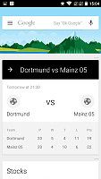
Holding the home button brings up Google Now. Google Now has brand new material design, but its functionality hasn't changed much. You can manage your daily routine and all your interests by using the service.
It provides traffic information to your work or home, knows the scores of sports teams you follow and gives you the weather forecast for your location. It knows your upcoming flights and hotel reservations. It's great for at-a-glance info, but can handle voice input as well. It also has a dedicated homescreen/lockscreen widget.
Overall, the best part about the Android 5.0 Lollipop-based user interface of the Blade S6 is that it truly feels new, well-polished and very clean. The new ART runtime is a huge deal too - it's supposedly responsible for the excellent performance and makes interaction with the device feel a lot more immediate. Getting the latest Android experience out-of-the box is a huge deal especially for a Chinese manufacturer and ZTE definitely deserves admiration for the extra effort.
Reader comments
- harry
- 31 Aug 2016
- rA%
in zte blade s6 i faced a problem thai in this mobile only one sim slot use.not both..it is a very big problem for me.
- Robert L
- 07 Mar 2016
- ii1
Why do I get a notification that this app is not available in this country? When i live i Brisbane and the DoDo portal app and GasBuddy (Australia) only apply in Austra;ia.
- Toni
- 13 Jan 2016
- 0jU
I made 160 orders till now, i never had i problem.
