ZTE Blade S6 review: A sharp tip
A sharp tip
Phonebook
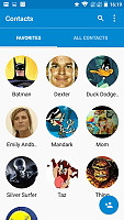
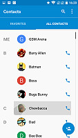
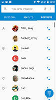
The phonebook application on the ZTE Blade S6, just like many others, is lifted straight from stock Android Lollipop with little change. The app features a clean tabbed interface, which displays all contacts and the favorites.
There is a Multi-select option it the app menu on the Blade S6 that seems to be missing from Nexus devices, but everything else is identical.
You can sync with multiple accounts including Google and Exchange. A button to add a new contact is constantly present in the bottom right corner - you can choose which account to sync the new addition with.

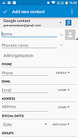
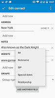
Sync options • Adding and editing contacts is straight-forward
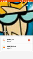
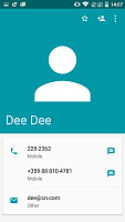
Viewing contacts is equally intuitive and fluent. It is achieved in a stylish material manner. Missing profile pictures are replaced by solid color.
Overall, the interface is really pleasant to work with and using stock apps really fits well with the whole clean, solid-color flat style of the whole ZTE launcher.
Telephony
The default phone application of the Blade S6 is again borrowed from the Nexus family. It definitely looks great with its metro design and abundance of transitions and animations. Its functionality however, is still a familiar affair.
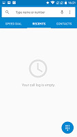
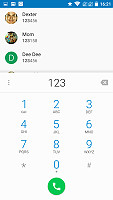
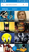
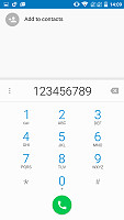
Launching the app brings you to the speed dial section, combined with a shot log of recent calls right above it. You can open the dialer at any time - it is readily available via a button at the bottom of the screen. You can also browse contacts without firing up the dedicated app from the third tab in the navigation bar.
You have three tabs to choose from - speed dial, recent calls, and you phonebook.
The in-call screen features solid color and sleek animation. Its layout is easy to read and operate.
Call quality on the ZTE Blade S6 is excellent. We had no trouble during testing and everything came out nice and clear. The noise cancelation system is also pulling its own weight ensuring pretty good background noise suppression.
The Blade S6 has quite an impressive speaker. Despite its small size and rather odd positioning it is quite loud and very clear. You shouldn't have any problems hearing it ring.
| Speakerphone test | Voice, dB | Ringing | Overall score | |
| 57.9 | 60.7 | 66.6 | Below Average | |
| 62 | 62.1 | 66.6 | Below Average | |
| 61.5 | 58.5 | 72.6 | Below Average | |
| 65.6 | 61.1 | 75.7 | Average | |
| 66.2 | 61.1 | 75.3 | Average | |
| 68.3 | 65.8 | 71.6 | Average | |
| 66.5 | 66.2 | 75.1 | Average | |
| 66.6 | 66.2 | 75.3 | Good | |
| 66.6 | 65.9 | 75.7 | Good | |
| 66.3 | 65.7 | 76.7 | Good | |
| 66.9 | 66.6 | 75.7 | Good |
Messaging and text input
You have two options to handle you texts out of the box - Google Hangouts and the stock messenger app. This is a relatively new feature for Hangouts which allows you to handle all messaging through a single app that is if you are an avid Hangouts user. ZTE has also included a more traditional messaging solution set by default.
We couldn't help but notice that unlike the rest of the GUI it was not executed in the flashy material design style. The app might have been lifted from a previous OS version, as it is HOLO through and through. This is not a bad thing, but it does stand out as a patch on the otherwise fluent user experience.
All SMS/MMS communication is organized into threads - each thread consists of all messages between you and one of your contacts. The application kindly allows you to attach different media files, automatically switching to MMS format to handle the delivery.
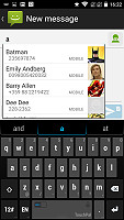
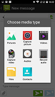
The messaging app has HOLO design
To handle emails the ZTE Blade S6 offers Gmail preloaded as well as a dedicated email app. This is kind of redundant, seeing how the latest version of Google's mail client can now work with any mail account, Google or not and is now the only email client you will need.
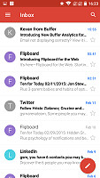
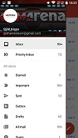
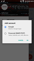

Gmail for Android now with more talents than ever
A button to start a new message sits at the top right bottom of the app. The composition screen holds no surprises.
The alternative ZTE email application looks and behaves extremely similar to the Gmail app. It does however lack one important feature - Google support - so we really don't see the point in the doppelganger.
As far as keyboards go, the Blade S6 comes preloaded with TouchPal. It is rather interesting and offers some advanced features like clipboard management and a wide array of emoji art and mood icons. If you are not into the whole emoticon thing there is also the stock Android keyboard available. It stretches nicely on the 5" display and allows for a really quick typing. You can enhance it even further by turning on the Gesture typing.
Reader comments
- harry
- 31 Aug 2016
- rA%
in zte blade s6 i faced a problem thai in this mobile only one sim slot use.not both..it is a very big problem for me.
- Robert L
- 07 Mar 2016
- ii1
Why do I get a notification that this app is not available in this country? When i live i Brisbane and the DoDo portal app and GasBuddy (Australia) only apply in Austra;ia.
- Toni
- 13 Jan 2016
- 0jU
I made 160 orders till now, i never had i problem.
