ZTE Nubia Z9 mini review: No small affair
No small affair
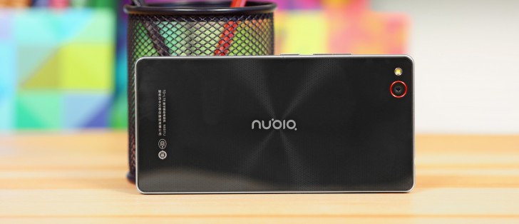
User interface with no traces on Material design
Just like the Nubia Z9, the ZTE Nubia Z9 mini runs an Android 5.0.2-based software that has been heavily retouched with the Nubia UI 3.0.8. If you have experience with phones aimed at the Chinese market you already have an idea what to expect - a colorful, app drawer-free experience. There are also some bad translations and odd, but many times in a good way, options.
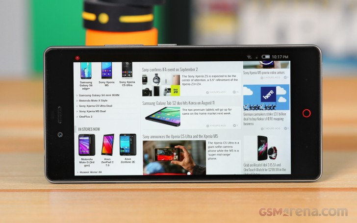
First, the elephant in the room. Our test unit came from HonorBuy and is intended for the Chinese market. Consequently Google is nowhere to be found on the handset as it is blocked on the vast Asian market. That means no Google Play Services, no Play Store, not even Gmail. Well, to be frank the latter can actually be added to the default email app, but other than that, using the Z9 mini you have to side-load most of the Android apps you might be accustomed to.
Of course, ZTE has included the Chinese alternatives for most mainstream apps in the ROM, but those are of little use outside the country. With root there are ways to enable Play Services, but this might be more than casual users can accomplish.
As already mentioned, ZTE's latest OS is in fact based on Android Lollipop and even more impressively, on a fairly recent 5.0.2 build. Nubia UI 3.0.8 is based on Google's latest platform and yet it has little to no visual resemblance to vanilla Android.
ZTE has adopted the new core for the sake of performance, stability and API, but it is still heavily customized and on the surface the OS has retained its signature look and feel.
What ZTE has done, in a nutshell, is move to Android Lollipop, without Google's new material design. The user interface has remained flat with almost no traces of Google's latest aesthetics. Fans will also be happy to know that the OS is still packed with various extras and additional functions, but more on that later.
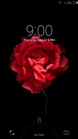
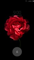
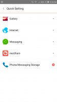
The lockscreen is standard - you get a dialer and camera shortcuts and can access the notification area. The dialer can actually be swapped for another app, but selection is limited. There is no squeeze to unlock, like in the Nubia Z9, but we don't really miss it, seeing how we couldn't get it to work properly on the Z9 anyway.
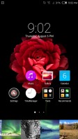
Like many other custom Android builds from China, Nubia UI doesn't have an app drawer. Everything is laid out on home panels instead. The homescreen deviates from Android standards. It has a special pane on the left, which is dedicated entirely to neoShare (a feature of the Weibo social network) and shortcuts to the various camera modes. The other homescreen panes hold widgets and shortcuts.
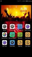
Dedicated neoShare and camera shortcuts panel
That's the launcher style popular in China, no app drawer, instead drop everything into the homescreen (think iOS, but with widgets here and there). Folders help organize the madness if you have too many apps and you can dock the 4 most used apps at the bottom row.
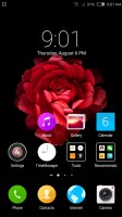
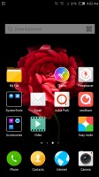
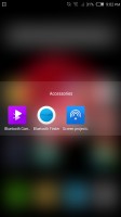
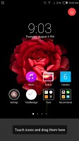
Standard launcher and folders to keep everything organized
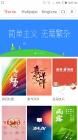
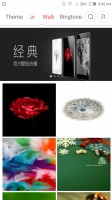
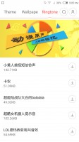
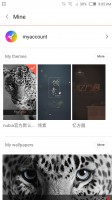
If you don't like the look, you can try out different themes. They change the wallpaper and icons, sounds too. Of course, you can also edit those one by one.
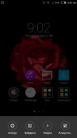
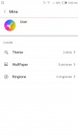
Changing themes, wallpapers and ringtones
ZTE has also developed an online portfolio of themes, wallpapers and ringtones. This is actually pretty common practice for Asian devices, as customization is a major selling point of smartphones. If none of the provided themes appeals to you, you can also edit every aspect or even create a new one from scratch.
The notification area combines notifications and quick toggles, plus a brightness slider. Only the top three quick toggles are visible at first, the rest are revealed with a second swipe. You can rearrange them so you can make the toggles you use most visible by default.
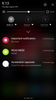
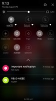
Pretty standard notification shade
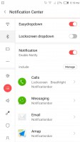
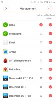
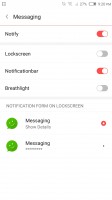
ZTE has implemented a pretty powerful Notification Center that gives you granular control over what apps get access to fire notifications. You can even define the types of notifications each application can generate - pretty thorough indeed.
The app switcher is launched by long pressing the Home key and shows cards with all running apps, their shortcut and name below them. There's also an X that will "Accelerate" your phone by closing running apps. The phone even calculates how much RAM the process with free. Our advice - don't do it. The mantra "free RAM is wasted RAM" applies here. There is also a whitelist for services that you want to be skipped during the clean. It is definitely convenient and the important things usually get detected and put here automatically.
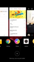
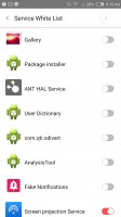
Task switcher with central "kill switch" and whitelist
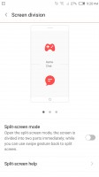
From the quick toggles you get to enable SplitScreen mode. If you guessed "run two apps at the same time" you get a cookie - the display is split in two (you can move the division line) and you can run one of several apps.
It's not the best multi-app implementation we've seen, in fact it has some rather irritating issues. For one, you can view the homescreen twice, dock and all, which just looks weird. Also, not all apps resize to fit their allotted portion of the screen, most remain a downscaled 16:9 version of themselves, which is often too tiny to use properly. The good news is that even third-party apps seem to work in this mode and some of them are smarter about resizing than the Nubia's native apps.
You can drag the division line all the way to the bottom, which will minimize that app to a small floating icon that can be used to reopen the app in its split-screen state.
An Easy mode is available that shows huge, easy to hit shortcuts, four on a screen plus two docked icons (phone and SMS). The selection of apps is limited to the bare essentials in this mode.
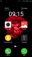
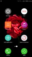
ZTE Nubia Z9 mini in easy mode
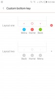
The ability to swap your back and menu buttons is definitely a nice little touch and can ease your transition to the Nubia from most other Android devices. For the moment these are the only two options available for customizing the capacitive navigation buttons, but the interface suggests that perhaps more will be added later. Further customization would be cool.
Accessibility and gestures
Since the ZTE Nubia Z9 mini lacks the edge to edge display of its bigger sibling it also lacks all the interesting gestures associated with it. Still, the phone is packed with interesting touch and motion controls, as well as a few accessibility features to ease the user.
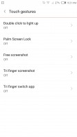
These are arranged into a total of five groups. First, there is double tapping the screen to unlock. It is a really handy feature that is finding its way on an increasing number of devices. There is also palm screen locking. You simply cover the screen with your hand and it locks. This works pretty well, but does tend to accidentally lock your device from time to time.
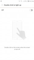
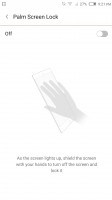
Double tap to unlock and cover to lock
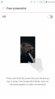
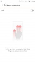
ZTE has also added a few extra twists to taking screenshots. If you hold the power key and volume up, instead of down as you would for a normal screenshot, you get a free selection interface in which only a fraction of the display can be selected and captured. Also, swiping up on the screen with three fingers is a quick way to capture a screen.
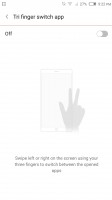
And if you long for the nifty app switching of the Z9, the mini has an alternative for you. Simply swipe left or right with three fingers. It is actually quite convenient.
As of other available gestures - you can mute the device by simply flipping it around and also clear all your notifications with a little shake.
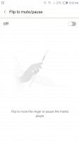
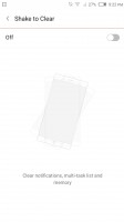
Flip to mute and shake to clear
As far as accessibility goes, the ZTE Nubia Z9 mini is fairly well equipped with fine tuning such as color correction and inversion, font scaling and even captions.
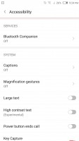
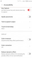
Extensive Accessibility options
A word of warning - the ZTE Nubia Z9 mini software in its current state was really not meant for the western market. Most of the software has an English translation but oftentimes it's of Google Translate quality. It ranges from odd phrasing to downright incomprehensible. And that's if you're lucky enough to get a translation - the app store, for example, doesn't have a Latin letter in sight.
That's not the end of it. A lot of the apps that are on the phone are China-specific. At best they are not familiar to a western audience, at worst they just plain don't work, like the map app.
ZTE has officially announced that it will be bringing the Nubia Z9 to the US and hopefully the Z9 mini as well. This means that a more English-friendly version is on its way (should land in Q3). We don't yet know if it will feature the Google Play package or not, but if it does (as it should) it will address many of our complaints.
Reader comments
- Anonymous
- 09 Nov 2020
- Nu6
How do I have a complete screen of Nubia z 9 mini in nigeria
- Anonymous
- 22 Jul 2017
- 7A$
yes , you are 100% right. i have ZTE GRAND SII mobile. the phone is restarted. i went to the same service center in arumbakkam. they told that display issue and they tell as the display and repair charge is cost as 4000. i am not given the mobile fo...
- maya
- 15 May 2017
- ijh
Good Article. My vote is 4 Doogee Mix because of Super Small design Looks very Beautiful And Doogee Mix Price is Much better than Xiaomi Mix Also 4Gb And a 6Gb ram version Available . so better I buy Doogee Mix I am Super Excited to buy it.
