Google Contacts 2.0 comes with cleaner and smarter looks
Ivan, 14 May 2017
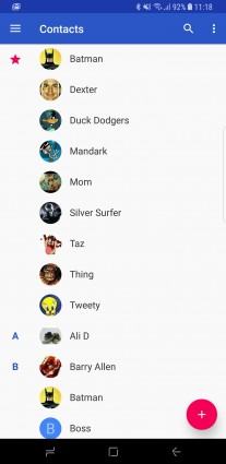
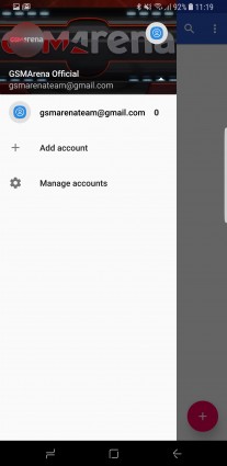
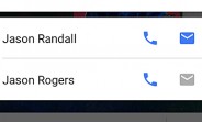
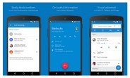
Google has redesigned its Contacts app to version 2.0. The new version brings a cleaner interface and has incorporated the account switcher in a much better way.
Now there's a slide-out menu with an account switch button like on other Google apps (think Drive or Gmail).
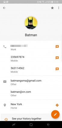
The contact page has also seen a redesign. Previously the contact picture took up half of the screen with all of the contact info crammed below - now the picture is a much smaller circle and you get much more at-a-glance.
Finally and quite naturally Contacts 2.0 supports the new Android O notification channels.
You can find the APK for sideload here.
Related
Reader comments
- Heretic
- 15 May 2017
- LxN
Then why use a samsung phone?
- r
- 15 May 2017
- XMB
ok
- Batman
- 15 May 2017
- n9w
That's not my number, don't call me.


 Samsung
 OnePlus
 Motorola
 Xiaomi
 Samsung