Google Maps redesign focuses on points of interest
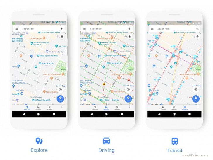
Google has announced a slight redesign for its Maps service today. It's not the 'chrome' around the actual maps that has a new look this time around, but the maps themselves. The driving, navigation, transit and explore maps now better highlight the most relevant information for each experience: things such as gas stations when you're in navigation mode, or train stations for transit.
Points of interest are now color-coded, which means it will be much easier to spot them on the map. Each specific type of place has a designated color and icon, so that it's possible to find with just a glance. If you access the Source linked below you can see a cheat sheet of the new colors and icons to help you know what to expect.
The changes will be rolling out to all Google products that incorporate Maps "over the next few weeks". This includes Google Maps on the web and the Maps apps of course, but also Google Assistant, Search, Earth, and Android Auto. In time, the new style will be seen in the apps and websites that use the Google Maps API too.
Related


Reader comments
- 1ns0mniac
- 17 Nov 2017
- Q{R
On my Galaxy S7, I downloaded the maps of "Here" on the SD card. It was taking about 2 seconds to launch the app. So, I cleared the app data & downloaded it again on phone memory. Now it is much faster to load. But still I can't stand the UI &...
- Anonymous
- 16 Nov 2017
- nIA
For off line navigation I keep returning to OSMAND PLUS. Crowd sourced, a lot of the time I find it better than Google and far better than here wego. I have to use hwg occasionally because unfortunately it is the map fired in my car.
- AnonD-425519
- 16 Nov 2017
- Y7F
Here maps! I forgot about that one. Or better yet, Here WeGo LOL. Bad name. Here Maps was a great name. I used to use it all the time but I couldn't stand how "laggy" the map is and how ugly it is. I also didn't like how icons would show up on the...


 Samsung
 Xiaomi
 Apple
Apple Samsung
 Apple
Apple