Nothing Phone (2a) review
Design, build quality, handling
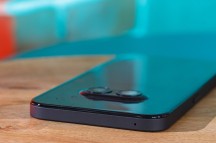
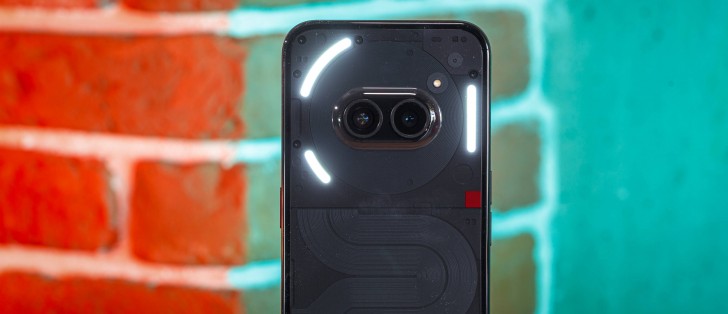
The Nothing Phone (2a) is quite the looker. Horizontal camera arrangements are no longer common in the industry, but here is Nothing. It is basically resurrecting one of its early design concepts and making it into an actual product.
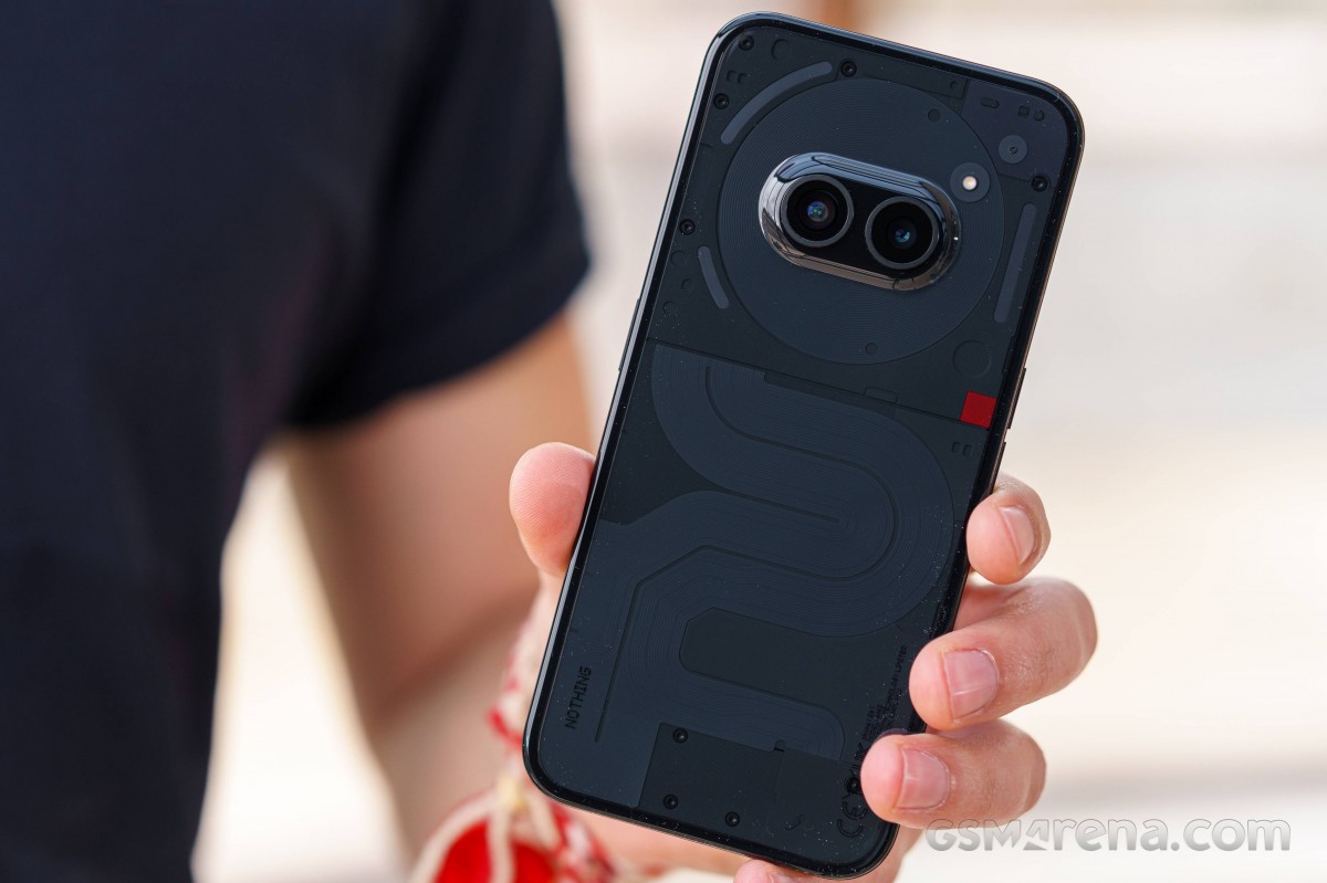
Of course, the main visual attraction of the Nothing Phone (2a) is undoubtedly its backside. The two camera sensors are neatly horizontally aligned and are nicely segmented away from the rest of the design by the circular coil of what is said to be the NFC antenna. Mind you, we can't exactly say how much of the "electronics" that show through the back of the phone are actually real functional parts or are just there for show and aesthetics.
Anyway, the back of the Nothing Phone (2a) is see-through, which has become sort of a signature touch for Nothing. Unfortunately, Nothing doesn't outright say what the rear panel is made of. It just calls it a "90-degree infinity back cover" and says that a special "dual compression and injection" process is used in its construction to achieve a 2.2:0.8 thickness ratio from the thickest to the thinnest part of the surface.
As per the reset of the marketing materials, this new curved panel design not only lives up to the "iconic" transparent look but does so "whilst enforcing the structural rigidity and overall durability of the phone".
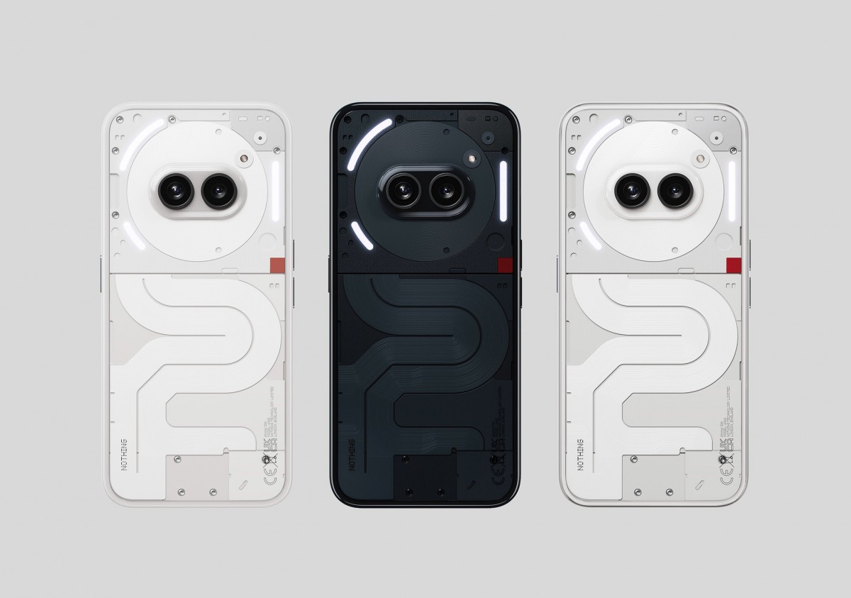
You can choose between three colors for the back side of the Nothing Phone (2a) - Black, like our review unit, White and also "Milk", which is a slightly different "white" inching on grey. There might be some regional limitations when it comes to color options, though.
In practical terms, we can say that the back panel looks and feels a bit plasticky to us, but not in a bad way. We like the slightly grippier feel that it offers. What we don't appreciate, however, are all of the fingerprints that it gathers as well as dust. Lots and lots of dust. For some reason, this surface gets incredibly electrostatically charged and will always inevitably be dusty unless you cover it up with a case.
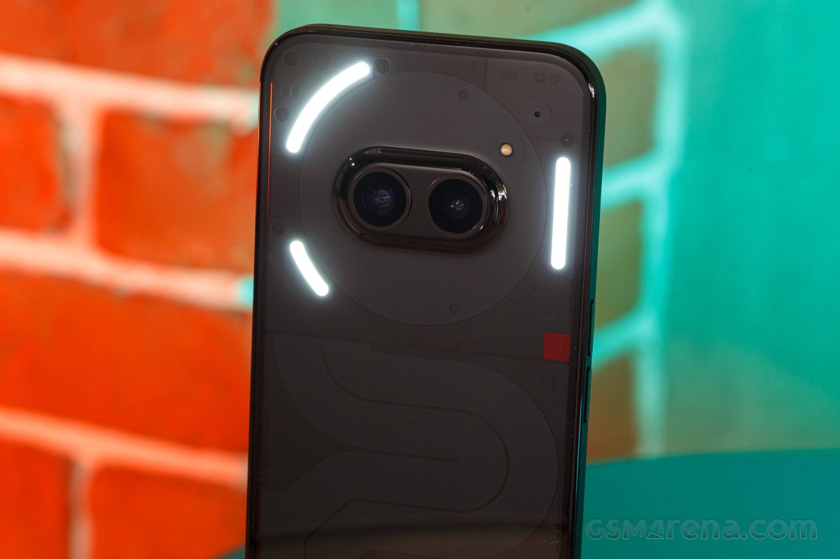
But what a shame that would be since you will also be covering up the signature Glyph interface. It consists of three light strips, all flanking the rear camera. There are a total of 26 individually addressable zones within the Glyph Interface, which enables all sorts of functionality, such as Glyph Timer and Glyph Progress. The latter is pretty cool since it allows you to track the progress of certain third-party apps like delivery or ride-sharing services.
Of course, you can also use the Glyph lights for notifications. The lights are also big enough to be useful as a soft "ring light" of sorts for the rear camera. You can also use the lights as a countdown indicator for the camera timer. Things like volume and battery percentage can also be visualized. Nothing markets the Glyph Interface as an innovative way to interact with the phone instead of just an aesthetic feature with 15 advertised functions.
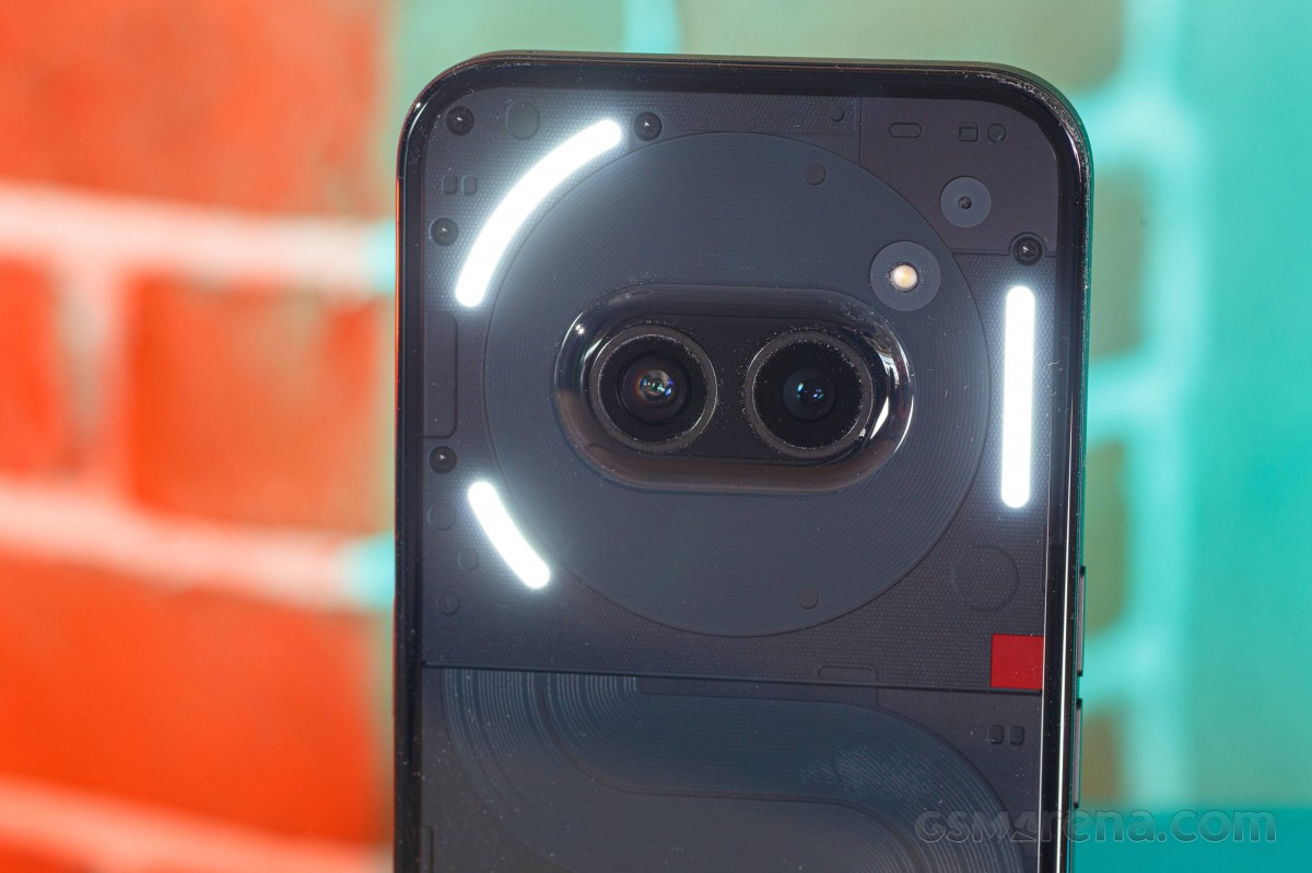
Speaking of the Glyph Interface, it is worth noting that while both the Nothing Phone (1) and Nothing Phone (2) have a blinking red light on the back in addition to the Glyph Interface to indicate video capture, it is absent from the Nothing Phone (2a). That red square on the back side is just part of the design.
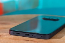
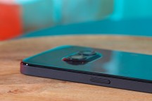
The rest of the Nothing Phone (2a) design is pretty unassuming. You get a nice rounded frame, which is probably plastic, judging from the look and feel and the lack of antenna lines. It has a nice matte finish.
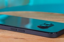
The buttons are well laid out and comfortable to use. But it is worth noting that this is one of those phones that have the volume rockers on the left and the power button on the right separated.
The front of the Nothing Phone (2a) is a flat piece of Gorilla Glass 5. It also comes with a pre-applied thin screen protector, which is a nice little touch. It is made of plastic, though, so you might want to swap it out for a nicer glass protector if you are into that sort of thing. Speaking of protection, the Nothing Phone (2a) has an IP54 ingress rating, just like the Nothing Phone (2). Nothing too fancy, but it's still better than no rating.
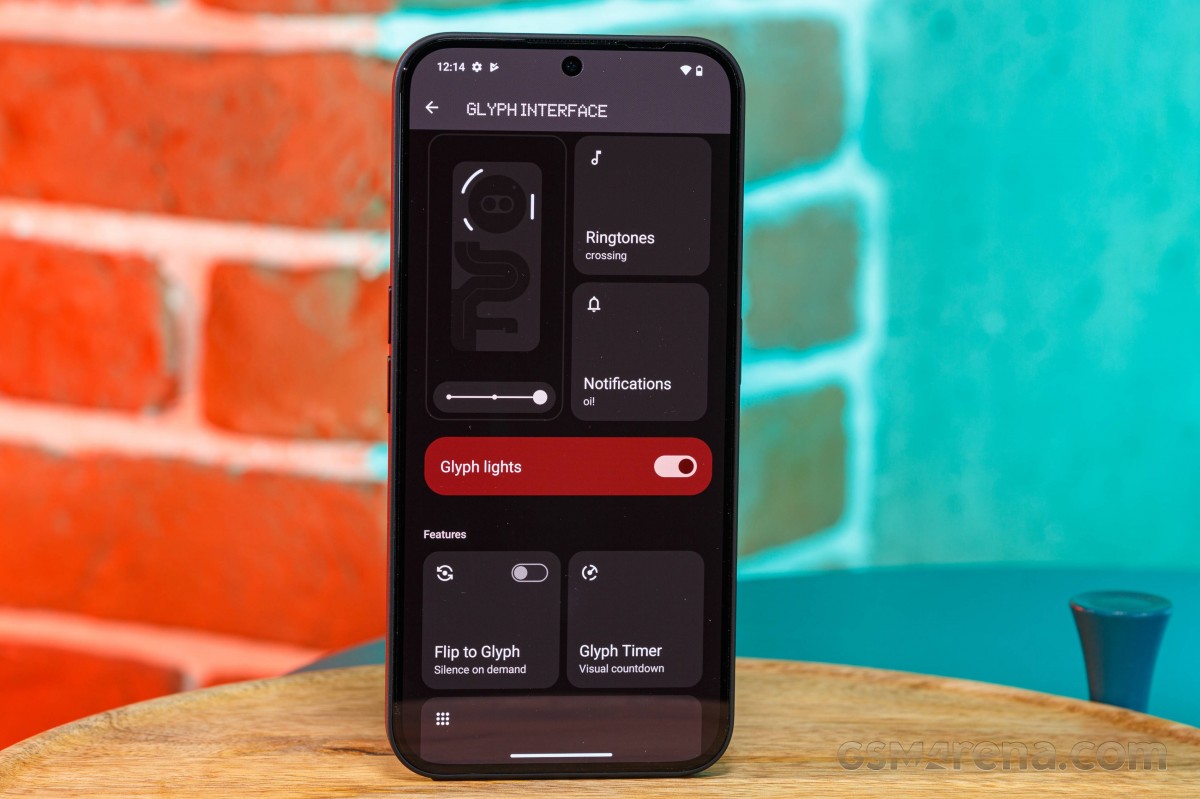
The bezels around the display are quite sizeable. So much so that, in fact, there was enough room to fit the proximity and light sensors above the display alongside the earpiece. In many modern phones, these sensors tend to be tucked away underneath the actual panel. Still, we don't think the Nothing Phone (2a) looks cheap or retro or anything of the sort. The bezels are symmetrical, which does give off a nice vibe.
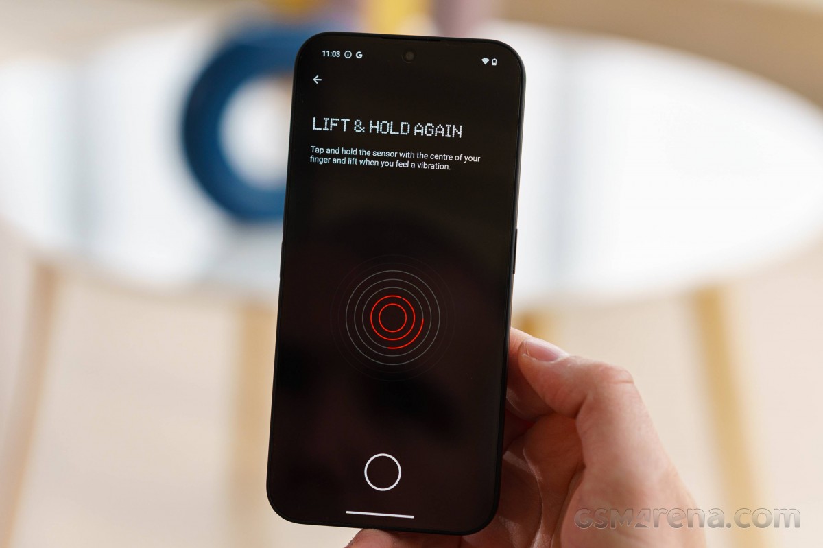
There is an under-display optical fingerprint reader on the Nothing Phone (2a). It is both snappy and reliable. We have no complaints about it.
Finally, a few words on handling. As we mentioned, the rear surface on the Nothing Phone (2a) offers a surprising amount of friction and grip. Its sides are nice and rounded for a comfortable in-hand feel. Some might find the volume controls to be a bit too low on the frame, but that will be highly subjective and not a major deal in our book.
Besides that, despite having a bit of hollowness to the back, the phone itself feels solid, with pretty much no flex in the chassis. Despite packing a pretty large 6.7-inch display and a larger 5,000 mAh battery, it also manages to be notably lighter than the Nothing Phone (2).
Reader comments
- ulv
- 27 Oct 2024
- pRa
GSM, you have very fluctuating battery scores. Here 2a scores 46 hours for calling, but I also saw 56 hrs when I added it to compare on the page of other phones. I think threfore, that no score is to be trusted anymore.
- Anonymous
- 16 Oct 2024
- nwn
Does this phone have a long exposure mode, not being in the pro section? Like the Huawei, Xiaomi e new One plus phones?
- Neptun
- 10 Sep 2024
- rJU
What did you decide?
