A sneak peak at Symbian's new homescreen
During a recent Nokia event in China a sneak look at what appears to be a revamped Symbian was leaked. It looks like a Nokia N8 with a different homescreen layout.
You can see a dedicated status bar, which is different than the current one on Symbian^3. It looks stationary and will probably stay on the screen in most occasions. Also the bottom of the homescreen is changed.
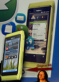
The Nokia N8 with different homescreen
The widgets on the screen look similar to the current ones that the N8 uses. This makes us believe this is a version of Symbian. But no information about a new design for Symbian has been out in a while.
We'll keep you guys posted in case new information surfaces.
SourceReader comments
- Suhanoo
- 23 Apr 2011
- vFH
Dear Mark, you are saying this because you are too jealous of Symbian. I bet your OS cannot do the following: 1. Multitasking (unless you use Honeycomb), bet you are not using Android 3. 2. Change your menu looks into folder or flat-menu (Except ...
- gdx
- 06 Apr 2011
- 9BC
symbian is better than android or anything for xpert user, android is better in look, but overall symbian is better
- mark
- 28 Feb 2011
- 3J7
does'nt matter how much you dress it up. its old and naff. symbian is dead just like windows 98. had its day. good job nokia woke up and went down the windows 7 route shame its 5 years too late.


 Samsung
 Xiaomi
 OnePlus
 Xiaomi
 Samsung