Acer Stream review: White water rafting
White water rafting
Acer’s custom job
The thoroughly customized user interface is what we like most about the Acer Stream. But you don’t have to agree – Acer have done well to give users a choice. You can opt between Acer UI and Android UI. Switching to and from any of the two available interface styles requires a reboot.


Welcome to the Acer Touch 3D UI v4.0
The Acer Stream runs Android 2.1 E'clair and if you choose to work with the standard Android UI there will be no surprises. There are five homescreen panes to populate with shortcuts, widgets and folders. Task management and notifications are the usual good Android stuff.
Basically, the differences to other Eclair-powered phones are minor. The only thing to note is perhaps some of the Acer home-made widgets. We like the Media player and the Web player for instance.
Now, if you decide to give the Acer UI a try prepare for a whole new experience. And just so you know – we liked it for the most part. Knowledge of the standard Android OS will help you find your way around the Touch 3D UI v4.0 of course. But it’ll take a while for you to start feeling at home. Everything has been rearranged: Lockscreen, main menu and the Notification bar.
Here's our demo video that will give you a primer on the UI:
The homescreen
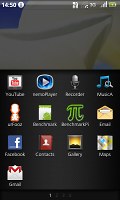
The first thing you’ll notice on the homescreen is the list of shortcuts placed at the bottom of the screen. Acer call it an Application dock and we find it quite a smart solution. Pulling up the Application Dock is the only way to display the customized launcher – the Acer Stream’s main menu. Below the Application dock you’ll find three side-scrollable screens with application icons.
Icons can be dragged between the Application Dock and the actual launcher. In effect you can have a mini launcher visible on the homescreen at all times. The Application Dock can store up to eight icons to frequently used features. You can choose to have no icons on the Application dock – drag them all back down to the main menu.
This isn’t something we would do though. All you get is a neater homescreen but you can’t use the blank space, which is pointless. And by the way, getting rid of the Application Dock will also affect how you work with the notifications.
The notification bar is right above the Application dock – that’s the middle of the screen, not top as you might expect. Otherwise, it’s the usual thin strip with indicators for signal strength, battery status, missed calls, etc. There is also a small clock.
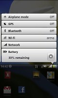
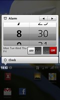
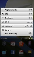
Tapping on it will display the notification area with info about recently installed applications, missed events, time and date as well as switches for turning on or off the Airplane mode, GPS receiver, Bluetooth or Wi-Fi, etc. This is also one of the ways to get to the alarm clock.
The upper half of the homescreen displays a large clock with the date right underneath. This part of the screen is side scrollable: a swipe to the right will display the recently used apps. The so called Application history is a stack of thumbs of applications. A swipe to the left will take you to the Media panel. It hosts your images, songs and videos which are displayed as Cover-Flow-like thumbs.
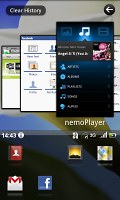


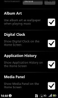
Application history • Media panel
You can set both the Application history and the Media panel to show or hide depending on your personal preferences. The same goes for the large clock on the homescreen, too.
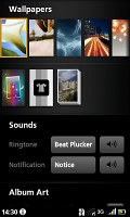
While listening to music, you can make the current song’s album art replace the wallpaper on your homescreen. Sadly, you can’t use it to get back to the minimized music player. However, you can always swipe to the right and go to the Application History where you’ll find the music player among the other recently used apps.
And where have all the widgets gone?
The Widgets
Surprisingly, those are not quite where you’d expect them to be. The Acer Stream’s lockscreen serves as an extended homescreen to fill with widgets. And it’s widgets only – no shortcuts or folders.
The lockscreen consists of five panes ready to accommodate a large number of status widgets or mini apps. When the phone is locked the controls are not working but the screen can be scrolled and the widgets can actually be pressed. It all makes sense – and there’s little to no chance to get the phone accidentally unlocked in your pocket or bag.
To begin with, tapping on a widget won’t launch the respective app – you’ll only see a pop-up prompting you to unlock the phone by an upward slide. It’s pretty safe. Status widgets like weather or My Location have tiny update buttons. You can update the widget and get the latest status without unlocking the phone. Music player widgets have equally tiny play, pause and skip knobs – the nemoPlayer even has volume controls. You can listen to music without unlocking the phone.


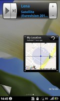
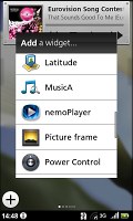
The widget panes of the lock screen
To customize the five panes of the Lockscreen you need to press and hold the Home key. The lockscreen is then accessible in edit mode, with an Add Widget button on each of the panes. This is one of the major differences between the Acer UI and the standard Android interface.
Pressing and holding the Home key will not bring the regular task switcher on if you’re using the Touch 3D interface. But you don’t need this – you have the application history a swipe away on the Homescreen at all times.
To sum it up, the user interface seems quite different at first but after a few days with the phone you’ll get to appreciate the Acer Touch 3D UI v4.0 for not only being colorful but pretty user-friendly as well.
The Clash of the Titans
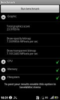
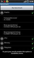
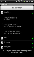
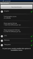
Finally, we ran the usual benchmarks on the Acer Stream and weren’t really surprised to see it get some pretty impressive scores. It’s close enough to some of the most powerful smartphones on the market such as the Samsung I9000 Galaxy S, the HTC Desire and the Sony Ericsson XPERIA X10.
Reader comments
- Anonymous
- 25 Aug 2010
- uEx
very true indeed. oh yeah, and repair that audio processor, FAST!!!
- thecalmcritic
- 04 Aug 2010
- tV3
Even if they're new at this game,let's look at the "Main disadvantages" again:- ~ Dim display with poor sunlight legibility ~ Camera lacks flash and a lens cover ~ Generally poor camera output ~ No web Flash support ~ microSD card not hot...


