Alcatel 3, 3L, 1s hands-on review
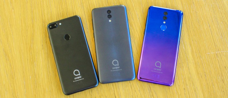
As has pretty much become tradition TCL dropped a slew of new alcatel devices at its MWC event. Confusing naming scheme, affordable price tags and sensible modest specs sheets all accounted for. That being said, this year's announcements were arguably a bit more exciting. And not just because of the flexible display demos also teased by TCL. Even purely in the realm of alcatel things are looking a bit more dynamic this year.
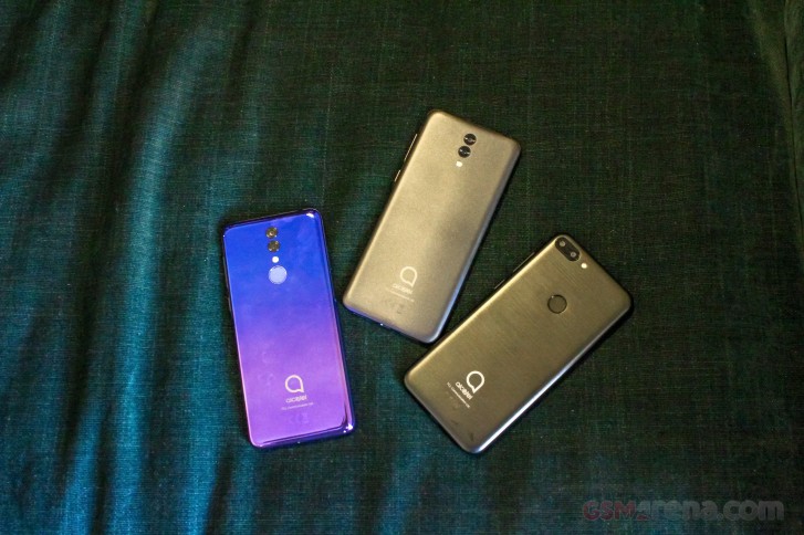
In case you want more details on the trio of news smartphones, as well as some specs, you can check our the announcement news. There's a rather interesting 3T tablet device and speaker dock in there as well.
alcatel 3 and 3L hands-on
We start from these two in a pair, since they are incredibly similar in most every aspect. In fact, so much so that we are still kind of pondering TCL's decision to differentiate them as separate devices in the first place. Given the company's track record and current business model of mostly customizing phones for carrier per request. Especially in the low end. The difference between the vanilla alcatel 3 (not to be confused with last year's version) and the 3L could easily get diluted.
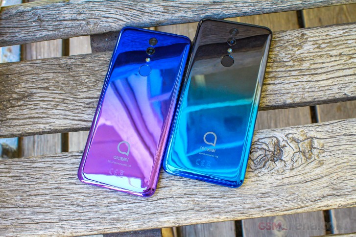
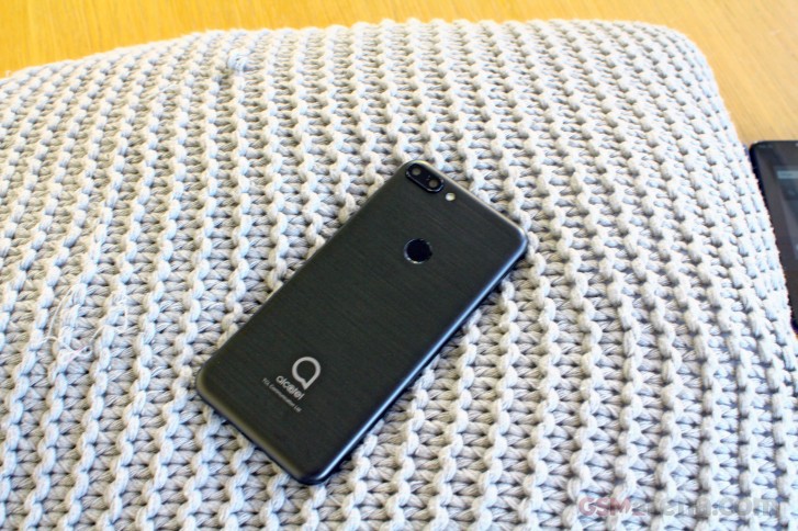
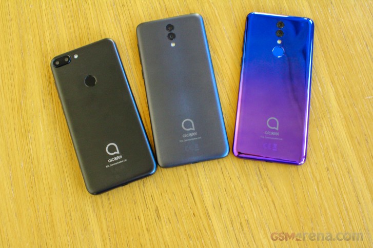
Aside from internals, which are obviously the easiest bit to change, the main difference between the higher-end alcatel 3 and the 3L seems to be the finish on the body. And, to be fair, we kind of get the justification. Both gradient options (blue-purple and black-blue) look really nice in person. As far as we managed to gather, TCL isn't really doing anything too fancy to achieve to look. NCVM, or non-conductive evaporation coating is fairly common and not necessarily expensive. But just because it's cheap doesn’t mean it looks the part. On the contrary, we were really pleasantly impressed by alcatel's gradient work.
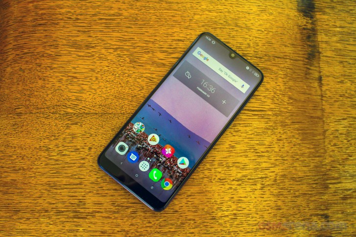
If we had to describe the rest of the in-hand feel of the alcatel 3, light instantly springs to mind. Surprisingly so. But all the while not hollow or bendy. Rather the reassuring, nice kind of light, if that makes any sense at all. At 151.1 x 69.7 x 7.99 mm, 149 grams feel pretty well distributed.
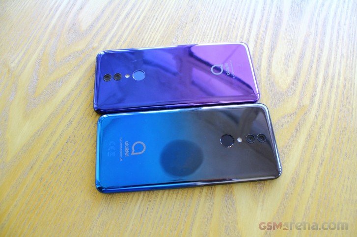
Finishing off the general hardware tour, we found absolutely no issue with the control layout. Buttons feel nice and "clicky" and are well positioned. The fingerprint reader is also convenient to reach and pretty snappy and reliable.
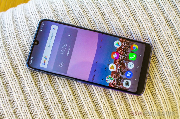
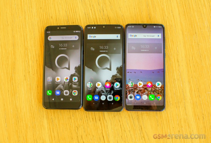
As for the 5.94-inch display - it looks very modernised, especially compared to previous budget alcatel models. The 19.5:9 aspect ration definitely helps. While we are not really proponents of notches in any shape or form, we have to admit this approach is fairly non-obtrusive. Plus, we appreciate the distribution of space above and below the screen - the forehead is almost gone, while the chin is still fairly wide, but that still works better ergonomically compared to reaching all the way down for a navigation bar.
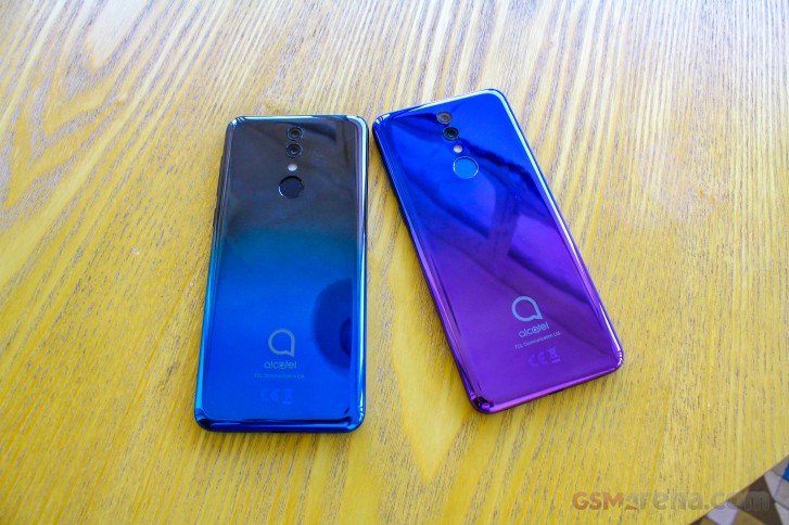
TCL also surprised us pleasantly with a a nice IPS panel. Naturally, we'll reserve judgement on its performance for the full review, but it did look quite bright on the show floor. Also, perfectly sharp, despite its HD+ native resolution. No instantly noticeable color shift either. It's a perfectly usable and adequate display experience.
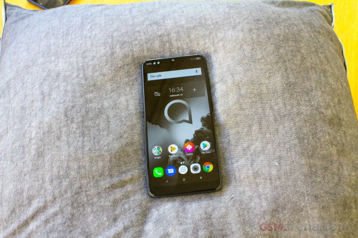
And that seems to be the running theme and really what LCT was going for with the alcatel 3/3L - give the overage user something decent to use at an affordable price point. They even mention it themselves as a cornerstone in marketing philosophy even now that the company is experimenting with more high-end things, like foldable displays on the side.
But, before we get to sensible internals and performance, it is worth circling back and making a few points about the finish on the alcatel 3L. Like we already mentioned, physically it is practically the same device. The only real difference in appearance coming down to a simpler more "metallic" finish. That, of course, is PR talk. Both devices are still very much made of plastic in a three-piece design (frame, back and front). Although the front is covered with a 2.5D protective glass, courtesy of Asahi Glass Co. - a Corning competitor. Not sure how these compare, but the extra piece of mind is definitely appreciated regardless.
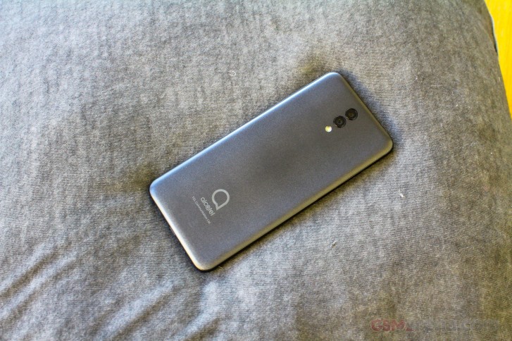
Thile definitely less eye-catching, the finish on the alcatel 3L does appear to resist smudges and fingerprint that little bit better. The other major downgrade in the alcatel 3L is the chipset. Quad-core Snapdragon 429, instead of the octa-core Snapdragon 439. Unfortunately it's kind of hard to say just how much of a difference that will make in real-world use.
At least our quick glance at the options of both devices showed more or less feature parity despite a difference in raw performance. We particularly enjoyed seeing the same camera hardware and capabilities retained despite the price slash.
Both phones have a 13MP + 5MP main setup and can do dynamic bokeh, as well as post-shot re-focus. AI imaging scene, also found on both phones, recognises up to 21 different scenes and optimises the camera settings accordingly. There is also Google Lens integration and AR emojis baked into the camera app.
Speaking of software, it might be worth noting that both the alcatel 3 and 3L will ship with an Android 8.1 Oreo ROM out of the box. An Android Pie update should be coming shortly.
alcatel 1s hands-on
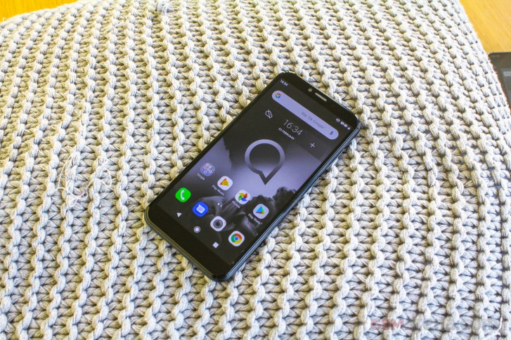
A quick look at the alcatel 1s is a pretty accurate gage of just how far budget phones have really come. Not necessarily in RAW performance, but it used to be practically impossible to get an eight core chipset at this price point not that long ago. Not that we are necessarily praising the Spreadtrum SC9863, but in a broader sense, the upward progression is definitely worth noting.
The same can said about display tech. No only is the panel on the alcatel 1s a decently sized, 5.5-inch one, but its also sports a trendy tall 18:9 aspect ratio. Probably best of all though and definitely most surprising - it's an IPS unit. Colors looks good, so does brightness and contrast. The only thing really missing here seems to be a layer of display protection. At least one isn't officially listed.
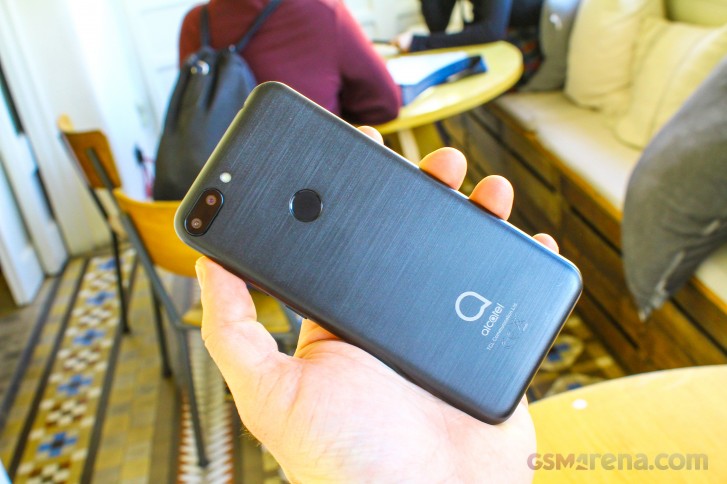
The 147.8 x 70.7 x 8.6 mm , 146 gram plastic body on the alcatel 1s feels pretty confident in the hand. It's a snug fit. At least relatively, when compared to the super tall phones nowadays. All the controls are well laid out, including the rear-mounted fingerprint reader. The latter seems to perform just as well as the one on the alcatel 3/3L. However, as is typical with most alcatel devices, the 1s might end up without said reader in particular regions or carrier versions. Another potential detail to keep in mind is the planned existence of a single SIM ans well as a dual SIM version. Both, surprisingly, featuring a microSD slot, so no hybrid setups here.
The camera setup on the 1s is surprisingly potent, at least as far as features are concerned. Even with its fairly modest 2MP secondary camera, the phone can do real-time bokeh. AI scene detection is also present and accounted for.
Last, but not least, unlike its alcatel 3 and 3L siblings the alcatel 1s does come with Android 9 Pie out of the box. Since the latter is better optimised for lower-end hardware courtesy of Google, having it couldn't hurt. Plus, it seems to add in an extra facial recognition unlock feature, TCL is calling Face Key, which we didn't find any mention of on the other two alcatel phones. Perhaps they can expect it as part of the Pie OTA.
Related
Reader comments
- Saintheykins
- 08 Apr 2021
- Nue
Where can I get it I love it
- jaf
- 12 Sep 2019
- UD%
The whole hands-on is very very confusing.
- HYPR
- 10 Sep 2019
- 7Mw
Confusing? The 1s will never beat any of the 3's because it had a very weak and cheap CPU / SOC. What are you talking about??




 Samsung
 Sony
Sony Samsung
 Samsung
 Xiaomi

