Android 10 Q beta review
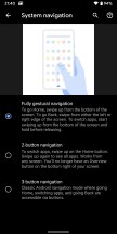
New gesture navigation
One of the biggest new features packed into the latest Android Q beta is the revamped navigation system. Last year with Pie, Google introduced its first take, which could really only be described as a half-baked attempt, at best. Gesture navigation is anything but new in the mobile world. Many Android device makers have already been shipping their own interpretations in the past couple of years, following Apple's lead. But one of the main benefits of using gestures over navigation buttons is the added usable screen real estate. Except Google's version in Pie didn't actually get rid of the navigation bar, which makes that point moot.
Better luck this time? Well, it's complicated. The new system, called "Fully gestural navigation" in Settings, is an improvement, although it's still far from fully baked. Then again, this is a beta OS release we're testing, so there's still time for its issues to be fixed.
Here's what you get: swipe up from the bottom to go home, swipe up and pause to get the multitasking menu. If you want to reach the app drawer, swipe up again after you've paused. In the Recents view the Google search bar shows up at the bottom with five suggested apps under it, if you move this panel up you'll get the full drawer. To go back at any point, you swipe from either the left or right edge of the screen.
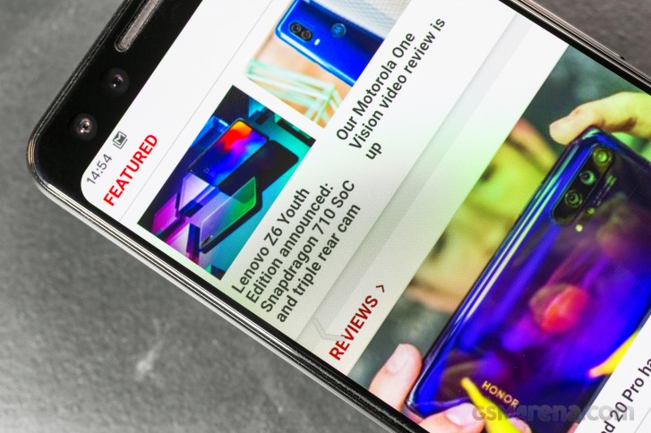
To quickly switch between apps, either swipe up then right (or left), or simply swipe right or left on the line that shows up at the bottom of the screen at all times once you enable the new gesture navigation system.
Here's the (perhaps rather obvious) problem: right now if you enable this system, you will no longer be able to swipe from the left edge of the screen to bring to front an app's hamburger menu-enabled navigation drawer. You can still tap on the hamburger itself, of course, but since most people are right handed and that is in the hardest-to-reach place on a screen for someone holding and operating a phone with the right hand, that's not ideal.
It gets worse: Google's plan for fixing this is letting app developers set 'exclusion zones' for the new system, for areas in which the app's own navigation might conflict with the Back gesture. So if an app has a slide-out navigation drawer, its developer can override the Back gesture on the left side (where the drawer resides) or just parts of it. RIP consistency, then - not that Android's 'Back' action has ever been consistent, but still. Think about it: different apps may choose different behaviors, so the same gesture would yield different results - which aren't obvious from the get-go. You'll basically have to swipe and see what happens. Hope for the best.
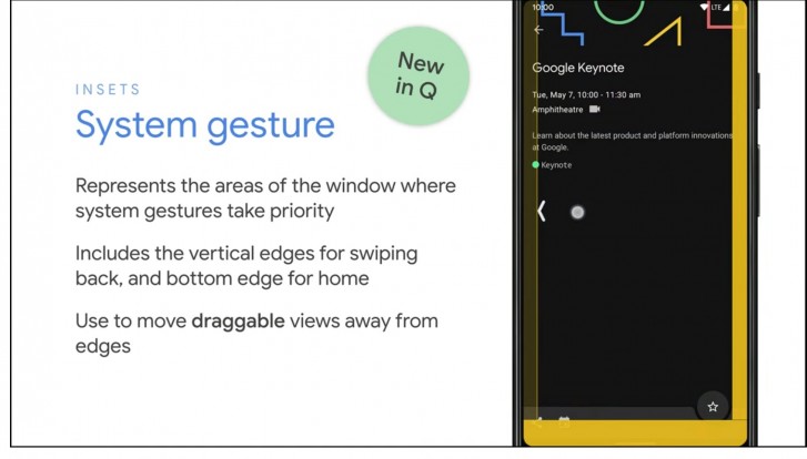
Don't get us wrong, we're big fans of the new Back gesture. Since this is probably the most used action when navigating the OS, being able to swipe from anywhere on the right or left edge of the screen inwards to trigger it is a godsend, and leads to a drastic reduction in finger gymnastics compared to other gesture systems that use swiping from the bottom to go back, for example. But this creates a problem given the existence of app navigation drawers - and it was Google that popularized those in the first place, many years ago.
So why not ape Xiaomi's gesture navigation system completely, and trigger the Back action only when the swipe originates in the lower two thirds of the left edge of the screen, leaving the top third to trigger the opening of the navigation drawer? Intuitively this makes as much sense as anything could when we're talking about gesture navigation since the hamburger icon is in the top part of an app's UI anyway. Or, if for some reason this isn't good enough, why didn't Google just restrict the Back action to swipes from the right edge, system-wide?
We don't know, and all we can do is hope that this gets fixed before Android Q is released to the general public. A smaller nitpick we have is that while the huge navigation bar of old is indeed gone, there's still a tiny version of it, with a big pill/line-shaped element in the middle, sitting pretty at the bottom of the screen. This reminds us of Apple's similar UI cue to get people to realize they're supposed to use gestures, but we're not convinced anyone has ever seen that and went "oh, yeah, I totally need to swipe from there to go somewhere". Not to mention that Back isn't a gesture that's initiated from that space.
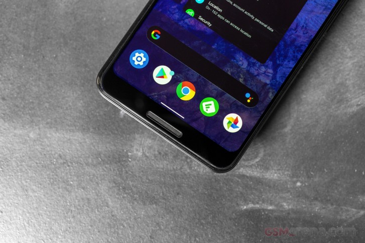
Moving on, if you're on a home screen swiping up from the bottom will bring up the app drawer, but if you pause you get the multitasking menu. That's fine in theory, but the animations here need some work, it just looks janky when the horizontally scrolling Recents list takes over from the vertically scrolling app drawer.


The transition between the app drawer and Recents is wonky
If you're wondering how you can quickly bring up Google Assistant since there's no more Home key to long press, you can swipe diagonally from the bottom left or right corner and it will show up. Like a lot of other things about such a gesture navigation system, this has zero discoverability, so it's good that on six out of eight Pixel models there's also the option of squeezing the frame to accomplish the same thing.
Interestingly, after last year's Pixels came with only the gesture navigation system and no three-button navigation option, in this Android Q beta you have three options for how to go about the UI: the new gestures, the old gestures (why?), as well as the fixed navigation bar with Home, Back, and Recents buttons. If that sounds more messy than choice-y, it is. Let's hope it will become less so by the time Q has a name.
Notifications
The running joke that it can't be a new Android version without a change in notifications still holds true in 2019. Google has once again tinkered with notifications, and while it hasn't done so as much as in some previous versions, the changes are still pretty significant.
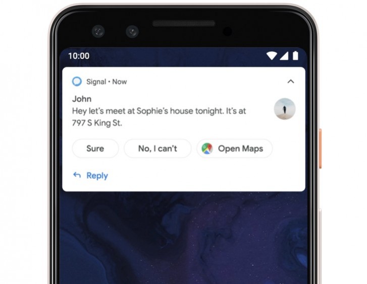
First off, Smart Reply is now built into the notification system, and as such it will work for any messaging app you have installed. What's more, it does its magic of suggesting a reply for you in the app's notification without requiring an Internet connection - it's all powered by on-device machine learning. Oh, and Smart Reply now also suggests actions you may want to take based on the contents of a message, not just replies - so if you receive an address, you'll get a suggestion for viewing that in Maps. Tap the suggestion in the notification, and you're instantly shown it in Maps - without the need to tap the notification first to get to the messaging app and then tap the address. The amount of time this will save you can quickly add up.
When you swipe left on a notification you get a new menu that lets you select whether that app's specific notification channel that triggered that notification serves you interruptive or gentle notifications. The former will make a sound and show in the notification drawer, status bar, and on the lock screen, while the latter are silent and appear only in the shade. You can also invert the swiping direction - to trigger the notification menu when you swipe right instead of left, in which case swiping left will dismiss a notification.
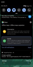
Notifications can be Interruptive or Gentle
You can change whether notifications from an app are interruptive or gentle on a per-channel basis, but this new setting means snoozing notifications is no longer possible. A new "Notification assistant" will by default automatically prioritize notifications for you, so manual adjustments will only be needed where it goes wrong.
Google packs its own Notification Assistant in Q, but since the menu in Settings looks strikingly similar to the one that lets you pick which Autofill service to use, we're guessing Google may have intended to let third-party developers come up with their own versions. However, for now, it's removed the associated API so we'll have to see if support for that comes back in later betas or not. It wouldn't be shocking if Google has had second thoughts about letting third-party apps have this much control over your notifications.
The notification assistant can read all notifications, including personal info such as contact names and the contents of the messages you receive. It is also able to modify or dismiss notifications or trigger any action buttons they may contain, as well as turn Do Not Disturb mode on or off and modify its settings. If Google doesn't change its mind again and its own Notification Assistant will be your only choice in Q, we're hoping it changes its Settings menu, as right now it looks like it was designed to be able to house more than one option.
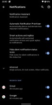
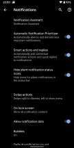
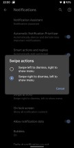
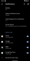

The new Notifications menu in Settings
Note: the "Bubbles" option that you may have spotted in the screenshots above is a new feature, but Google has already announced that it's not intended for mainstream users yet. In fact, in the final release of Q it will be relegated to the Developer options menu. This is why we haven't discussed it here; we expect it to go live in Android R next year. In short, you can think of it like Facebook Messenger's Chat Heads, but for the entire OS.
Reader comments
- Ace
- 04 Sep 2019
- qba
so I currently just updated my pixel 3 to this update and now I am stuck on the boot up logo for pixel... it wont even access anything, and I have tried a hard reset and still nothing... any advice?
- Walter C. Dornez
- 30 May 2019
- r93
Indeed. But if it brings the Compact line back, it might be worth it
- TheGoldenMellifluous
- 29 May 2019
- uEx
From what I heard so far, the "Xperia 4" name was based on rumors going on Esato Forum, one of few places where Sony fans gather to get news and rumors. And one of the reliable Sony leaker said "Xperia 4" could be the chosen name for the Compact line...
