Android 11 review
Conversations
Android has always had an excellent notification system but with Android 11 it is getting a major shot in the arm. One of the new features responsible for this is Conversations, which should have a significant impact on your notification system if you send and receive a lot of messages.
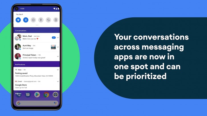
Prior to Android 11, the operating system made no distinction between notifications from messaging apps and those from other apps. This meant someone trying to get in touch with you had to share space with things like media controls, app update notifications, delivery notifications, random spam from a game you installed a while back, and anything else that your phone would keep popping up. Clearly, this is not ideal as for most people an incoming message would be a higher priority than any of those other notifications.
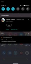
This is exactly what Conversations tries to fix. With this feature, Android 11 will automatically filter incoming notifications from messaging apps and show them in their own dedicated section at the top of the list. Conversations is designed to work with multiple messaging services, so all of your contacts from different messaging services can coexist together at the top of the list.
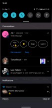
Every app gets its own item in the Conversations list. If an app gets multiple notifications from different contacts, they are all grouped into a single item. You will see the name of all the people who messaged along with their pictures and the app icon.
If you want further control over the items in the list, you can press and hold on them to increase or decrease their priority. An app can be made always to have its notifications appear on top of the Conversations list. Conversely, an app can be made to never make a sound if a notification comes in.
Conversations requires support from the app developer. Once an app has added support for the required metadata and properties, Android will pick up any notifications coming in from it and place it in the Conversations section.
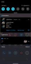
Of the apps that we had installed on our device, Messages, Telegram, and WhatsApp were automatically sorted into Conversations. However, notifications from Skype, Twitter, Instagram, and even email apps like Gmail and Spark were recognized as regular notifications. Also, and this likely due to some bug, but apps that do get placed in Conversations will occasionally appear outside of it, like Telegram in one of the screenshots above.
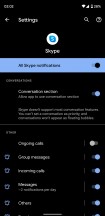
However, for some apps, it was possible to manually enable Conversations support as they did partially support the required metadata. For example, Skype was not originally placed in Conversations by default but going into the notification settings for the app inside the main Android Settings app allowed us to flip a switch that enabled the app to appear into Conversations but with a message that you won't be able to set the priority level for the app in the Conversations list and also there won't be any Bubbles support (which we will talk in the next section).
What does and doesn't get recognized as Conversations worthy for now seems a bit up in the air at the moment. Not only is there the situation with developers not being up to speed with their app support but there's also the question of whether an app even qualifies to be in the Conversations section. For example, neither Twitter nor Instagram are messaging apps primarily but both have a messaging feature. Does this mean they can be in the Conversations section? What about Reddit or Twitch?
In the end, it will have to depend upon the developer to decide these things but it's entirely possible that an app that doesn't need to be there ends up in Conversations while an app you want to see support for never gets updated for it.
One thing to note is that Conversations does take a fair bit of space up top. This tends to push other notifications down quite a bit, especially if you use the new media controls, which we will also talk about a bit later. If you have a full stack of Conversations and media control, your other notifications may just exit the screen entirely, making it difficult to see things quickly at a glance without scrolling. Google does put a fair bit of spacing between sections here so it all feels spread out a bit and not the most efficient use of space.
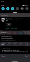
That's a lot of space for just three notifications
All things considered, Conversations is still a good improvement over the traditional method of listing all notifications together. However, the real improvements will be seen once more apps support it natively and also on devices with larger or multiple displays.
Chat Bubbles
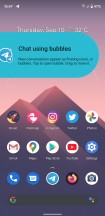
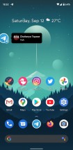
An extension of the new Conversations feature is Bubbles. Bubbles creates a chat heads style floating UI for chats that show up in Conversations. The UI should be familiar to anyone who has used Chat Heads in Facebook Messenger or any other similar interface.
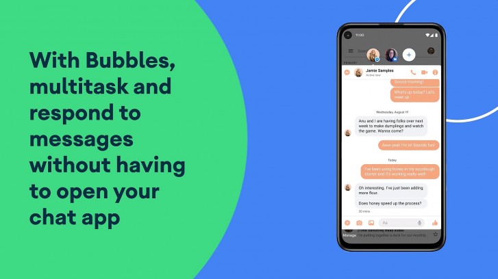
Ideally, an app should automatically trigger a bubble when a message comes in as long as it is configured correctly. In our case, Telegram was able to create a bubble for a message that just arrived. If this doesn't happen, you can click on the icon that appears on the bottom right of the notification in Conversations. Again, the app needs to be configured for this icon to show up. A long-winded way of enabling it going into the notifications channel settings for the app in Android Settings and enabling Bubbles manually from there. There you can also choose to have it be enabled for all conversations from that app, selected ones, or none at all.
Unfortunately, like Conversations, Bubbles was a bit unreliable in our usage with the final stable release. Apps would occasionally show bubbles and other times not show them at all. Apps that supported Conversations would often not support Bubbles. Apps that we know should support Bubbles, like Google's own Messages app, didn't show bubbles at all even when the app was set to high priority in Conversations. Even Telegram, which worked fine initially, stopped showing bubbles for some of the chats. We guess devs still need extra time to fine tune things.
While we expect this sort of behavior from early builds of the OS, Android 11 is now in its final release and has been in beta for months now. For a core feature to be this unreliable and spotty at launch is disappointing and really hope it's up to the app devs to fix it.
When Bubbles did work, it was every bit as useful as Google promised it would be. We could have our messages on top of any non-fullscreen app and could just expand and hide away the chat as required. This significantly improved multitasking. The fact that you can have bubbles from chats from different applications also makes it very versatile. Also, the UI within these bubbles is the full app layout and not a compromised experience. The only downside to this is the slightly cramped space, especially with the keyboard open.
We hope Google gets Bubbles working correctly and that app developers add support for it as it is easily one of our favorite features of this new OS.
Media controls
Just to roundup the trifecta of new notification features, we have the new media controls next.
Android has previously handled media controls in a somewhat clumsy way. Every time you play something in an app that hooks into the media controls, a new notification item appears with the controls in it. If you open a few of these, you now have multiple media controls littering the notifications. In comparison, iOS has had a more restrictive but cleaner solution, where it would have one set of media controls and they would only be assigned to the app currently using them. This way you are never confused with what the controls are for.
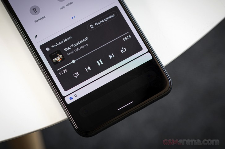
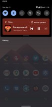
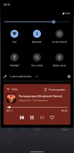
With Android 11, Google has made some changes to how the music controls appear. First of all, the controls are now part of the Quick Settings panel at the top of the notification shade. This means they will always be above all the notifications. You get a more compact view with a single swipe and then a second swipe to expand the Quick Settings panel also expands the media controls.
The other interesting thing here is that multiple media controls can now be scrolled sideways on the media panel. So instead of stacking vertically and taking up more space, you can just swipe to go to a previously used media application.
There is also a new option in Settings > Sound > Media, which lets you hide the media player controls from the expanded Quick Settings panel. For example, if a media player hides its controls from the compact Quick Settings panel once it has stopped playback, the playback controls are still accessible if you fully expand the Quick Settings panel. This setting allows you to disable that behavior, where the media controls disappear completely from both, the compact and expanded Quick Settings panel, once the playback ends.
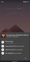
Lastly, the media player panel now also houses controls to let you quickly change your output device. This will include your phone's speaker by default but also any Bluetooth or Chromecast audio devices you may have paired with recently to let you quickly switch over to them. It's a setting that iOS has had for some time and can be quite handy. You can also adjust the volume here, which is great as the core Android UI had lacked software volume controls outside of the Settings app, unlike the always available volume bar in the iOS Control Center.
Oh, by the way, Android 11 no longer shows those blurry, low-resolution fullscreen album art anymore on lockscreen during playback. You will just see the new media control panel on top of your existing wallpaper.
Reader comments
- Anonymous
- 08 Oct 2021
- Nue
You can d that in the developers option
- Anonymous
- 20 Sep 2021
- uwV
Don't upgrade 10 to 11. It is not good compare to 10.
- Syfur
- 17 Sep 2021
- XVT
Android 11 is the worst android ever!! Trying to improve some features, they have downgraded them. From my perspective, conversation bubble is a straight downgrade. on messenger, chat heads were far better that this new bubbles! The look uglier, bugg...
