Android 12 to introduce slightly altered notification card design
Just like almost every Android version, there's some change to notifications, even if it's just a minor improvement and not a full-fledged functionality. Which is the case with the latest Android 12 DP3 update.
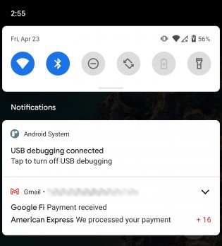
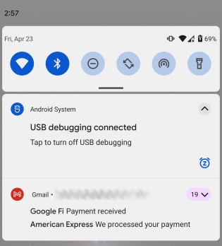
The re-design of the notification cards isn't big as it just relocates the notification count for stacked cards. For instance, in Android 11, if you have more than one notification from a certain app, a badge with the notification count would appear in the lower-right corner of the stacked cards. Whereas Android 12 moves the counter right next to the expand arrow in the upper-right corner. The badge is even highlighted in a corresponding to the app's icon color.
This change not only improves visibility but also saves up some space for text preview on the card. But as it's usually the case with developer previews, everything is subject to change, so the current design may not end up the same upon official release of Android 12 in a few months.
Related
Reader comments
- OhNom
- 27 Apr 2021
- Kk0
Okay, but on mobiles 5 years could be a downtime, I would say 3-4 years, if they released Fushia OS, it would be a good time to implement it, but however now I think it would be counterproductive, everyone is used to annual releases, and the custom i...
- OhNom
- 27 Apr 2021
- Kk0
I think that it did, obviously if you look in the comments of GSMarena, Android Reddit, Android Police, probably most, if not everyone knows them, they are not places for normal users
- OhNom
- 27 Apr 2021
- Kk0
How much is a lot? 20M out of 1200M devices sold annually? I also don't try anything, I just told the truth, most of my android brothers have no idea about the characteristics of their phone, I know people who have devices with 120Hz and th...





 Nothing
 Xiaomi
 Samsung
 OnePlus
 Motorola