Android 8.0 Oreo review: The little things
The little things
Look and feel
You can't really say that there's a big difference in this area between the new Android release and Nougat, but there are some notable changes nevertheless. Perhaps the most obvious one has to do with the Quick Settings area, and specifically its background color. This is now a light grey, which blends in much better with other UI elements such as the Settings menu.
Subjectively, it feels more professional-looking than the dark grey of years past, but the fact that the Quick Settings icons themselves are now black when the function they depict is enabled will take a little bit of getting used to. The battery percentage is now shown to the left of the battery icon in the status bar, not inside it, greatly improving readability.
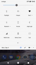
New background color for Quick Settings
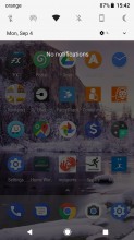
Upon the initial swipe down from the top you'll notice that the date has been moved under the row of six most used Quick Settings icons, to the left. At the same level, on the right is where the Settings shortcut now lives, and to the right of that there's a small arrow that will expand the entire Quick Settings area when tapped. Of course, you can still accomplish the same effect by simply swiping down again.
While you're there, you'll see that the Edit shortcut for rearranging Quick Settings tiles has appeared just to the left of the Settings gear, and to the left of that is a handy user selector which lets you pick from the defined ones and guest mode, also allowing for the quick addition of a new user.
On Google's Pixels you have the same Pixel Launcher greeting you on your home screen as before, since this is an app that gets updated through the Play Store, independently of Android releases. Likewise you're stuck with the ancient Google Now Launcher on the Nexuses that will receive Oreo. We'll focus on the Pixel Launcher here because it's the newer (and still updated) app.
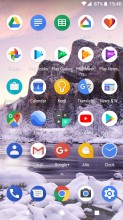
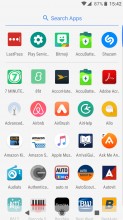
Lock screen • Google Now Feed • Home screen • App drawer
While it may not have been upgraded by Oreo per se, the new OS version brings a new launcher-related feature - namely notification dots - and this is obviously supported in Google's own Pixel Launcher. More on this in the next page of the review, which is all about notifications.
A couple of other subtle changes have been enabled in the Pixel Launcher on Oreo: when you're in the app drawer, the navigation buttons turn black, and you can now swipe up anywhere on the homescreen to bring up the app drawer - you no longer have to 'grab' the app dock at the bottom to achieve this effect.
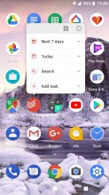
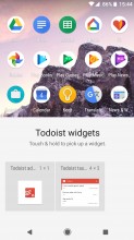
Widget button on long press • Widget selector for each app
If you like widgets, you'll be happy to know that you no longer have to scroll through endless lists of those in order to get to the one you want - in Oreo if you long press an app's icon you can then choose to see only that app's widgets by tapping a new button that's to the left of the Info icon. Adding widgets to the home screen in this manner has the potential to be much faster than the older method of long pressing an empty area (which still works, by the way).
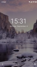
Ambient screen
The lock screen hasn't changed, but the Ambient screen has been redesigned. This comes to life whenever you get a new notification or when you pick up your device, provided that you have enabled one or both of those functions in Settings first. As always, it only lights up a fraction of the pixels, taking advantage of the fact that OLED screens don't use any power to display black.
The new Ambient screen implementation shows you each incoming notification in a larger font. It also highlights the name of the app that generated said notification, and puts quick action buttons front and center. So when you receive an email, for example, you just tap on Reply once and then the screen is automagically unlocked and you're taken straight to your email client where you can immediately start writing that reply. It's a much more efficient way to do things, especially if you like acting upon notifications as they arrive. The old Ambient screen basically emulated the lock screen, forcing you to first expand a new notification before you could act on it.
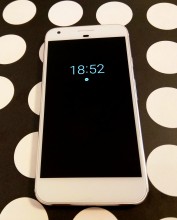
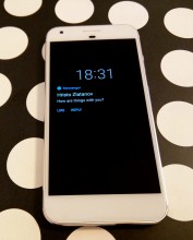
New Ambient screen: When you double tap to wake • When you get a new notification
It's worth noting that when you double tap to wake the screen (or when you pick up your phone) you will see a minimal version of the Ambient screen, which only displays the time and the icons of the apps you've received notifications from. You need to then double tap again to be taken to the lock screen.
Reader comments
- 8
- 15 May 2019
- rJ3
8
- Anonymous
- 03 Jul 2018
- aqp
Yes,it is on official lists
- AnonD-757346
- 07 May 2018
- d@C
The oreo update completely stooped my Samsung galaxy S7 from working. I was forced to do a factory reset which has caused untold problems.