Apple iOS 14 review
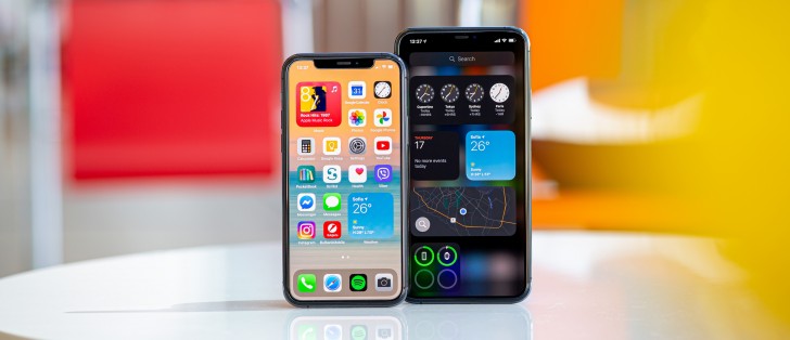
General iOS 14 interface
The iOS 14 focus falls on the new widgets and App Library, which will improve your experience should you decide to use them. It's nice to see Apple has decided to make new features as optional as possible, instead of forcing them on you right away.
The rest of iOS remains mostly unchanged with some minor UI improvements across different system apps. New apps and features are available, too. But let's start from the beginning.
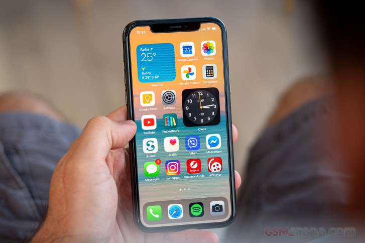
The lockscreen on iOS14 remains intact - it's one with the Notification Center and houses your notifications (privacy options area available), plus shortcuts for the torch and the camera. You can get past it via Face ID, Touch ID (where available), or PIN if you've opted for secure unlock.
Your apps usually populate the homescreen(s) and widgets - the leftmost Today page. Now there is also a rightmost page - the App Library.
A new option allows you to hide specific homescreens - you may have a page that's full of games and hide when at work or hide the two pages of work apps when on vacation. You can't opt-out of Today and App Library though.


Lockscreen • Homescreen • Homescreen • Today • App Library • Hide homescreens
You can continue to use iOS 14 the old way if you like and completely ignore the App Library. Unfortunately, there is no option to disable the App Library entirely.
If you update your iPhone to iOS 14, you'll see nothing has changed. Until you start putting widgets on your homescreen(s), everything will be as it was pre-iOS 14 - nothing will be forced on you. Apps will be added on your homescreen(s), widgets will pop-up in Today.
Or you can decide to embrace the changes and go all in.
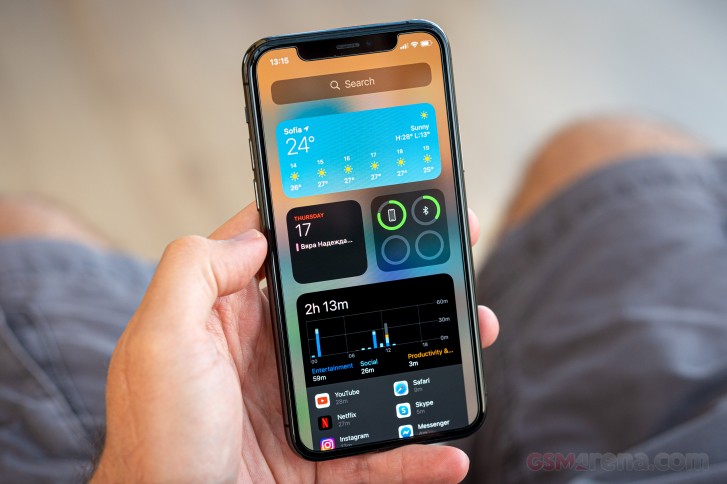
The new Widgets can be placed on any of the homescreens and the Today page and they can coexist with app icons. There are three widget sizes supported by iOS 14 - 2x2, 4x2, and 4x4.


All available widgets at launch
You can stack widgets of the same size on top of one another. Once you have a stack, you can either have the OS automatically choose which is the most relevant widget to surface to the top of the stack automatically, or you can flip through the stack manually by swiping up or down until you find the widget you need. We do like this idea of stacked widgets - it's a real space saver - especially if you combine a frequently used widget at the top with less frequently used ones in the stack below it.


Different widgets sizes • Widgets • Widgets • Stacked widgets • Stacked widgets • Settings
The App Library is an app drawer, which is always your rightmost homescreen pane. Apps are added automatically to the App Library upon installation. The sorting is also an automatic process, and you can't edit the categories or move apps in different categories.
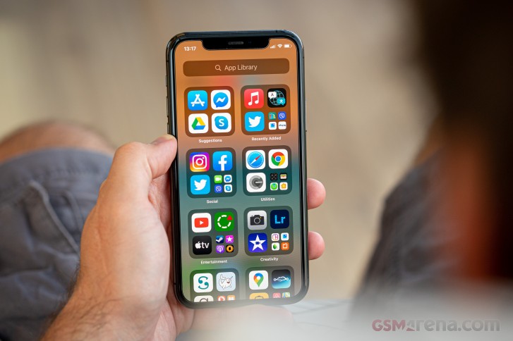
The App Library has a search bar at the top followed by all categories - Suggestions, Recently Added, Social, Utilities, Games, Productivity & Finance, Creativity, Entertainment, Information % Reading, Travel, Other, Shopping & Food, Health & Fitness, Education. We guess the app sorting depends on the App Store tags the developer has used upon uploading the apps.
The App Library has three settings only - Add new apps to Homescreen and App Library, Add to App Library only, and Show Notification Badges in App Library. That's it.
The App Library is the place where you are going to ditch your least used apps to die. It's inevitable.
We bet the Today page will slowly go away, but for now, it is an exclusive widget page. You put the same widgets and stacks you can on your homescreen(s). Here you can also use the old third-party widgets that haven't been optimized yet for iOS 14. The old widgets come right after the new one, should you choose to use some of the new ones.
In time, we guess all developers will update their widgets to support iOS 14, and that will be the death of the Today as we know it.
The navigation gestures stay the same as they were on the iPhone X. Swipe upwards from the bottom line to close an app, swipe and stop midway for task switcher, swipe from the side of the screen for back and forward. You can also swipe on the line left or right to switch to your recently used apps instantaneously.


Gestures • Task Switcher • Moving between apps • Back • Closing an app
The Notification Center is summoned with a swipe from the left horn or the notch. The pane was unified with the lockscreen in iOS 11, and that's why you can have different wallpapers on your homescreen and notification center.
The Control Center, which has customizable and (some) expandable toggles, is called with a swipe from the right horn. You can use haptic touch to access additional controls. And the battery percentage is also here.


Notification Center • Control Center
You can use the Haptic Touch on various app icons to reveal quick actions, if available. You can also use it for notifications, toggles, and in-app content pop-up or expansion (pictures, links, file descriptions, etc.). You can also use Haptic Touch on folders to rename them or see the apps inside that have pending notifications. And as usual - a pop-up preview of pictures, weblinks, messages, emails, notes, and photos is available.
There is a system-wide Dark Mode. You can enable it manually or schedule it from within Display Settings, and it switches to dark all-white backgrounds across iOS. The Dark Mode affects all system apps, but also apps that rely on system backgrounds. You can also check the option to darken the homescreen wallpaper when in Dark Mode.
Siri - Apple's digital assistant - is used by 400+ million people monthly. You summon it by holding the 'side' key (the Power key). You can do all sorts of things with Siri - from questions and translations through setting up reminders and sending replies to messages to asking for reservations or tickets, directions, and whatnot.
Siri Shortcuts are available within a standalone app. There are so many things you can assign a shortcut to that it will take many pages to describe them. You can script almost anything available within iOS itself, a lot of stuff from within the system apps, and some advanced actions from any well-known apps such as YouTube or Facebook.
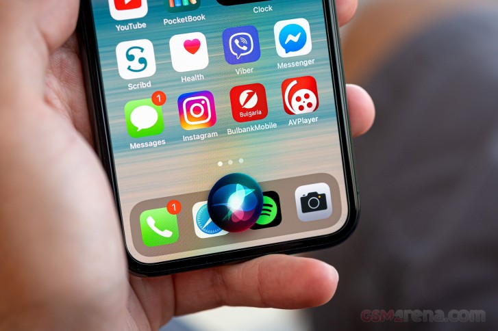
Another new feature in iOS 14 is the more compact Siri interface. Upon summoning Siri, you will see a small ball around the bottom, and your answer will be provided in a small pop-up window. This way, you can still see what's happening in your active app.
This concludes our general UI exploration.
Reader comments
- Minu
- 05 Aug 2022
- ter
Now all apple needs to dethrone android is to make their atrociously overpriced products available for less than $60, make them usable without itunes and allowing facetime and bluetooth with other platforms, which they will never, ever do. Even symbi...
- mobileman
- 18 Jul 2022
- pdH
is it true that you cant get home,back and close buttons on screen?? i mean iphone 13 and how about new 14 model?


