Apple iOS 7 review: Eye of the beholder
Eye of the beholder
iOS7 user interface (continued)
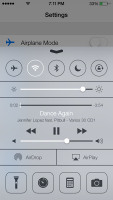
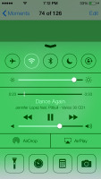
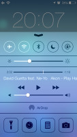
Apple decided not to follow the competition and put the connectivity toggles in the notification area. They're in a brand new Control Center instead, that's pulled up with a swipe from the bottom of the screen.
It has five non-customizable rows for various shortcuts. The top row has five toggles - Airplane, Wi-Fi, Bluetooth, DND mode and Rotation Lock. The second row has the brightness slider. Next come the media player controls including a volume bar. The fourth row has AirDrop and AirPlay shortcuts. Finally, at the bottom of the Control Center there are four shortcuts - one that turns on/off the LED flash to serve as a flashlight and three app shortcuts - Clock, Calculator and Camera.
The volume slider is perhaps a bit redundant but nothing in the Control Center is customizable. It's a great, and well overdue, addition.
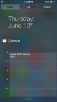
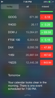
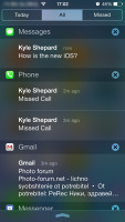
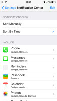
The Notification Center has been redesigned as well. It now has three tabs - Today, All and Missed. The Today tab has the date, a summary of all events for the day, calendar day view, reminders, stocks and tomorrow's summary. As usual, you can choose which apps you want to show up in the pull-down Notifications and in what order.
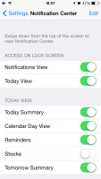
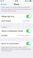
The Today's tab is customizable, you can disable its elements one by one - everything but the date displayed at the top can be removed so it doesn't get in the way. You can even disable the Today tab altogether in the Notification Center for the lockscreen.
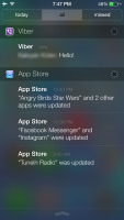
The All tab is basically the notification center of iOS 6 but sans the weather, stocks and calendar events. The first two are now part of the Today tab, while the weather is gone for good. You can disable the All tab for the lockscreen as well (just turn off Notifications View). If both Notifications (All) and Today tabs are disabled, the entire Notification Center won't be available on the lockscreen.
The Missed tab displays new emails, messages and missed calls, while your iDevice was locked. Those notifications are still available in the All tab.
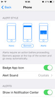
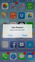
Other than that, the handling of notifications hasn't changed a bit. You can opt to disable a notification, set it to be a banner, which will shortly pop up over the status bar or an alert showing up at the center of the screen.
There are options to disable badges on app icons or disable lockscreen notifications.
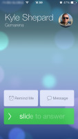
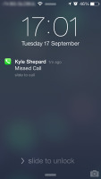
As before, you can interact with notifications straight on the lockscreen. If a notification has just arrived, sliding to unlock will open up the relevant app - upon a missed call, you'll go straight to the phone app. You can also swipe a notification to perform a task - swipe to call back or text.
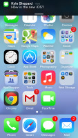
The banner notification is very subtle. If you receive a text in the middle of something, it will briefly pop up over the status bar and disappear in a couple of seconds, and not distract from what you're doing.
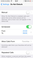
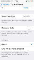
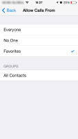
Do Not Disturb is, as expected, still an integral part of the iOS 7. It gives users further control on notifications, or rather their suppression. If turned on, it will mute incoming calls or alerts. You can allow calls from your favorite contacts and have the option to set a specific time interval in which you won't get any notifications.
There's a dedicated toggle to activate the DND feature and it can be customized in the Notifications submenu. When Do Not Disturb is on, a crescent icon appears next to the clock in the status bar.
According to Apple, iOS 7 offers multi-tasking for all apps. Previously the true multi-tasking was reserved only for navigation or music streaming apps, the rest had to go in suspend mode.
Now, this multi-tasking for all apps will surely drain the battery faster than Apple would have liked, so there is a catch. Yes, all apps will work in the background, but the iOS will learn which one of them you use most often and when.
Let's say you open the Facebook app every morning and don't use it for the rest of the day. The iOS will soon learn that and will optimize the app to work according to your schedule until you change it. This means most of the day and night the app will still be in suspend mode (push notifications will work of course), but the iOS will run Facebook shortly before your alarm goes on and load all the content. That way when you open it, your news feed will be already updated.
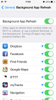
We noticed that apps also update in the background when push notifications come in. This is a part of what Apple calls opportunistic updates - the iPhone waits until a data connection is available and starts the updates then, so it doesn't need to activate the connection on another occasion and waste your battery.
We haven't spent enough time with iOS to give a proper judgment on how well the new multitasking works, but once we do we'll duly update this article.
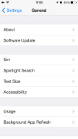
All apps that use Cellular/Wi-Fi connection and can work in the background are listed under Settings -> General -> Background App refresh.
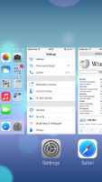
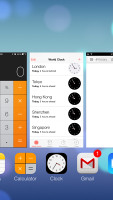
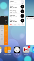
The task-switcher interface is invoked with a double tap on the Home key. It looks a lot like the webOS cards of old and, more recently, the HTC Sense Task switcher - all apps are presented with cards that you can swipe up to close. Each card has the respective app icon so you can easily recognize what's what.
The multitasking UI works in both portrait and landscape mode, but you cannot see more than three cards at a time. It's one of the limitations of the card interface and we suspect this is why HTC went for a different task switcher on the One, but here's hoping that Apple will at least fix the landscape mode down the line.
The iOS 7 Settings menu has the same layout as in previous versions but updated with the new flat and borderless look.
Besides the Background App Refresh, the iOS 7 offers even better control over the apps that use mobile data. The Cellular tab offers detailed cellular data breakdown by apps and services, allowing you to properly manage your resources.
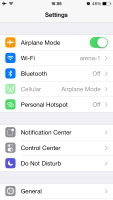
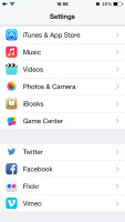
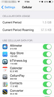
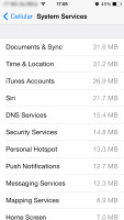
Settings • Cellular Data settings
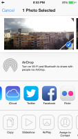
Another thing worth mentioning is the Vimeo and Flickr integration in addition to Twitter and Facebook. Once you enter your account details in the settings you can upload your photos straight to your Flickr gallery, while your videos will go to your Vimeo. You just need to hit the share key on a picture or a video and use the dedicated Flickr/Vimeo icon.
The last major change about the user interface is the Back gesture available in all iOS 7 default apps (maybe developers will be able to extend the support to third-party apps after launch). Whether you are in settings, App Store, Messages, Notes, Reminders, Safari, etc. a swipe from the left side of the screen will take you one step back.
Reader comments
- AnonD-214520
- 12 Dec 2013
- mkr
Apart from that, I really do not understand how can a company force its customers to change a product so much from the state it was originally purchased without giving to the possibility to restore it to the configuration it was at the date of purcha...
- AnonD-214520
- 12 Dec 2013
- mkr
Well, I have two identical iphones and I upgraded iOS 7 only on one: after several months use my conclusions are the followings: 1- iOS 7 drains 35% more battery than iOS 6; 2- iOS 6 is 30% faster than iOS 7; 3- iOS 6 is by far clearer than iOS...
- AnonD-202636
- 03 Nov 2013
- XuW
I want to buy iPhone 4S or 5. But i want to know should i buy with iOS6 or iOS7 as i heard there are issues currently with iOS7. Please help & advise
