Apple iPad 2 review: Love and hate 2.0
Love and hate 2.0
iOS on the iPad – the basics
The iPad is still a big iPod Touch. And it will stay like this until iOS reaches Mac OS X in terms of capabilities (if that ever happens) or until the tablet gets powerful enough to run the actual Mac OS X. In case you are not familiar with the iPad user interface, we’ve prepared a quick walkthrough for you.
The iOS looks slightly different on the iPad mostly due to the larger screen and less importantly - the higher resolution. And while there are not too many UI tweaks to make better use of the extra space, most of the system apps have been reworked and use split screen allowing you to see more content and saving you a few taps.
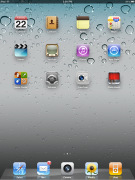
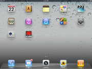
The homescreens on the iPad UI support landscape orientation too and the dock can harbor up to six icons. The iOS 4.3 saw the addition of a screen brightness slider to the multi-tasking bar.


The iPad lock and home screens
Great examples of the iPad-specific UI are the email client, the settings menus and the contacts app. As you can see from the screenshots below their interface is divided in two columns – the left one for navigation and the right – for displaying content.


The email, settings and contacts apps
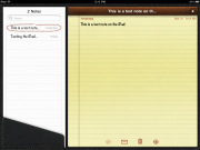
Not all the apps keep the split-screen view when the iPad is in portrait mode, though. The navigation bar in the Notes and Mail apps (for example) gets integrated into a pop-up balloon and can be accessed from the upper left corner at any time.


Notes in portrait and landscape view • Email in portrait view
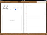
Most other system apps have some extra eye-candy and usability improvements over the iPhone and iPod Touch too – those include Contacts, Calendar, iPod, YouTube, Notes, Safari, App Store, iTunes, etc. . The looks and design can even fool someone the iPad uses a different iOS version from those on the iPhones and iPods.
Finally, the drop down selectors and pop-ups no longer occupy the whole screen but only a part of it as is more natural. Tap-and-hold now works in more places and other similar tweaks were also present.
Multi-touch gestures – everything you need to know about them
The iOS multi-touch gestures have been a hot topic ever since the first iOS 4.3 beta came out. Basically their purpose is to help you navigate through the UI without using the Home button. Unfortunately, a few weeks prior to the iOS 4.3 release, it became clear those gestures are strictly an experimental dev feature and won’t be included in the final iOS 4.3 version.
Well, the gestures are still in the iOS 4.3 update, but they are locked. Luckily some good fellas found out how to unlock them without even jailbreaking the iPad. You need an Intel-based Mac computer with Mac OS X and the Xcode dev tools. You can find the guide here. Note that there is a way to do the job with the previous version of Xcode, which is free. Here is how.
As we said the gestures replace the Home key. You can switch between the active apps using four (or five)-finger swipes. A similar swipe to the top will bring you the task switcher.
The last gesture is four (or five as it feels more natural) finger pinch zoom out. It will bring you the homescreen, while the app will go in background.
The pinch zoon out and left/right swipes works everywhere but the homescreen, while the swipe up gesture is available everywhere.
We have to admit those gestures are quite useful and we hope Apple will soon bring them to the iOS officially. We can’t understand any concern about the performance they might have since they worked like a charm for us.
We were also able to test the four/five fingers on an iPhone 4, but due to the small screen we are not sure if they can replace the Home key. Four fingers are just too much on the 3.5-inch. Perhaps three-finger gestures would be better, but those are reserved for the iPhone’s accessibility options for now.
Reader comments
- Ticky Patrick
- 09 Jun 2023
- PxG
Why is my profile control to kid file?
- Anonymous
- 05 Dec 2021
- KZK
Just add another one G will be done


