Apple iPad 3 review: Hotter than ever
Hotter than ever
iOS beyond FullHD
iOS on the iPad looks and feels akin to the one on the iPhone - the whole UI is upsized to match the 9.7 diagonal of the big screen and in addition you get one more app on the dock.
We were hoping that by the time we saw the third generation iPad, iOS would be more like OS X but it seems Apple is keen on making it the other way around - introducing iOS features to OS X. But we digress.
Here's video demo of iOS on the new iPad.
iOS 5.1 on iPad is still different than on the iPhone, mainly due to the larger screen real estate than the humongous resolution. And while there are not too many UI tweaks to make better use of the extra space, most of the system apps have been reworked and use split screen allowing you to see more content and saving you a few taps. Naturally all Apple-made apps are optimized to fully-utilize the new 1536 x 2048 resolution.
The lockscreen is the first place you'll end up on the iPad - it has the familiar "slide-to-unlock" slider. Double-pressing the home button reveals music controls and a virtual volume rocker. There's no shortcut to open the camera, which is a shame but we guess Apple never intended their tablet as a camera-slate.
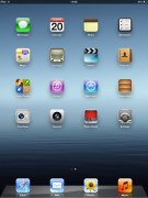
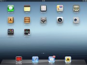
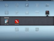
Once you unlock the device you dive right in to the simplicity of iOS. Unlike Android, it isn't comprised of layers of advanced menus but instead gives you all your apps placed in a grid. You can reorder the apps however you like or place them into folders.
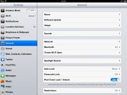
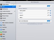
The settings menu is the one place where things get a little deeper. Most of the apps' settings are placed here instead inside the apps themselves. You can view settings for iCloud, Safari, Messages, Photos and so on.
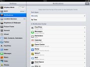
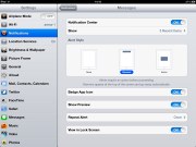
Users receive notifications both on the lockscreen and on the homescreen - and there's a pull-down Notification center a la Android. You can set the behavior for the notification from each individual app. The system is pretty flexible and configurable now.
The Notification Center displays all your pending alerts. You can enable/disable and rearrange the alerts in the Notification settings.
The Notification Center supports widgets too. So far there are only two to choose from - Weather and Stocks.
The pull-down Notification Center works much like the Android notifications. You can access the Notification Center from anywhere in the interface and even in games or apps. It does pause the app beneath, so there's no way you accidentally stray off the road while playing Real Racing 2 HD.
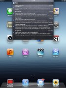
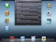
The notification area pull-down
Notifications display on the lockscreen too and they're active. When you respond to a notification by sliding it across the screen, it will take relevant action (return a missed call) or launch the appropriate app.
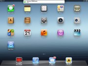
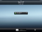
Various types of notifications
It's a pleasure to use iOS on the iPad, especially if you're a regular on the iPhone but we dislike the fact that Apple hasn't tweaked the UI to utilize the added space and increased resolution.
Reader comments
- Lobo
- 17 Apr 2024
- j4U
get Samsung Galaxy Tab 2
- Thirdy Junio
- 14 Oct 2023
- j2a
this iPad thing’s so 2012!
- Anonymous
- 10 Oct 2020
- XSH
cannot used facebook and social media. ios version did'nt upgrade. it is really bad.


