Apple iPad 4 review: Marching on
Marching on
iOS 6 at the helm
iOS 6 on the Apple iPad 4 looks just like you'd expect. It's an upscaled version of the iPhone UI, with subtle changes to make better use of the available space here and there. On the plus side, the interface is very simple and very easy to pick up, though we would have appreciated some advanced functionality to go with the extra screen space.
Here's a video of the iPad 4 in action.
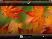
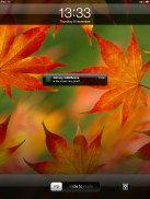
The Apple iPad 4 lockscreen has the familiar "slide-to-unlock" slider with a shortcut alongside it to launch a slideshow of your photos without unlocking the device. Double-pressing the home button reveals music controls and a virtual volume rocker. There's no shortcut to open the camera, but given that tablets (even the smaller ones) aren't exactly the best devices for taking snaps on the go that's not too bad.
Once you unlock the iPad 4 you dive right in to the simplicity of iOS. Unlike Android, its interface is one consists of a single layer, which has all your apps placed in a grid. You can reorder the apps however you like or place them into folders.
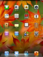
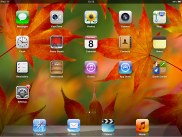
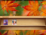
Homescreen on iOS 6 • Newsstand
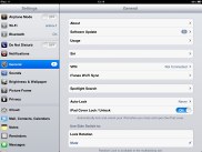
The settings menu is the one place where things get a little deeper. Most of the apps' settings are placed here instead inside the apps themselves. You can view settings for iCloud, Safari, Messages, Photos and so on.
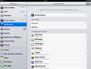
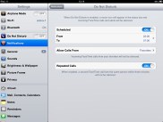
The Do Not Disturb mode, which came as a part of iOS 6 gives you further control over your notifications. If turned on, it will mute incoming calls or alerts. You can allow calls from your favorite contacts and have the option to set a specific time interval during which you won't get any notifications.
There's a dedicated toggle to activate the DND mode and it can be customized in the Notifications submenu. When Do Not Disturb is on, a crescent icon appears next to the clock in the status bar.
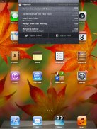
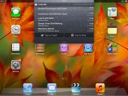
As the other iOS 5+ devices, the iPad mini offers a pull-down Notification center a la Android. It looks rather awkward covering just a part of the screen, but that's how it works on Android tablets too and while we're not fans of how it looks, it doesn't cause any issues with usability.
You can access the Notification Center from anywhere in the interface and even in games or apps. It does pause the app beneath, so there's no way you accidentally stray off the road while playing Need for Speed. You can set the behavior for the notification from each individual app. The system is pretty flexible and configurable now.
Ideally there would have also been some connectivity toggles in the notification center, but we'll have to wait a bit longer for that we guess.
Notifications display on the lockscreen too and they're active. When you respond to a notification by sliding it across the screen, it will take relevant action (return a missed call) or launch the appropriate app.
Overall the iPad 4 UI feels pretty much the same as the iPad 3 and the iPad 2 before it. That is to say, it's a great combination of functionality and simplicity and Apple's continued updates to the platform have brought some excellent new functionality (and some regression with Maps). Things move faster here, but the experience on the iPad 4 isn't vastly different compared to an iOS 6-running iPad 3. In fact, we had to use one after the other and look really close to spot the differences.
Reader comments
- Shaikh
- 20 Jan 2024
- rJT
We can't download anything without logging in use existing an Apple ID . It is the disadvantage of this iPad . I am texting this comment with my this iPad . Reply to my comment (Apple) . And exchange my iPad with new model because from where I...
- ripka
- 23 Feb 2015
- ksd
How can I get a battery out I pad 4
