Apple iPad Air review: Sun and heir
Sun and heir
Apple iPad Air runs on iOS 7
The Apple iPad Air runs buttery smooth with iOS 7, a major overhaul to the user interface with brand-new flat looks, transparent menus and keyboard, new system icons and apps, new control center and much more. The iOS 7 has already made its way to the compatible iGadgets out there and is already quite familiar, but its adoption rate is not as good as previous iterations because some users simply don't like the new looks. Anyway, we'll explore the iOS 7 thoroughly as we usually do, so don't you worry if you think you've missed something.
Before we continue, here is a quick video demonstration of the new iOS 7 running on the iPad Air:
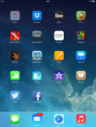
iOS 7 looks a lot different compared to its predecessors, but its logic of operation is mostly the same. All of your apps are on the homescreen, folders are available and there is the familiar dock that can take up to four shortcuts.
All system icons are different in the iOS 7: the clock now has an animated icon showing the current time, the system fonts have been altered, and there are lots of semi-transparent elements and new gestures.
Let's start from the beginning - the lockscreen. It's totally different and yet it works in a very similar way. The slide to unlock bar is now gone and you can swipe anywhere on the screen to unlock your iPad Air. The camera shortcut at the bottom is also avaialble, you can swipe up from there for quick access to the camera app. A double press of the Home key will bring up the multimedia controls as usual. Lockscreen notifications are available as well.
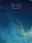

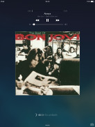
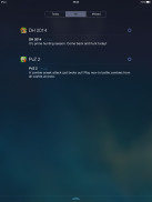
The lockscreen works as before
You can notice two transparent small lines at the top and the bottom of the lockscreen. Swiping from the top down will display Notifications, while swiping up from the bottom will bring up the new Control Center.
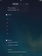
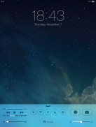
Notifications and Control Centers are available on the lockscreen
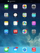
Swiping the lockscreen out of the way reveals the revamped homescreen. The Spotlight pane is now gone - but not lost. It's just triggered by a new pull-down gesture anywhere on the homescreen.
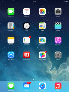
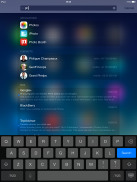
The Spotlight is now hidden but has a dedicated gesture
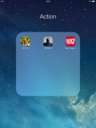
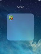
Folders are available as usual, but there is no limit anymore to how many apps you can put inside them. Pages are available in the folders, each page can pack up to nine apps and there is no limit on the page count. Now you can finally put the Newsstand app away in a folder!
The opening and closing of folders is now accompanied by a cool animation. These take a bit too long, though, and might become irritating once you are past their initial "wow" phase. Another cool bit involves the folder icons and the folders themselves being semi-transparent and their backgrounds adapt to the prevailing theme color. You can disable the folder animations, the opening and closing app animations plus the parallax effect from General -> Accessibility -> Reduce Motion. This will speed things a bit.
The Notification and Control Center colors are also adaptive, just like the folders, and they'll change depending on the background. So they might be blue-ish on the homescreen, but light gray in the web browser, or dark gray in the settings, or green in the gallery, etc. Unlike the iPhones' keyboard, the one in the iPad is not semi-transparent, nor is its background adaptive.
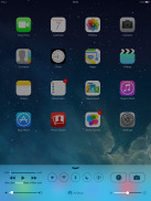
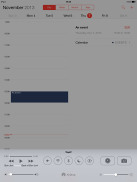
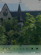
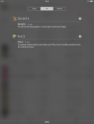
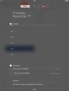
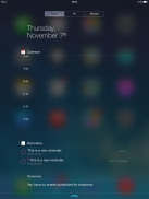
The semi-transparent Control Center and Notification Center in different colors
The parallax effect is observable throughout iOS 7. Apple designed the new iOS on independent layers - background, homescreen icons, icon badges, and then app pop-ups. The iPad Air then uses its accelerometer and gyroscope to move layers independently and create an illusion of depth. The movement is very subtle. In fact, you might not even notice it if you are not looking for it, but it's there and it looks awesome once you start moving your device.
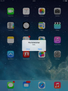
The parallax effect is not only available on the homescreen. You can see it in folders and in the pop ups that ask you for passwords or display notifications. Those pop ups by the way are also translucent and adapt their background color.
In case you don't like the parallax effect you can turn it off from the Accessibility settings -> Reduce Motion.
Apple iOS 7 brings live wallpapers. You can find them in the relevant section of the Wallpaper Settings. Currently there are seven live wallpapers but there is no wallpaper section available in the App Store. It seems we'll have to rely on Apple for adding more.
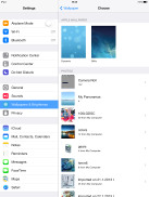
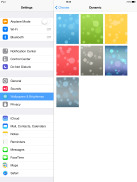
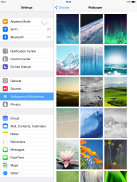
Wallpaper settings • Dynamic wallpapers • Still wallpapers
Apple decided not to follow the competition and put the connectivity toggles in the notification area. They're in a brand new Control Center instead, that's pulled up with a swipe from the bottom of the screen.
It has two of non-customizable rows for various shortcuts. The top row has the music controls, five toggles - Airplane, Wi-Fi, Bluetooth, DND mode and Rotation Lock., plus two shortcuts - Clock and Camera. The second row has the volume and brightness sliders flanking the AirDrop and AirPlay shortcuts.
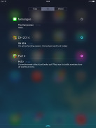
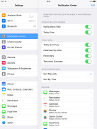
The Notification Center has been redesigned as well and now occupies the entire screen. It now has three tabs - Today, All and Missed. The Today tab has the date, a summary of all events for the day, calendar day view, reminders and tomorrow's summary. As usual, you can choose which apps you want to show up in the pull-down Notifications and in what order.
There is no option to add stocks in the iPad's notification center, as the iPad doesn't come with the native Stocks app.
The Today tab is customizable, and you can disable its elements one by one - everything but the date displayed at the top can be removed so it doesn't get in the way. You can even disable the Today tab altogether in the Notification Center for the lockscreen.
The All tab is basically the notification center from iOS 6 but sans the weather, stocks and calendar events. The first two are now part of the Today tab, while the weather is gone for good. You can disable the All tab for the lockscreen as well (just turn off Notifications View). If both Notifications (All) and Today tabs are disabled, the entire Notification Center will no longer be available on the lockscreen.
The Missed tab displays new emails, messages and missed FaceTime calls you received while your iPad Air was locked. Those notifications are still available in the All tab.
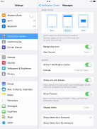
Other than that, the handling of notifications hasn't changed a bit. You can opt to disable a notification, set it to be a banner, which will shortly pop up over the status bar or an alert showing up at the center of the screen.
There are also options to disable badges on app icons or disable lockscreen notifications.
The banner notification is very subtle. If you receive a text in the middle of something, it will briefly pop up over the status bar and disappear in a couple of seconds, and not distract from what you're doing.
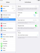
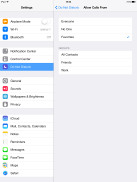
Do Not Disturb mode is available on the iPad Air too. It gives users further control of notifications, or rather their suppression. If turned on, it will mute incoming FaceTime calls or alerts. You can allow FaceTime calls from your favorite contacts and have the option to set a specific time interval in which you won't get any notifications.
There's a dedicated toggle to activate the DND feature and it can be customized in the Notifications submenu. When Do Not Disturb is on, a crescent icon appears next to the clock in the status bar.
According to Apple, iOS 7 offers multi-tasking for all apps. Previously true multi-tasking was reserved only for navigation or music streaming apps, the rest had to go in suspend mode.
Now, this multi-tasking for all apps will surely drain the battery faster than Apple would have liked, so there is a catch. Yes, all apps will work in the background, but iOS will learn which one of them you use most often and when.
Let's say you open the Facebook app every morning and don't use it for the rest of the day. iOS will soon learn that and will optimize the app to work according to your schedule until you change it. This means most of the day and night the app will still be in suspend mode (push notifications will work of course), but iOS will run Facebook shortly before your alarm goes on and load all the content. That way when you open it, your news feed will be already updated.
We noticed that apps also update in the background when push notifications come in. This is a part of what Apple calls opportunistic updates - the iPad waits until a data connection is available and starts the updates then, so it doesn't need to activate the connection on another occasion and waste your battery.
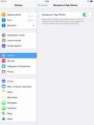
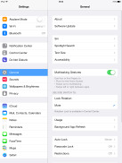
All apps that use Cellular/Wi-Fi connection and can work in the background are listed under Settings -> General -> Background App refresh.
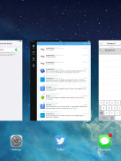
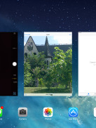
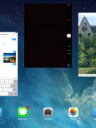
The task-switcher interface is invoked with a double tap on the Home key. It looks a lot like the webOS cards of old and, more recently, the HTC Sense Task switcher - all apps are presented with cards that you can swipe up to close. Each card has the respective app icon so you can easily recognize what's what.
The multitasking UI works in both portrait and landscape mode, but you cannot see more than three cards at a time. It's one of the limitations of the card interface and we suspect this is why HTC went for a different task switcher with the One, but here's hoping that Apple will at least fix the landscape mode down the line.
The four/five-finger multi-tasking gestures are also available on the iOS 7 running on iPad Air. You can switch between the active apps using four (or five)-finger swipes. A similar swipe to the top will bring you the task switcher. Finally, you can use four (or five as it feels more natural) finger pinch zoom out. It will bring you the homescreen, while the app will go in background.
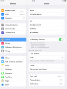
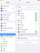
The Multi-tasking gestures switch in the Settings app
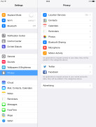
The iOS 7 Settings menu has the same layout as in previous iPad versions but updated with the new flat and borderless look.
Another thing worth mentioning is the Vimeo and Flickr integration in addition to Twitter and Facebook. Once you enter your account details in the settings you can upload your photos straight to your Flickr gallery, while your videos will go to your Vimeo. You just need to hit the share key on a picture or a video and use the dedicated Flickr/Vimeo icon.
Reader comments
- Roblox Gameplay
- 20 Apr 2023
- 7k3
Hi I'm Using iPad Air for many years it pubg and free fire but sometimes it crashes so dont download high data games but for Roblox it support for some particular games. Thank you,
- Anonymous
- 16 Oct 2020
- S1U
Support aim or not
- aung
- 01 May 2017
- 6p$
can use sim
