Apple iPhone 13 Pro review
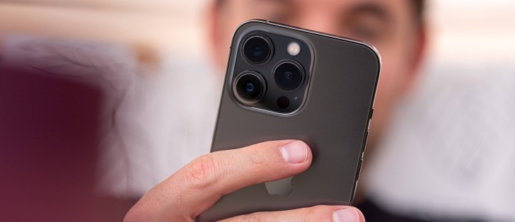
Design, build quality, handling
You no longer have to compromise pocketability to get the best hardware Apple is putting in a smartphone - the iPhone 13 Pro shares it all with the Pro Max. That holds true of the internals this year for a change, and we appreciate it. On the outside, much like last year, the 13 Pro is essentially a shrunken down 13 Pro Max.
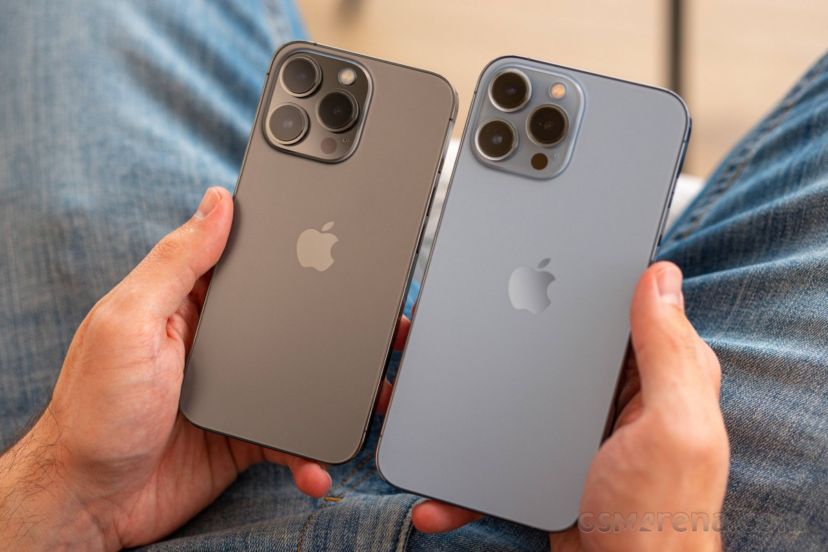 Same phone, different size - iPhone 13 Pro (left) next to iPhone 13 Pro Max
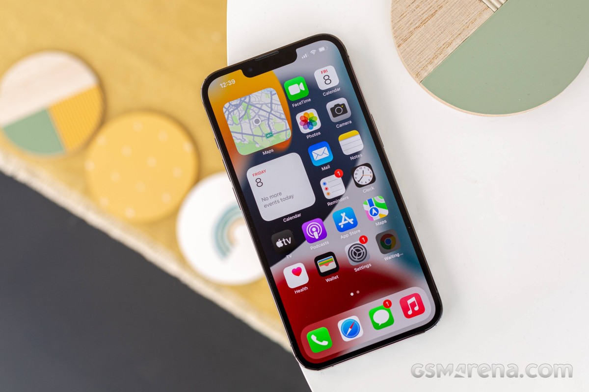
That means you're getting the design touch of the year that everyone is talking about, the 20% smaller notch on the front. We would certainly like to see that gone, but Apple's answer is 'not this year'.
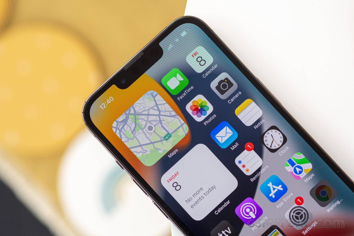
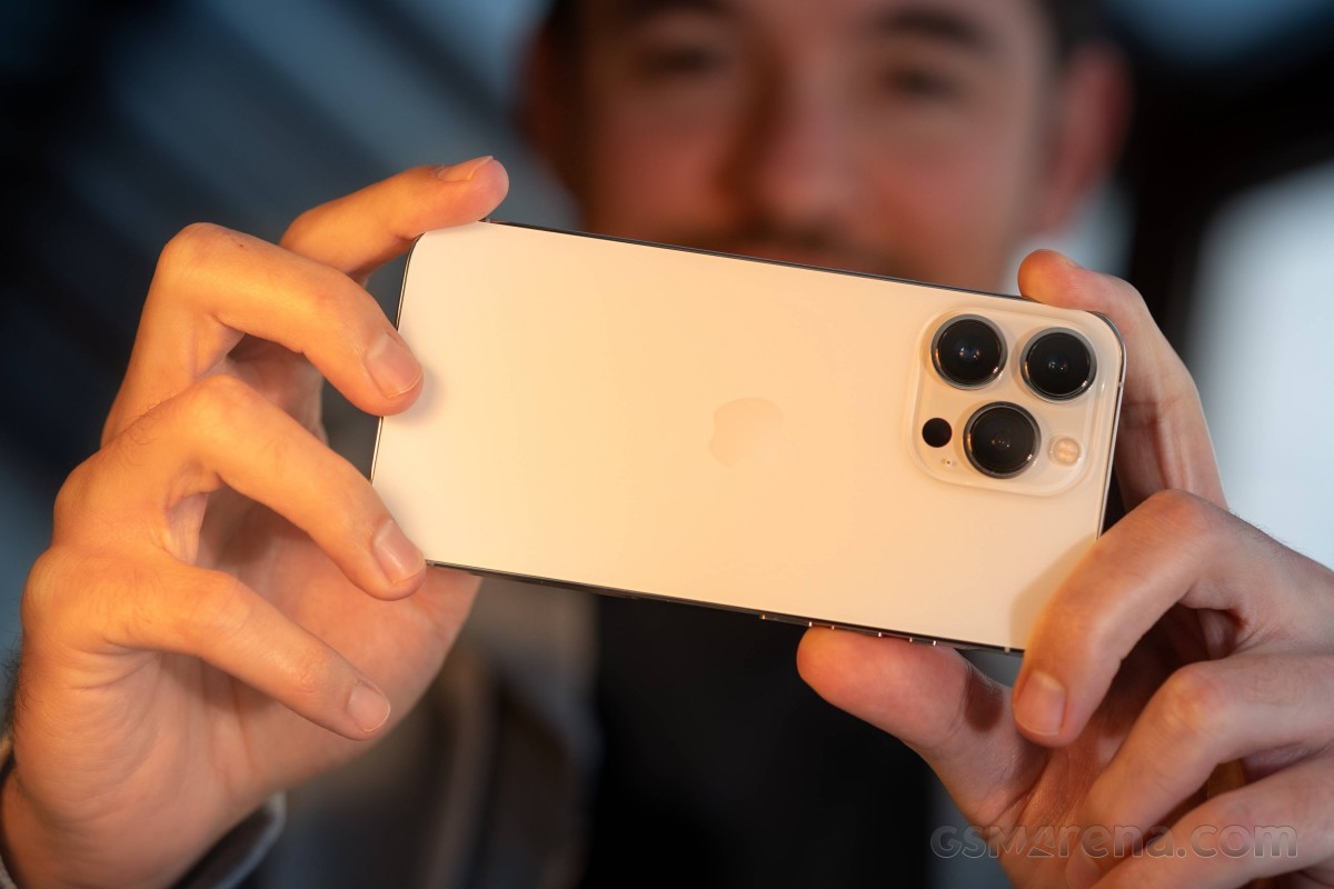
What's gotten bigger in 2021 is the camera island on the back. The improved imaging hardware is probably partly responsible, but we can see the design, marketing, and accounting departments pitching in to augment it further - the 13s must be recognizable as new, and reusing old cases is bad for the bottom line.
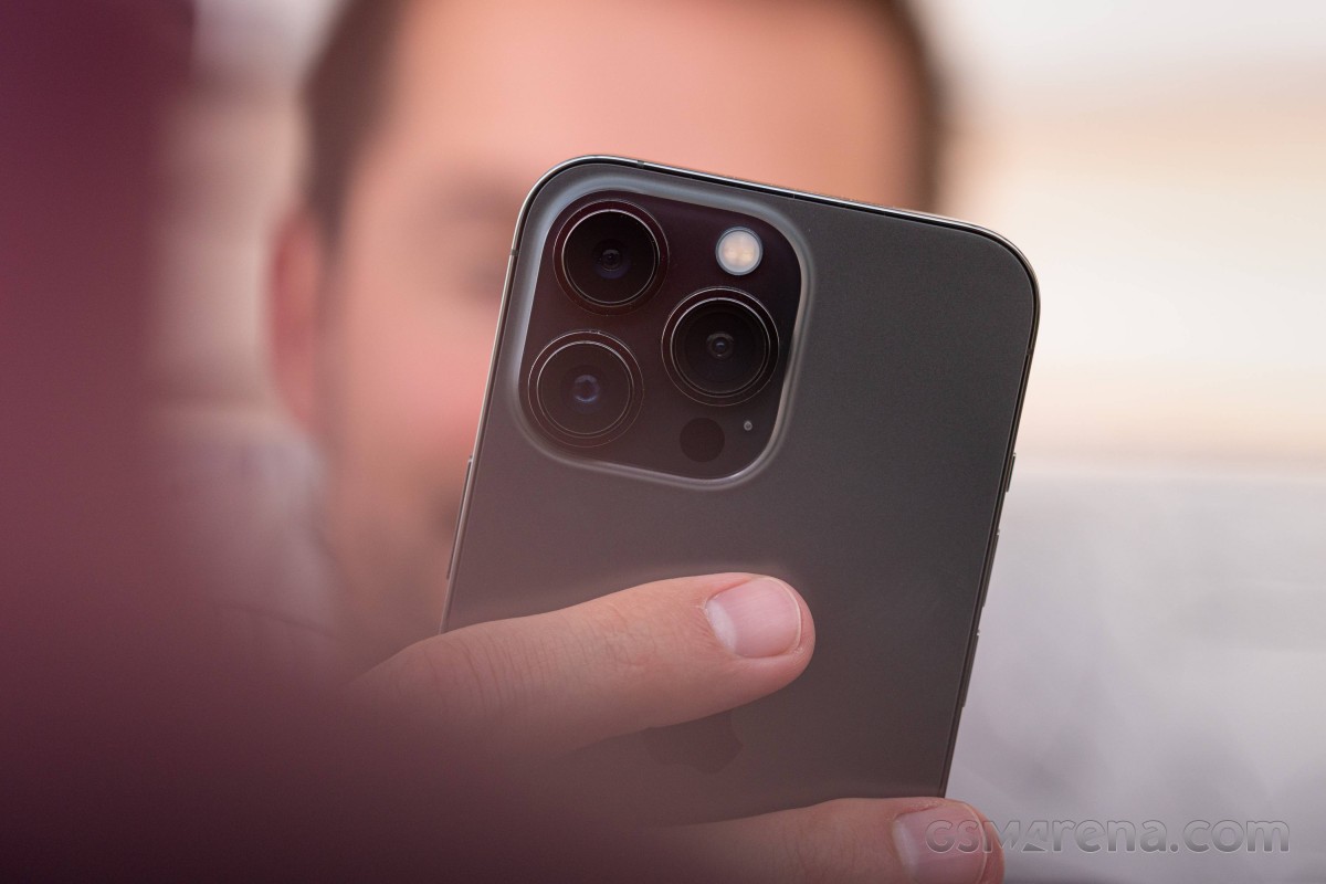
It's not a huge change, of course - it's still a triangle of cameras with some auxiliary bits nearby. That's the scope of the changes in the iPhone's looks this year - different enough to pass for a new model, but not a full redesign that everyone can easily spot.
Then again, the enlargement of the camera cluster is more noticeable on this smaller model than it is on the Max. After all, it's the first time the assembly extends beyond the vertical central axis of the back - it's big.
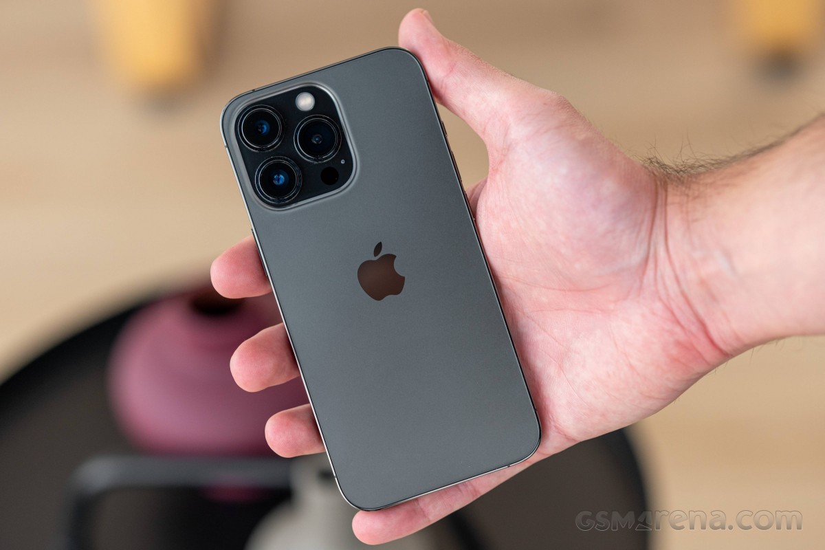
The 13 Pro also gets a larger battery than the outgoing model, but it's a marginal 10% increase. That has meant a similarly negligible change in thickness from 7.4 to 7.7mm - we'd say you wouldn't be able to feel that in your hands.
The new phone weighs over 200g now, and while the move from 189g to 204g may go unnoticed, switching to the 13 Pro from any phone of roughly the same size and proportions will certainly surprise you - it's way heavier than you'd expect.
There's the matter that a compact but heavy phone implies high quality and evokes associations of a premium product. But in absolute terms, it's just plain heavy. So if you're after a light phone, the 13 Pro isn't that - compact, maybe, but not light.
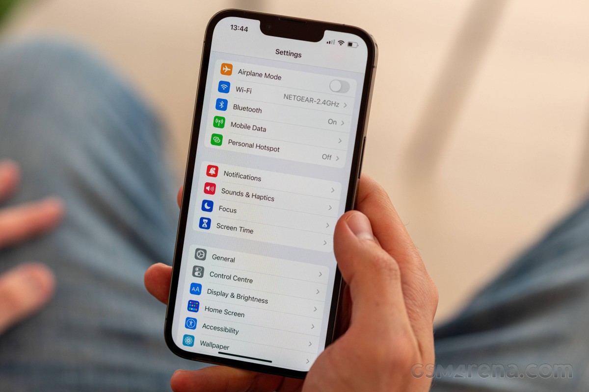
The list of small changes continues with the new Sierra Blue colorway that replaces the Pacific Blue of last year. We have the Pro Max in blue but opted for the good old Graphite on the Pro. The other two colorways are Silver and Gold - all four are shared between the two sizes.
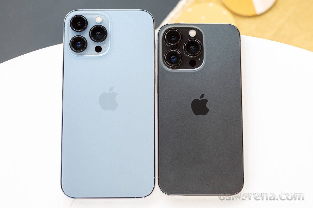 Sierra Blue iPhone 13 Pro Max (left) next to Graphite iPhone 13 Pro
There are no generational changes in the materials being used or the finish. The display is protected by what Apple calls Ceramic Shield, a Corning-made toughened glass that's supposedly the best in the business.
The rear glass panel has a matte finish that's possibly the most slippery one we've touched, the glossy Apple logo providing a lone island of grip. Conversely, the logo proudly shows fingerprints, while the rest of the back is almost immune to them.
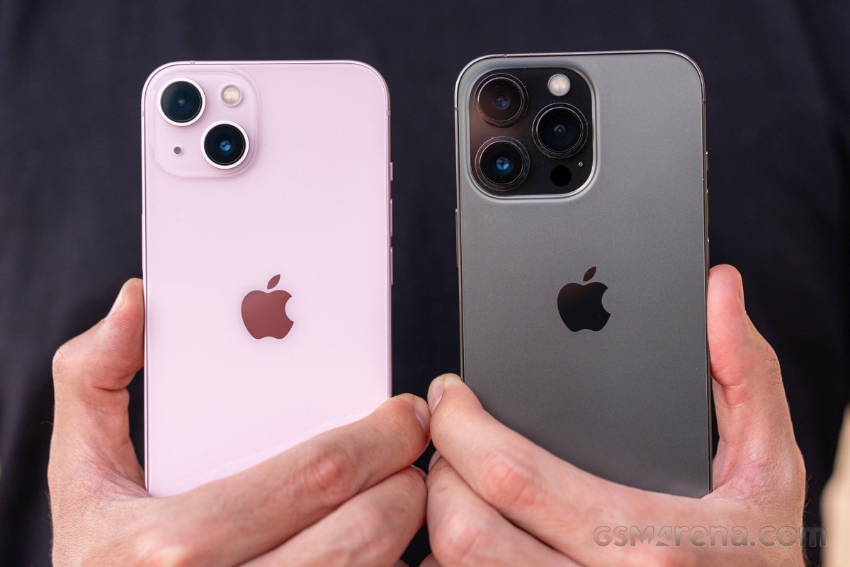 Glossy iPhone 13 (left) next to matte iPhone 13 Pro
Another fingerprint magnet, the polished stainless steel frame all around the phone, is easy to wipe but practically impossible to actually keep clean. The Silver colorway is arguably the worst in this respect - no one likes looking at a dirty mirror. The matte aluminum frames of the non-Pros are undoubtedly superior in this respect.
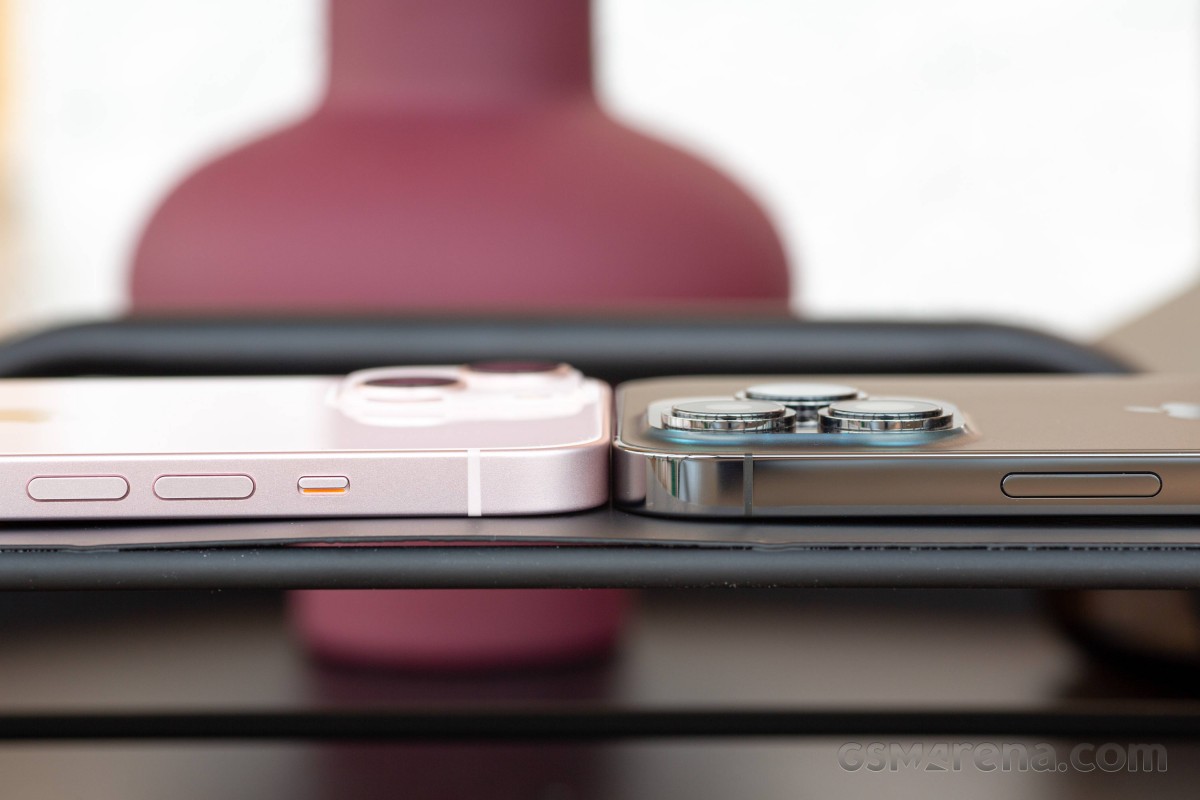 We like the matte frame of iPhone 13 (left) more than the glossy one of the 13 Pro
Along with that flat frame, you'll find the usual things in the usual places. The side key is the one thing that's on the right of the phone, while the left is home to the two separate volume buttons, the mute switch and the SIM tray. The still-surviving Lightning port is on the bottom, joined by the primary speaker and microphone as well as the classic pair of screws with five-pointed star heads - do these count as a design accent or a structural element?
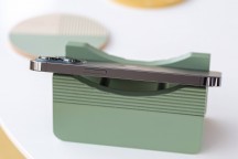
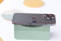
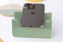
Power button on the right • Volume buttons and mute switch on the left • Lightning and stuff
The earpiece also serves as a loudspeaker in typical iPhone fashion. The rearranged TrueDepth camera bits have pushed it towards the edge, making the ensemble smaller in the horizontal direction but slightly taller. The bezels have the same thickness all around the display, which will please people who look into that kind of stuff and the black frame is neither too thick nor particularly thin.
The 13 Pro maintains the extended water resistance we saw on the 12 Pros - the IP68 certification requires the phone to survive 30 minutes 1.5 meters underwater; the iPhone should be good all the way down to 6 meters. You can't tell that by holding it, and you'd certainly better not test it, but it does sound reassuring.
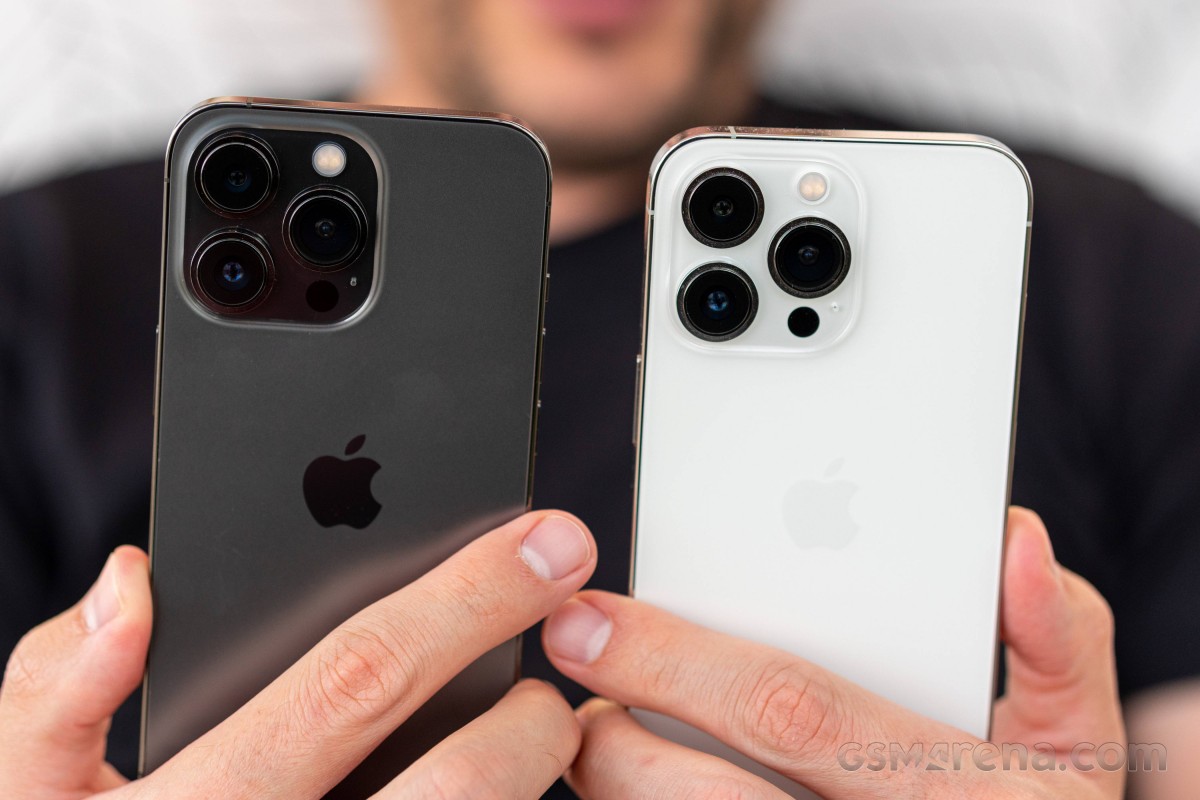 A couple of iPhone 13 Pros
We did already state the obvious about the 13 Pro Max, we'll say it again about the 13 Pro as well - it's little but a facelift of an aging design. Smaller notch, bigger camera bump, a different hue - you can look for and list the changes, but that won't change the fact that a more thorough restyling is due. It does remain a beautiful, recognizable handset with a premium look and feel - there's no denying that either.
Reader comments
- Sanish
- 08 May 2025
- 6kx
13 pro the Best iphone ever👌👌
- Anonymous
- 19 Apr 2025
- raQ
Yes. I'd highly recommend the 13 pro as you can find many great deals on it with tons of storage. Still competes with the latest iPhone at a fraction of the price! Hope you enjoy your new phone!
- AVerifiedPig
- 02 Apr 2025
- Lcd
I'm upgrading from a 6s. I can get a 13 Pro for under 500€ with a new battery but reconditioned. Worth it?