Apple iPhone 15 Pro long-term review
Design
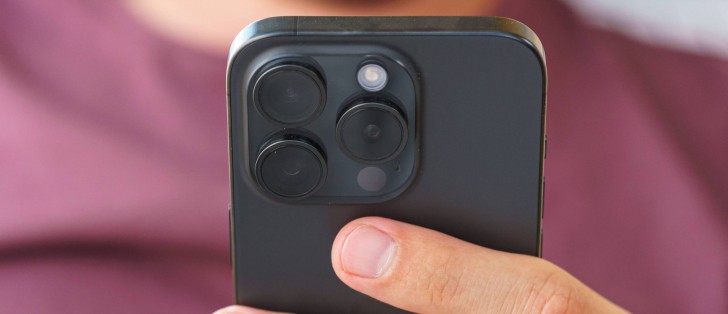
The design of the iPhone 15 Pro remains special in one specific way: size. In a world where compact smartphones are now on the endangered species list, Apple continues to produce its mainline smartphones in a size almost anyone would find comfortable. Sure, there are always the Plus or Max models if you have dinner plates for hands but the default iPhone or iPhone Pro is always this compact, accessible size.
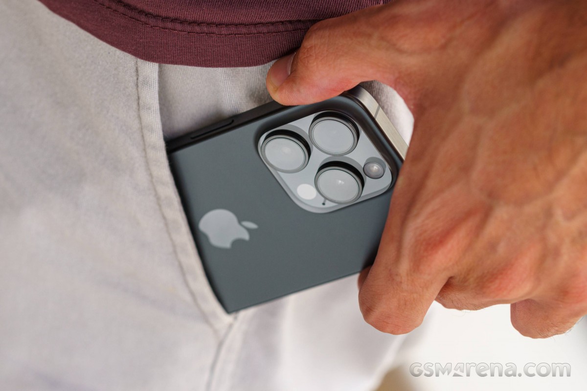
For anyone who carries their phone in their front pants pocket, the advantages of a compact phone need not be mentioned. It slips into the pocket easily, doesn't stick out too much when you sit, and there's even some room left for your AirPods case. Even if you put a case on, the entire device is still more compact and usable than most other phones in this category without a case.
With the iPhone 15 Pro, Apple pushed the accessibility needle further than its predecessor by switching over to titanium. This resulted in almost 20g of weight loss compared to the 14 Pro, which is pretty significant and noticeable when switching between the two phones.
Since we are on the topic of titanium, let's talk about it a bit further. Titanium is exceptionally strong for its weight but there were some concerns regarding how well the color finish would last on the models that do have color on them. After seven months of use without a case, we can say that the metal and the color of our Blue Titanium variant look as good as they did when it was new. Aside from being prone to attracting smudges, the metal shows no signs of damage nor has the color faded or scraped anywhere.
Of course, this may just be the result of taking care and never dropping the device but that's the bare minimum that is expected from you as the user of a super-premium device.
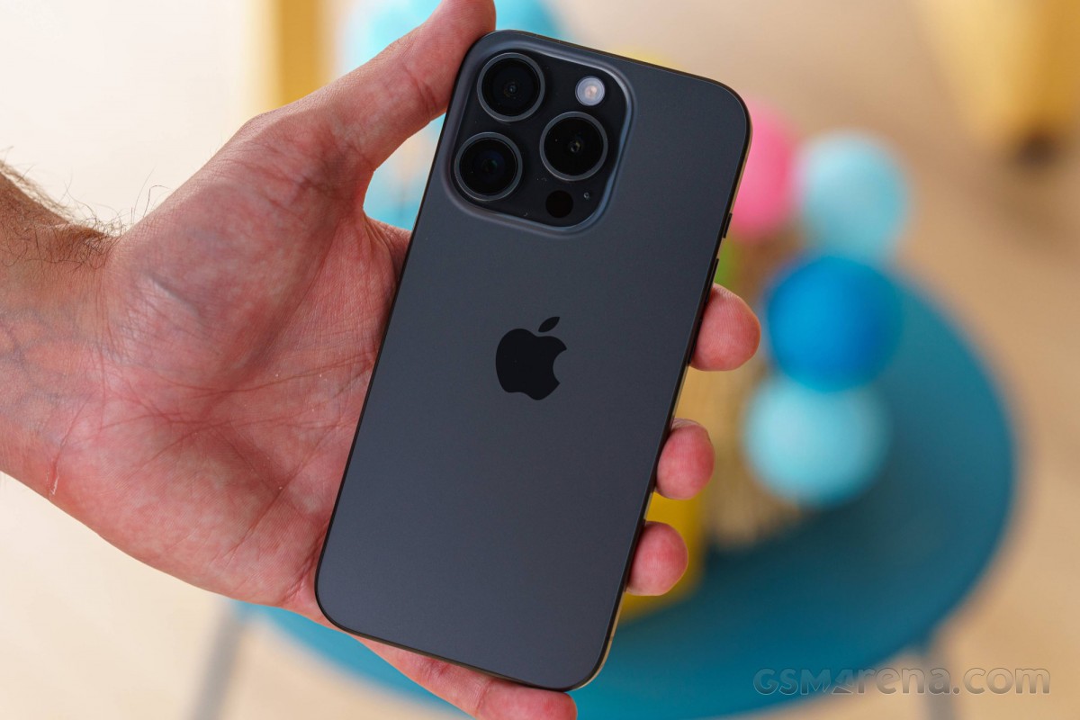
But while we do appreciate the weight savings of the titanium over the stainless steel and the fact that it comes at no loss to durability, the material just does not feel special in hand. If we were never told that it was titanium we most likely would have assumed it was just aluminum. That's what made the stainless steel body of the previous models so good as there was a jewelry-like quality to them that made them look and feel special. The titanium just feels ordinary in hand and the bland colors with matte brushed finish don't help.
The camera bump is also not particularly pleasant to look at. While the use of a different texture to the glass surrounding the lenses is a nice touch (even though it's the same as the rest of the back glass panel), the three lenses jut out too much. We also find having to clean all three lenses individually a bit annoying as on most other phones there is a single, easy-to-clean glass covering all the lens elements, and the design is definitely starting to show its age.
What's not showing its age is the flat-sided design. While many other phones recently have adopted this shape, it only really works well on a compact design like the iPhone 15 Pro as you can grip the entire phone properly, and feels impractical on larger devices. Also, the way Apple manages to make the two glass panels seamlessly meld into the metal frame is truly artful. There is no lip or raised edge to feel here as you slide your finger around the corners; one second your finger is gliding over glass, the next metal, and once again glass like it was nothing. It's not easy to achieve this without affecting the structural integrity of the glass but Apple gets it done somehow.
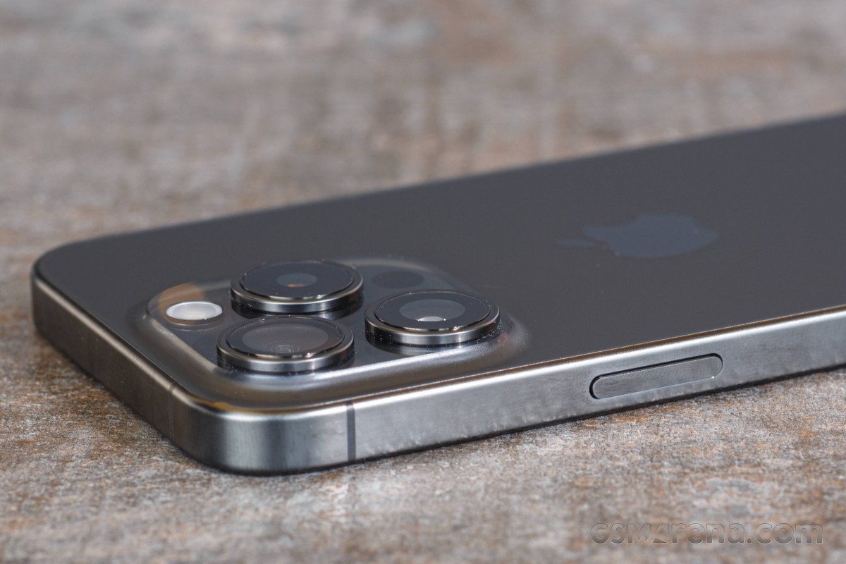
The inclusion of the Action button on the side was something new for this generation. After trying out the various preset options and even messing around with the Shortcuts feature to assign a custom workflow (like launching a new Safari tab, for example), we eventually just settled on using it as a mute switch the old-fashioned way. The old alert slider was a legendary feature for a reason and remains a very handy tool that we wish more phones had. So while the customizable aspect of the Action button is nice, mute still seems like the best fit for this button.
The last exterior feature we want to touch upon is the inclusion of USB-C. It's hard to imagine now after seven months just how much ink was spilled on this one aspect before and immediately after the iPhone 15 Pro was launched.
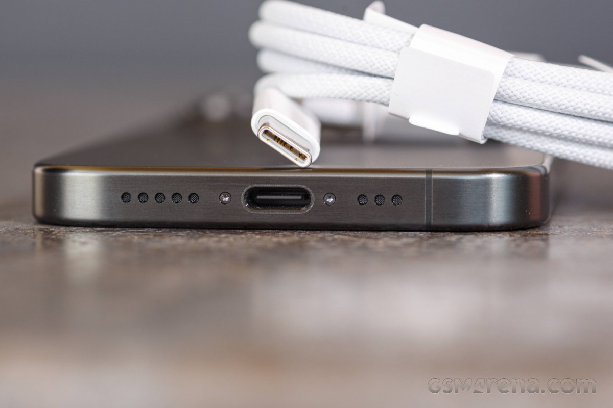
Looking at it now, it just feels like a normal feature you'd find on a normal phone, which is a good thing because it makes the iPhone 15 Pro feel like a normal phone that blends into your life and workflow instead of being a special princess that demanded its own special accessories that didn't work with anything else. Going on a trip somewhere with your laptop, camera, and phone? Guess what, you can now just charge all of them with the same cable. Want to borrow a stranger's charger because you forgot your own? Well, you can do that now because they probably have a USB-C charger, too.
Why it took this long and the looming threat of a government body intervening to get here is beyond us but we are glad it finally happened. Let's never talk about Lightning again.
Display
The display on the iPhone 15 Pro is unchanged from the previous generation model. You get the same 6.1-inch, 2556 x 1179 resolution 120Hz OLED panel with a peak brightness of up to 2000 nits.
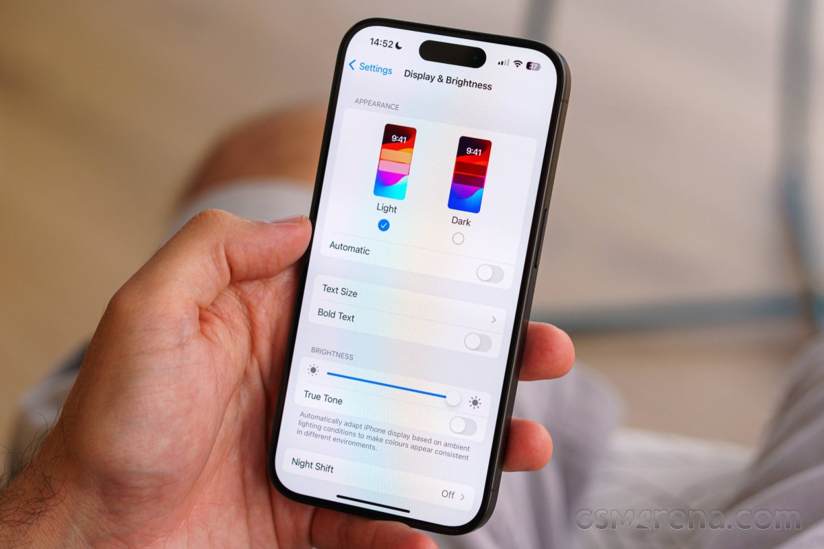
The way Apple handles the displays on its devices is definitely something to take inspiration from as the company rarely ever misses. We already have all the numbers in our full review from last year but the sheer accuracy of the colors and the way it handles wide color content is something every phone manufacturer should take lessons from. There are no color presets to fiddle with; the colors always look the way they should, provided you don't have True Tone or Night Shift enabled.
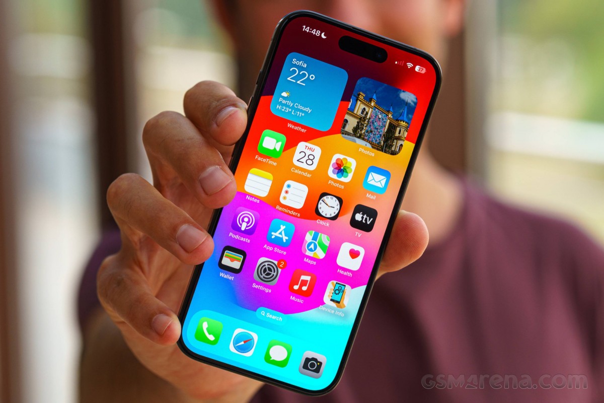
Even better is the handling of HDR content, although this may be controversial. HDR content always loads in high brightness and Apple takes advantage of the phone's display to make the non-video parts of the screen maintain its original SDR brightness levels. This means you can have an HDR video playing in a portion of the screen in the Instagram app and while the video will be searing bright, the rest of the UI around it will maintain the same brightness as non-HDR content. At times it almost looks like the rest of the screen has dimmed but that's only because your eyes have adjusted to the brighter HDR content on screen.
The reason this is controversial is that people don't like being flashbanged by random HDR videos on their timelines while just scrolling through Instagram in bed at night. Instagram supports Apple's HDR video and because iPhones that can record in Dolby Vision have the feature enabled by default (without most people realizing), a lot of video content on the app is now unintentionally in Dolby Vision, which can get seriously bright as it appears out of the blue on your feed. At present, neither Instagram nor Apple provide a way to disable viewing this content in HDR, which annoys a lot of people.
The display's high brightness does come in handy outdoors, as the iPhone 15 Pro has exceptional visibility under direct sunlight. The display seems completely unaffected by the fact that it is competing with a star for brightness and remains exceedingly clear outdoors no matter how bright it gets.
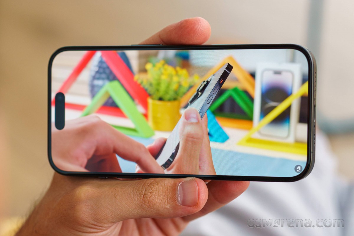
The 15 Pro also benefits from the smallest bezels yet on an iPhone. These are some of the thinnest bezels we have come across and a lot of the time it feels like just holding the screen as the bezels just meld into the dark body of our Titanium Blue model.
As for the Face ID pill at the top, it becomes second nature to ignore it when using the phone normally in portrait orientation. It's only when you turn the phone around and hold it sideways to watch videos or play games do you notice it and then it's hard to ignore. It especially takes up more space on the smaller iPhone 15 Pro than it does on the Max model since it's the same size regardless of the phone. If you are someone who regularly uses your phone for videos or games then this is another reason to go for the bigger model.
One thing we noted over our time using the phone was the oleophobic coating slowly eroding around the bottom left and bottom edge of the phone. These are usually the places you tend to swipe from to go back and to go home and there were permanent smudges there. For now, these are just tiny slivers around the edges of the glass and are barely visible but could grow over time.
Lastly, we had a few notes regarding the refresh rate behavior. While it's cool that Apple got on the high refresh rate train a few years back with the iPhone, the way it's enforced does leave something to be desired. It seems Apple does leave it up to the developer to implement high refresh rate the way they see fit. We have come across apps that either don't support it at all or do so where some animations are clearly taking place at 60Hz even if the rest of the app is animating at 120Hz. These can be quite distracting and we have yet to come upon anything similar on Android, where an app either supports high refresh rates totally or not at all.
Having said that, Apple's own apps and many of the well-made apps work just fine. Even the default Camera app refreshes at 120Hz, something you'll never see on Android where the camera app is usually locked to 60Hz resulting in choppy UI. Also, a lot more games support high refresh rates on iOS than they do on Android. Games like Genshin Impact don't even have high refresh rate support on Android but can go up to 120Hz on the iPhone. It's just another reason why you would want to be on Apple's platforms if you are into mobile gaming.
Reader comments
- CamoGeko-XDA
- 21 Mar 2025
- AJX
I have it in black and it’s a great looking device. Although if I could have found it in blue I probably would have gone for that colour instead.
- Anonymous
- 07 Sep 2024
- XBE
GSMArena please is that a titanium blue or black? Or are there 2 iPhones 15 pro in 2 different color?
- The Top Zone
- 07 Sep 2024
- m%u
We also found it to be an exceptional device and have recognized it as the best overall in our Best Smartphones of 2024 guide (https://thetopzoneblog.com/top-picks/best-smartphones-2024/). Its performance, camera quality, and overall design truly set...