Apple iPhone 15 Pro Max review
Apple iOS 17
All new iPhones come with Apple's iOS 17 out of the box. The new iOS version is the most insignificant update ever, no matter what Apple may try to sell you. It brings a new Standby mode, highly customizable Contact Posters, Password sharing with friends, offline maps in Maps, updated Messages with automatic SMS code deletion, and interactive widgets, among a few others.
Let's take a closer look at the iPhone 15 Pro Max's iOS 17 now. Its interface is still based on homescreens populated with apps and widgets, App Library for your less important apps, and Notification and Control Centers.
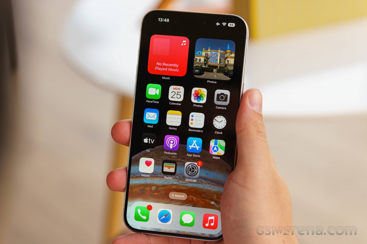
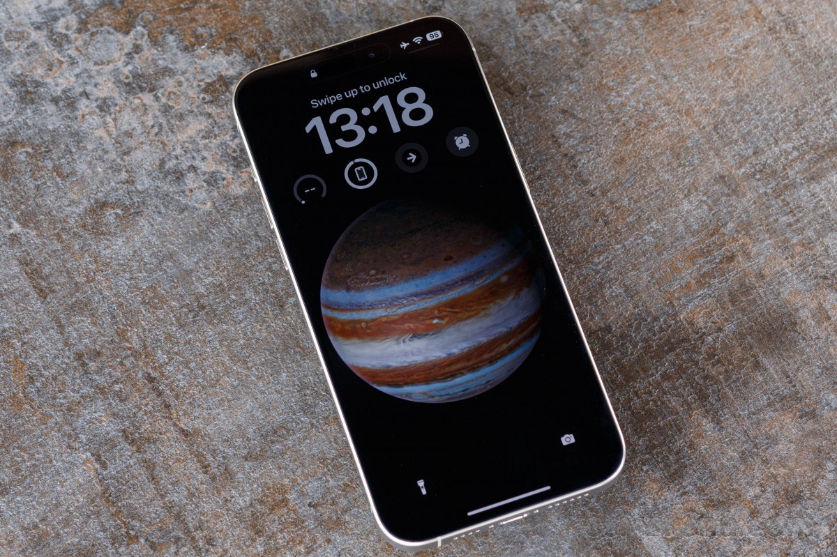
The lockscreen on iOS 17 follows a familiar logic - it's one with the Notification Center and houses your notifications, plus shortcuts for the torch and the camera. The Always-on option is available on the iPhone 14 Pro or later, and you can opt out of the wallpaper if you prefer.
There is now a new optional Standby mode, which activates during charging when the phone is put into landscape orientation. It is sort of a landscape Always-on with a bigger clock and calendar. It can show notifications, too. There is also a Night version with red colors.
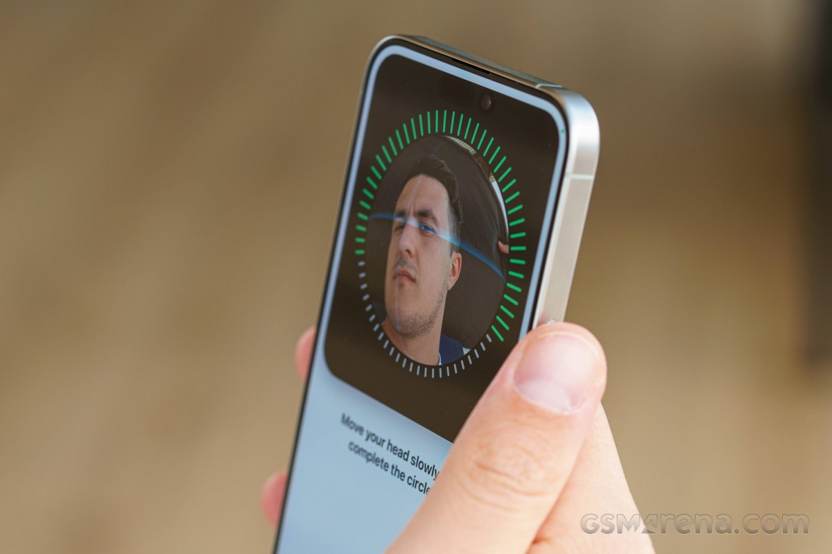
You can get past the lockscreen via Face ID or PIN if you've opted for secure unlock.
You can customize your lockscreen by picking from some cool wallpapers and adding a row of widgets (up to four). There can't be more than one row of widgets. The neat thing is that you can build a couple of different lockscreens and switch them on the go (tap and hold, then swipe). This way, you can easily change the look of the homescreen/notification center depending on your mood or situational context.
You can also pair your homescreen look with the lockscreen and change both in one go.
The Action key triggers on/off when you long press it. There are a few predefined actions - silencer, torch, magnifier, camera shortcut, Focus, Voice Memo, Shortcut, and No Action. The Shortcut option allows you to assign any configuration you've set up within the shortcut app and opens thousands of possibilities.
Your apps usually populate the homescreen(s) and widgets. There are two specific screens - the leftmost is the Today page, while the rightmost page - App Library.
You can hide specific homescreens - you may have a page that's full of games and hide it when at work or hide a page of work/school apps when on vacation. You can't opt out of Today and App Library, though.


Lockscreen • Homescreen • Today • App Library • Hide homescreens • Task switcher
The Focus functionality is here to stay - you can assign a Focus mode on each lockscreen preset you create. And in addition to all other ways of switching between Focuses, now switching between lockscreens also changes the Focus mode.
There are different Focus modes like Work, Personal, Driving, Gaming, and Do Not Disturb, among others, highly customizable at that. And you can create and automate your own, of course.
Widgets can be placed on any of the homescreens and the Today page, and they can coexist with app icons. There are three widget sizes supported by iOS - 2x2, 4x2, and 4x4. You can stack widgets of the same size on top of one another, and, optionally, they can rotate automatically.


Widgets • Widgets • Widgets • Stacked Widgets
The widgets are now interactive - you can tap on some of them and change things without going into the app. For example, if you have a Home widget, you can turn on/off devices straight from the widget.
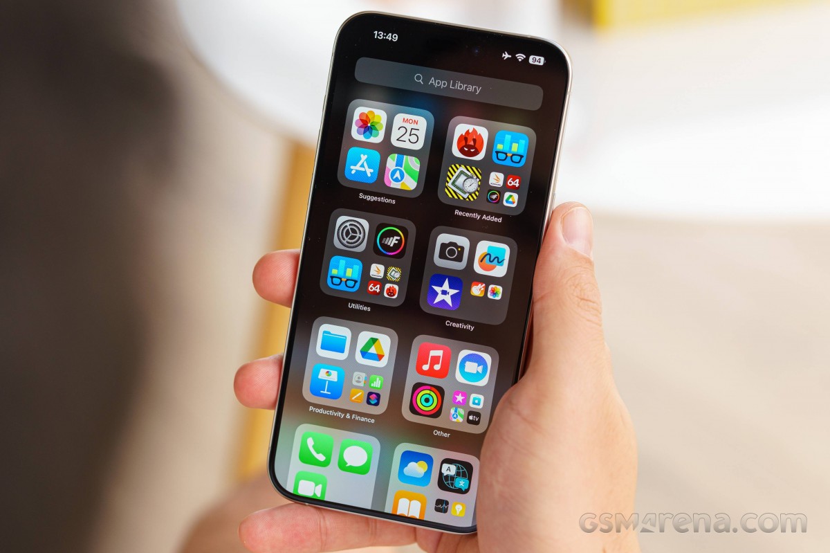
The App Library is an app drawer, which is always your rightmost homescreen pane. Apps are added automatically to the App Library upon installation. The sorting is also an automatic process, and you can't edit the categories or move apps in different categories. The app sorting depends on the App Store tags the developer has used upon uploading the apps.
The Today page is still alive. You can put the same widgets and stacks you can on your homescreens. Here, you can also use the old third-party widgets that still need to be optimized for newer iOS versions. The old widgets come right after the new ones, should you choose to use some new ones, of course. It's a pity this Today page cannot be disabled, as we found it mostly useless.
The Notification Center is summoned with a swipe from the left horn or the pill itself. The pane was unified with the lockscreen in iOS 11, and that's why you can have different wallpapers on your homescreen and notification center.
The Control Center, which has customizable and (some) expandable toggles, is called with a swipe from the right horn. You can use tap and hold on any element to access additional controls. And the battery percentage is also here.


Today • Today settings • Notification Center • Notifications • Control Center
The Task Switcher hasn't seen any updates - you see app cards and swipe them for closure. You can also swipe on the gesture line for quick switching between apps.
The Dynamic Island allows for more convenient multi-tasking. This is what Apple calls the i-shaped cutout and its animations and convenience features. For all intents and purposes, the Dynamic Island is a pill-shaped notch as Apple has blackened the middle part for aesthetic purposes. There you will see the mic and camera indicators and nothing else.
The animations around the island always use a black background. There are three Island modes. Standard form - inactive island or just accommodating camera/mic indicators.
The active form is a longer pill-shaped notch with info on both the left and right side for certain events, alerts, and notifications. This long pill can also split into an i-shaped one if you launch another compatible app that can be minimized here, like the Timer.
There is also a third form that expands into a pop-up balloon - this can be invoked by a tap and hold on the small animation. A tap will open the respective app instead, though. We think these gestures should have been inversed or at least configurable, but as usual - Apple knows best.


Indicators • Dynamic Island • Dynamic Island expansion • Dynamic Island
The Dynamic Island incorporates different things - starting with the Face ID animation, charging animation, music info (Music, Spotify, Amazon, YouTube, Soundcloud), call info (Phone, WhatsApp, Skype, Instagram, Google), timers, etc. If you activate a second app that needs to use the Dynamic Island, you get a sweet animation that shortens the island and adds a small icon on the left side.
The supported system alerts include calls, AirPods and Watch connections, Battery and Charging, Focus changes, AirDrop, Face ID, AirPlay, NFC events, SIM alerts, Silencer on/off.
Let's mention some of the new features.
FaceTime now supports leaving audio and video messages for when you're calling someone and they aren't available.
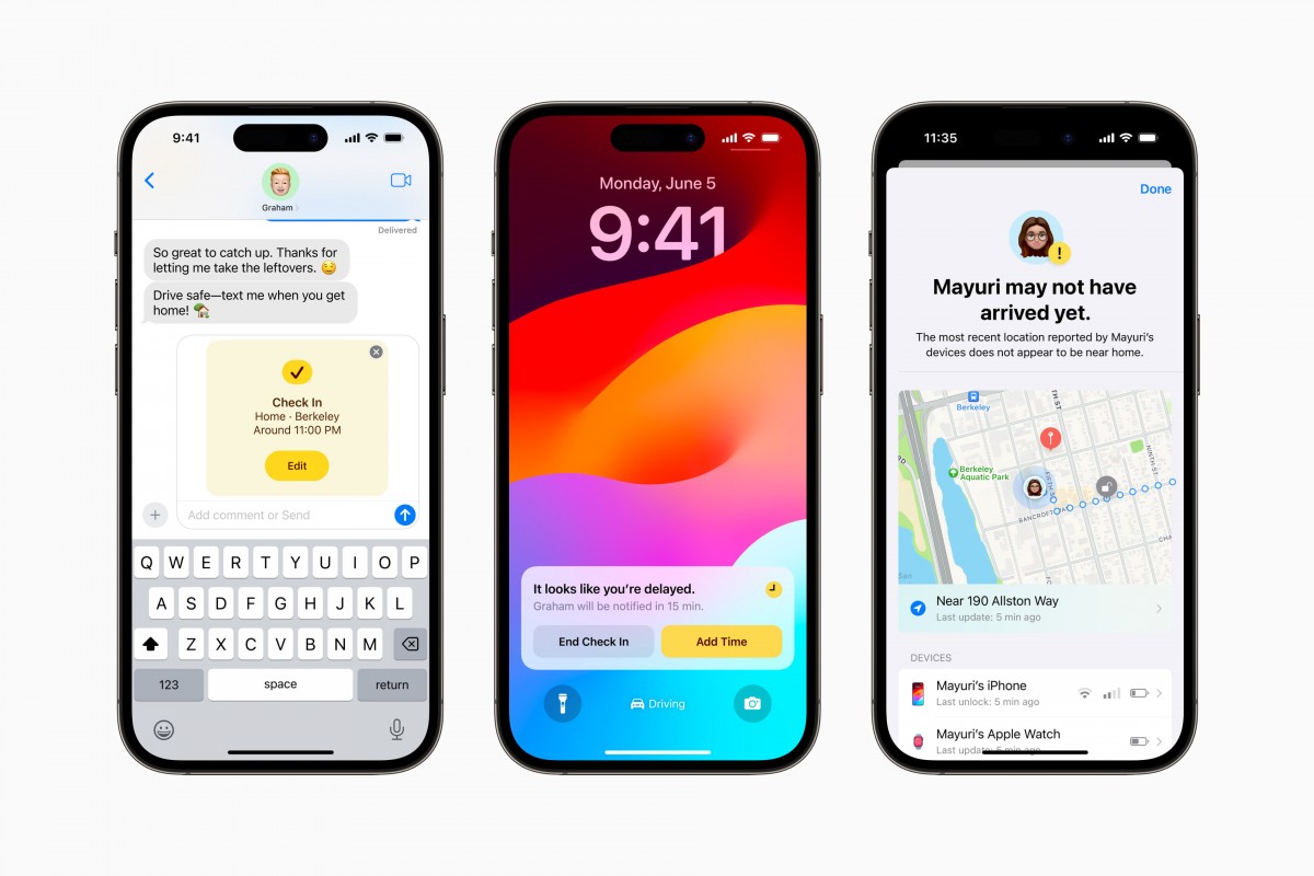
Messages now has a Check In feature. It takes over the chore of checking-in with family members while traveling. It works like this: once you've initiated a Check-In, a friend or family member will be automatically notified when you've arrived at your destination. If you're not making progress toward the destination, the selected contact will get your device's location, battery level, and cell service status.
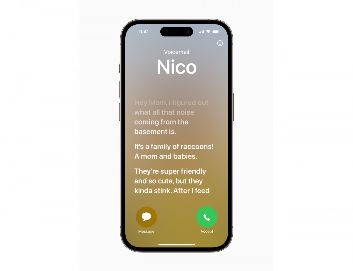
Live Voicemail is an interesting new feature. Now, you don't have to pick up when a number you don't recognize is calling - the phone will do that for you and will display the live scrolling text of what the person calling is saying, so you can easily decide if it's worth talking to them. Calls identified as spam by carriers won't appear as Live Voicemail and will instead be instantly declined. The transcription is handled entirely on-device.
There is a new customizable call screen, which Apple calls Contact Posters. You can change how they appear and choose beautiful treatments for photos or Memoji, adding "eye-catching typography" and font colors. These work in third-party apps as well, and they're also used when you want to share contact details with someone through a new feature called NameDrop - it's as easy as tapping your phones together (or an iPhone and an Apple Watch), and the contact cards are swapped.
The multimedia is handled by Apple's default apps - Photos, Music, TV.
The Photos app's library has four different views - Years, Months, Days, and All Photos. AI-powered search options and powerful photo and video edit modes are available, as usual. Visual Lookup is here to stay - you can smart crop an object or copy text from any photo.
The TV app is part of iOS 17, and it is your default video player for locally stored movies and shows you've added via iTunes. This is also the digital store for movies and TV shows, and it is also the place where you find the Apple TV+ streaming service. A bit overwhelming, but you get used to it eventually.
Music is the default player, and it relies heavily on Apple Music. But even if you decide not to use the streaming service, it can still do an excellent job if you have a few minutes to add your songs via iTunes.


Photos • Photos • Photos • TV • Music
Books are here for your documents, PDFs, and eBooks. Stocks and News are onboard. Safari is your default web browser, now upgraded with Face ID for the Private tabs, and Apple Maps is your default map client, which now supports offline maps.


Books • Books • Safari • Safari • Maps
The LiDAR scanner is onboard on the latest Pro models, too. It measures distances by firing laser beams and measuring their reflections with a dedicated sensor. This way, the phone can make a super accurate 3D representation of an object and later place it virtually anywhere. Thinking of new furniture? This will be perfect. Want to compare the size of objects you can't put next to each other - LiDAR will help.
The LiDAR scanner is also very accurate at measuring distances, and you can use it just for that - like a fancy digital tapeline. Or you can set a distance and see virtual walls in real-time at the predefined distance. Professionals such as interior designers may find the LiDAR scanner a handy tool. Thanks to the powerful AR capabilities that also come as a bonus with LiDAR, you can also have an amazing AR experience with compatible apps and games - there are plenty available on the App Store.
All recent iPhone models support Emergency SOS via satellite. This service is text-only and will be used primarily for emergencies, but it does support two-way communication, so you will be notified when rescue is on the way. The Find My app will also be able to share your location with friends so that they can keep an eye on you.
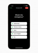
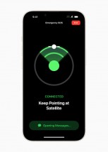
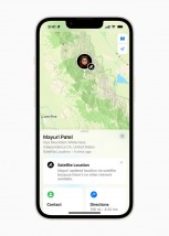
The new satellite messaging service • An emergency questionnaire • Find My reports location over satellite
You can compose custom messages to explain your situation, but when speed is life-saving several specially-prepared questions will let you send out a detailed SOS in just a few taps. The new feature added for this year is Vehicle emergency satellite services. It will require an active roadside assistance subscription, initially with AAA in the US.
In locations with a clear view of the sky, a message can be transmitted in about 15 seconds, but if there are trees overhead, it may take a couple of minutes. iPhone buyers will be getting two years of free satellite services, after which a fee of some kind will be incurred for the feature. Emergency SOS via satellite is available in Australia, Austria, Belgium, Canada, France, Germany, Ireland, Italy, Luxembourg, the Netherlands, New Zealand, Portugal, Spain, Switzerland, the U.K., and the U.S.
Crash Detection is also available on all iPhone 15 models, thanks to a new accelerometer that can detect up to 256G. If such an emergency occurs, the phone will automatically contact emergency services. This is a setting within the Emergency SOS menu called Call After Serious Crash. You can either turn it on or off; there are no other settings.
Finally, let's spend a minute on connectivity.
The new USB-C port on the iPhone 15 Pros adheres to the USB 3.0 standard and supports up to 10Gbps transfer speeds - compare that to the USB 2.0-compliant vanilla iPhone 15s and their 480Mbps data transfer cap.
Video output is supported as well (Display port DP) via Type-C Alt mode, which means that most standard Type-C hubs with a video interface should be able to get an image from the phone. By default, you get a mirror of the display without any other fancy options like a dedicated desktop mode or anything of the sort. In other words, it does a simple screen mirror for the UI.
In terms of resolution, the iPhone appears to be outputting in 4K (2160p) or at least near that, but in a 19.5:9 aspect ratio to match the phone's display - the TVs we connected it to, reported a 2160p signal.
However, certain apps behave differently; some, like the Photos app and Netflix, offer dedicated casting of content to the display in a 16:9 aspect ratio. Other video apps, like YouTube, however, don't have said dedicated video casting behavior and are stuck at 19.5:9 aspect ratio and 4K resolution, leaving the image both letter-boxed and pillar-boxed. There is seemingly no way to control this behavior, and it is a bit of an inconsistent mess.
The iPhone does offer some display settings when connected to an external display, mainly dealing with the selection of HDR or SDR color mode where supported, as well as a toggle for the ability to automatically adapt and match the output resolution to the content being played.
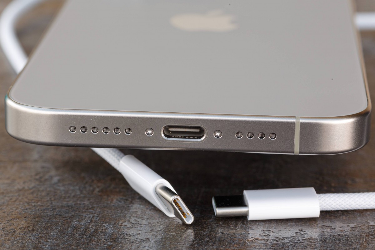
All iPhone 15 models also support USB Host mode, and we successfully hooked up a mouse and keyboard. The keyboard started working instantly, but getting the mouse to pick up and actually show an on-screen cursor required enabling the Assistive Touch option in Settings. USB thumb drives, card readers, and hard drives work fine and automatically mount and appear in the Files app. Compatible external storage is also recognized by the Camera app, and you can output ProRes videos there.
Various USB-C game controller/phone holders are supported, too. Anything that works on Android via USB-C should work on the new iPhones as hassle-free.
Finally, we saw quite a few people asking about the iPhone 15 Pro Max signal reception. We found that on par with the 14 Pro Max - we never lost signal in the city, even when inside all-metal elevator cabins or underground garages. The call quality, even with a single bar of signal, was excellent. We found this iPhone to have better 4G, 5G and Wi-Fi reception than the Sony Xperia 1 V and 5 V, the Huawei Mate 50 Pro, and the Galaxy Z Flip5 and Tecno Phantom V Flip (those were around the reviewer(s) at the time of testing).
Reader comments
- Ingvaar
- 22 Apr 2025
- JK{
Hi, I agree with you on a lot of points you made, but I have to make a little correction. When you type and you make a mistake, you can go back and correct it by pressing and holding the space button on your keyboard and moving your finger (like s...
- NeilLaw
- 13 Dec 2024
- m5Y
My first and last iPhone. I honestly don't know how to begin my frustrations. Being a long time android user I was looking forward to the "it just works" however Lack of decent keyboard options, SwiftKey and gboard feel feat...
- Anonymous
- 19 Sep 2024
- IbL
Then the phone would be too expensive and the charging would take to long and they w8uld need to redesign the entire case to fit the battery


