Apple iPhone 7 review: Jacked up
Jacked up
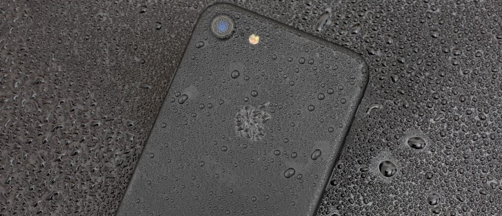
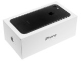
Unboxing the Apple iPhone 7
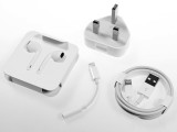
The Apple iPhone 7 comes in a very familiar box, which packs an A/C adapter, a Lightning cable, and a pair of EarPods ending on a Lightning plug.
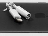
There is also a Lighting to 3.5mm adapter so you can continue using your headset of choice. You can get extra adaptors from Apple if you like to have a designated adapter for each of your headphones.
Apple iPhone 7 360-degree view
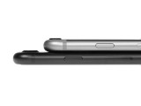
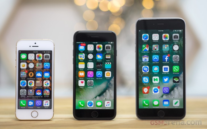
At 138.3 x 67.1 x 7.1mm, the iPhone7 is exactly the same size as the 6s. The new flagship managed to somehow lose 5g down to 138g.
Design and build quality
Next year is the iPhone's 10th anniversary and that perhaps explains why Apple settled for refining the iPhone 6 design instead of going for a complete overhaul. Or they might have wanted to avoid a double shocker where people end up hating the new look, blaming it for the missing audio jack and "fake" Home button.
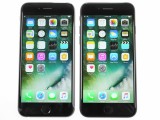

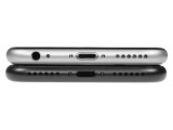
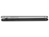
Apple iPhone 6s next to the iPhone 7
Speculation aside, the iPhone 7 may look too familiar, but feels different enough and still pretty relevant. A subtle change makes a good enough difference - the antenna strips have been pushed all the way to the top and bottom, following the phone's curvature. They are less intrusive this way and almost invisible on the black and jet black models.
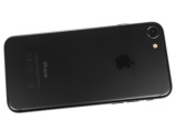
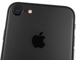
The new antennas flow with the phone's curves • How it used to be
We've already seen similar antenna design in phones like the Meizu Pro 6 and Apple did well to acknowledge the need for improvement.
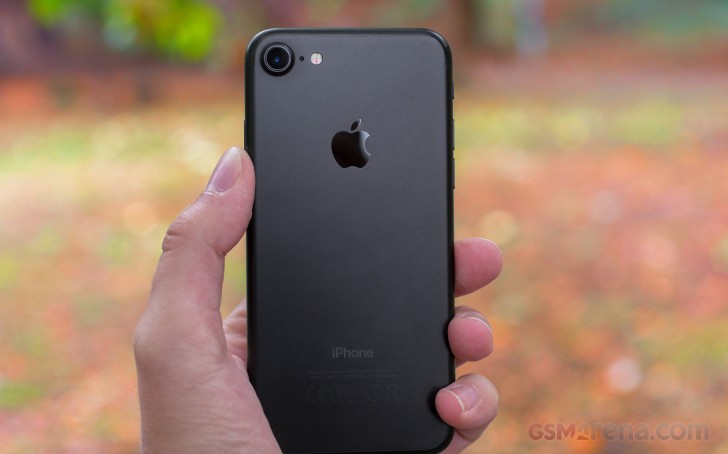
There are two other visible changes to the iPhone 7's unibody design: the camera hump is bigger but also more discreet and, of course, there is no audio jack.
In recent times every new generation of iPhones has introduced a new color option, and the 7th is no exception. Apple has retired the Space Gray paint job in favor of two new Black options. Just Black is the new matte black flavor featuring the same grippy finish as its Space Gray predecessor, while the Jet Black is a true blast from the past.
The Jet Black iPhone 7's glossy finish looks amazing and evokes fond memories of the iPhone 3G and 3GS. It is only available for the 128 and 256 GB models, which suggests Apple considers it the premium color option.
Unfortunately, the Jet Black edition is highly scratch-prone and picks up fingerprints in no time. Even Apple admitted the Jet Black phones are not for everyone as their shiny looks are rather easily ruined by scratches unless protected by a case.
Handling the iPhone 7 is a pure pleasure - it's very thin and lightweight, while the 4.7" screen makes it one of the most compact flagships out there. Even though the iPhone 7 is rounded in shape, the matte finish provides a secure enough grip, while the waterproofing will take your worries away even if you do drop it in water.
Quite expectedly, opting for the Jet Black one will require some extra care, but we must admit it looks even better than its matte counterparts.
Apple did a great job of making the new iPhone 7 a competitive and attractive proposition, even though the design is not what you would call new. It still feels as premium as it did two years ago.
Controls
At the bottom of the iPhone 7, there is the Lightning jack and two grilles. Teardowns have revealed that there is a mic behind both of these grilles, but one is joined by the phone's primary speaker, while the other sits next to a seemingly unused space inside the phone. Apple responded to that and claims it's a barometric vent, which is used to allow access to the ambient air for the barometer sensor in the otherwise water-tight body of the iPhone 7.
A notable omission on the bottom is the 3.5mm audio jack but more on that later.
The top of the iPhone 7, on the other hand, is perfectly clean.
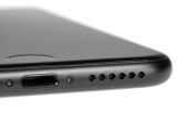
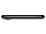
The bottom • the second speaker • the top
The left side of the iPhone 7 has the well-known mute switch and the two volume keys. The right one houses the power/lock key, and the nano-SIM ejectable slot.

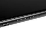

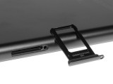
The left side • the mute switch • the right side • the nano-SIM slot
Finally, the back of the iPhone 7 shows the only visible change - the new antenna bands moved to the top and bottom. The camera lens is bigger and is less protruding and there is a new quad-LED true-tone flash around.
The small hole between the lens and the flash is the third microphone found on board the phone - most probably the one that is used for noise-cancellation during calls. It's real shame that with all those mics on board that iPhone 7 still records its videos with mono audio. But we digress.


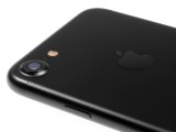
The redesigned back • the new camera
The front of the Apple iPhone 7 is familiar, though there are a few surprises beneath the surface. Above the screen is the earpiece, the new 7MP FaceTime camera and a bunch of sensors.
The earpiece now doubles as a speaker, part of the two speaker setup introduced with the iPhone 7. The second speaker is where it has always been - at the bottom under a nicely carved grille.


The front • the earpiece/speaker
Below the screen is the second novelty - the Home button with a second-gen Touch ID fingerprint sensor. While the ID scanner is the same as on the iPhone 6s, the Home key is something we have a lot to talk about.
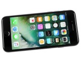
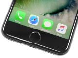
Below the screen • the new Home key
First, it's no longer a button. It's a flat round piece, which does not physically sink in when pressed. Instead, it's connected to Apple's updated Taptic Engine inside the phone. The iPhone 6s also had a Taptic engine but the module was much smaller.
Thanks to the taptic engine, the key is pressure sensitive and can differentiate between pressing and tapping.
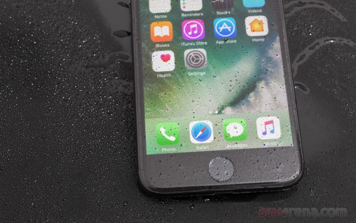
The Taptic Engine works nice and creates a nice illusion of a real click. You can even configure the force of the feedback. It may take a few days to get used to the new clicks, but once you do, and trust us - you will, you'll hardly miss the old physical feedback.


Configuring the feedback for new Home key
But some of us are still missing the reassuring travel of a physical key and can't shake off the feeling that the new key feels like innovation for the sole sake of innovating as opposed to filling a particular need. Not only the press feedback is inferior to a real button but the bigger Taptic Engine module is now occupying a big part of the space vacated by the 3.5mm audio jack.
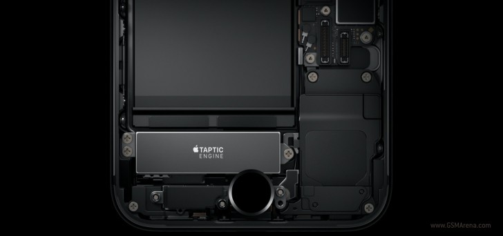
Of course, we wouldn't have objected if the pressure-sensitive Home was the only way to ensure waterproofing but we can see both Samsung and Sony making waterproofed phones with physical keys.
There is another aspect and that's longevity and repairs - Apple may as well have gone for the new key design so that they don't have to deal with faulty Home buttons and phones bricked (the infamous Error 53) by unauthorized replacements of faulty button/fingerprint sensor combos.
But whatever the reason for this move, the worst part is that Apple is not frank about it. It's instead beating around the bush claiming technological innovation while the replaced part provided better user experience overall.
It's the same situation with the 3.5mm audio jack. It's like Apple is hiding the real reasons for removing it. They didn't really need to get rid of it because they don't have an industry-wide standard to replace it with except... Bluetooth. Could it be that it's the push towards wireless Bluetooth audio to blame? After all, the company just came up with a new wireless set called AirPods, which retails for $159. No, we're not conspiracy theorists.

Reader comments
- BABABOI
- 05 Aug 2023
- 3rL
Yes
- BABABOI
- 05 Aug 2023
- 3rL
Hello, I am the owner of IPhone 7. I want tell you my experience that I had with this phone for 2 years. So, let’s start with just how cheap did this phone become. For me it had a price of 50$. And I wanted to try it. And I did not expect it to ...
- Anonymous
- 11 Jun 2023
- Nu6
but they still made it better than the androids ...eg the measurment app
