Apple iPhone X review
Apple iOS 11 on the iPhone X
The Apple iPhone X runs on the latest iOS 11. Now that there is no Home key this iOS version was exclusively tailored for the X with new gestures and functions. Other than that, it's the same iOS 11 that was announced back in June. It's not a major or redefining upgrade. Instead, it focuses on refining the design, adding new usability features, and introducing advanced machine learning.
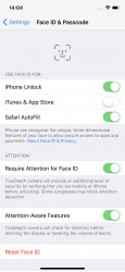
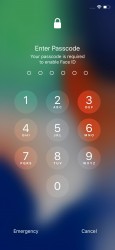
The departure of the Home key meant also retiring the Touch ID and replacing it with something else. And that's the Face ID. Apple managed to miniaturize the technology behind Microsoft's Kinect sensor and put it in the iPhone X for accurate faces recognition. The X can memorize only one face, which is somewhat a bummer, but other than that it works just as accurately and fool-proof as advertised.
It takes less than a minute to setup Face ID and then it works as fast as the first-gen Touch ID, meaning you unlock your phone in about a second. It recognized our faces with hats, long collars, and sunglasses. The integrated machine learning means it will know if you are growing a beard and adjust the data accordingly.

What bothered us is the swipe from the bottom to unlock upon successful Face ID verification. It would have been much better to swipe from anywhere rather than just the bottom. This often requires stretching your thumb and may eventually become annoying - it sure did for us.
The camera access from on lockscreen has changed, too. Now you have two shortcuts - flashlight and camera, but instead of a swipe, you need a force press. That's actually neat.
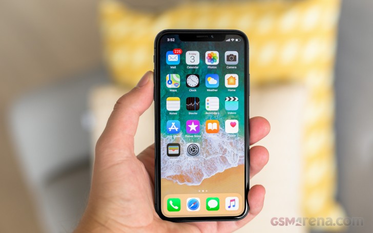
Naturally, apps go on the homescreen, there are no widgets and no separate app drawer either. With the new taller screen, you now have even more rows of apps. The leftmost Today page is here to stay - it is the place where various widgets go and includes a system-wide Spotlight search.

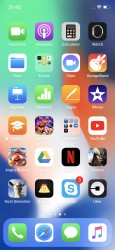

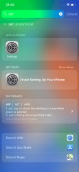
The homescreen • more apps • Today • Spotlight
Now that there is no Home key, Apple came up with a system-wide gesture for closing apps - a swipe from the bottom. Previously this would have brought up the Control Center with all the toggles, but now it brings the homescreen. This won't become a habit in an instant for sure.
So far, so good. But things go eerie from here.
How do you summon the task switcher then? Well, you start closing an app with that swipe from the bottom, and you stop halfway. Honestly, we couldn't have imagined this weirder. Apple could have used Force Touch in a new way unseen so far but it instead chose not to. They sure like to get rid of their own inventions.
Not only the task switcher has been made harder to summon, but you have to tap and hold on a card to activate the kill mode, and then swipe it to the oblivion. Again, no love for Force Touch here too.


The task switcher • kill mode • closing an app
What about Siri? We are glad you asked. You press and hold the power key, which is now known as "the side button". To power off the phone, you press and hold the power key PLUS one of the volume keys. If you press the same combination but don't hold, well, you will take a screenshot.
The awkwardness continues with "the line" at the bottom of the display. After "the notch" and "the horns," we get another thing that will go down in history for better or worse. This line was invented to mark the closing gesture position. Wherever you see the line, that's where you need to swipe up from.


The line requires some extra space
But the line is not an overlay in most apps, but an extension. And that extension mirrors the notch. Yes, the whole interface just moves upwards to make place for "the line." It could have been easily a tiny overlay, even a dot, but Apple made another questionable design choice - this time with the UI - and pretty much put another notch at the bottom - only it's a virtual one this time around.
To be honest, the keyboard and some apps do need the extra space at the bottom for usability reasons. If the keyboard didn't have the bottom notch, it would have sat way too low for typing.


Sometimes the line can be for the better • and sometimes it doesn't require more space
So, the bottom notch with the line may not be the most thoughtful decisions, but there is a bonus feature. You can swipe left or right on or around the line, and you'll quickly switch between active tasks. Previously this was done with force swipes, but now it's much easier.

Switching between apps is easy - just swipe on the line
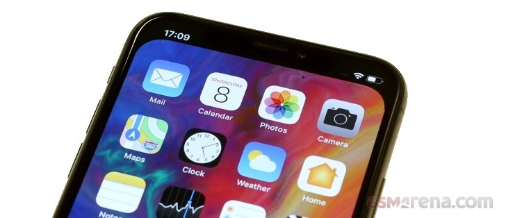
Now about those horns - the areas on the left and right of the notch. Apple tucked there all the things from the status bar - the clock, network info, connectivity, and battery indicators. There was no room left for Bluetooth indicator, or even the battery percentage, though.
We found the horns to be way more inconspicuous if you choose a wallpaper with a dark upper part. It turned out there are already apps which can add the black part on your wallpapers of choice. Before we found that out, we photoshopped some of the stock wallpapers and we really liked the result.
The Notification Center, or what's left of it in iOS 11, is summoned with a swipe from the left horn, but the gesture also works from the notch, too. The pane was recently unified with the lockscreen, and if you use different wallpapers for home and lock screens, you may get confused at first.


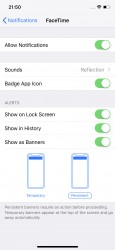
Notification Center • Notification Center • Notification settings
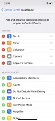
The Control Center with all your toggles (now configurable by the way), is called with a swipe from the right horn. You can use 3D touch to access additional controls. And the battery percentage has been moved permanently here (Windows Phone says hello).
And while we are deep in the weird iOS changes, let's mention that a tap on Wi-Fi or Bluetooth severs all connections, but it doesn't turn off these features. According to Apple this way you will keep AirDrop active and yet won't be connected to anything until the next morning (or until you manually initiate the connection). That's fine, but now we have to dig in settings to turn those off when we really need to, which is a step backward. If only Apple had some additional layer of interaction to make those toggles two-step triggers. Like a longer press or 3D Touch. Oh, wait!


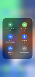
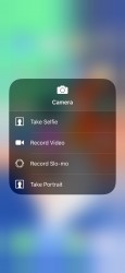
The Control Center • Expandable torch • Expandable toggles
Using the iPhone X in landscape direction adds more points for weirdness. The line shows the bottom, but now that there are no horns, you just have to guess where the notification center gesture ends and the control center one begins. It's not that hard, but odd it is.
And speaking of landscape view, the two-pane layout seen on the iPhone Plus models is absent, as is the landscape mode for the home and lock screens. And you would think that a tall screen like this would be a perfect fit for this sort of two-pane UI.
We criticized Apple for finding better uses for 3D Touch on the all-screen iPhone X, but even without new features, it's still as useful as before. In this iteration, you can use it on various app icons to reveal quick actions and favorite rows, if available. You can also use it for notifications, toggles, and in-app content pop-up or expansion (pictures, links, file descriptions, etc.). You can also use 3D Touch on folders to rename them or see the apps inside that have pending notifications.
Naturally, a pop-up preview of pictures, web links, messages, mails, notes, and photos, is available.


Using 3D Touch • pop-up • pop-up • media preview • link preview
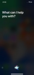
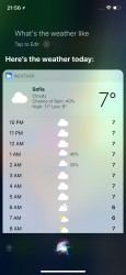
Siri - Apple's digital assistant - is used by 375 million people monthly. But that was old Siri, the new one is much, much smarter. And it sounds smarter too, thanks to deep learning, Apple has created a more humanly sounding female voice, and there's a male voice, too. For example, Siri can pronounce the same word differently, matching natural pronunciation of a sentence.
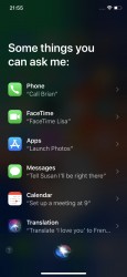
Siri looks different now. The new UI is better at question-and-answer conversations and shows multiple results by default. It understands context, so it will suggest creating an appointment based on what web page you just bookmarked in Safari. It will also suggest new topics you may be interested in, based on what you're reading. This learning will be synced across all your devices, so they improve together.
Siri can also do translations for you. You can speak to it in English, and it will translate that to Chinese, French, German, Italian or Spanish.
Finally, you can now type to Siri instead of speaking, which is a very welcome option. The option is buried in the Accessibility settings menu though, in case you were wondering.
Now, we want to highlight some of the iOS 11 features.
Screen recording is a new toggle in the Control Center and does exactly what its name suggests.
But the newly implemented screenshot editor is probably the most obvious addition - once you grab a screen snap, you can now immediately doodle on it.


Recording key in CC • Editing a screenshot • Sharing a screenshot
The App Store is a cornerstone of the iOS experience. It's turning nine this year and has served 180 billion downloads over its exciting life. And according to Apple, it has paid out $70 billion to app developers (30% of which just in the last year). So, it's a huge business.
To better highlight developer creations, the App Store is now split into two - Apps and Games. The Games tab will list in-app purchases below the game (great for consumers, makes pay-to-play games easy to spot). There's also a new Today tab, which highlights Apple's favorite apps and games and their developers.
And while we are on topic, you can now enable app offloading - your iPhone will automatically delete unused apps to free some storage, and will mark such with a small cloud icon. Once you need such an app, it will be instantly downloaded from the App Store. Just like the offloaded images from the gallery.


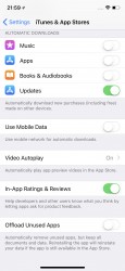
The App Store • Apps • Games • Offloading settings
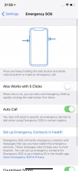
Another new feature found in iOS 11 is Emergency SOS, which hopefully you will never need. You can either hit the power key five times or trigger it from a new menu invoked by holding the lock and some of the volume keys. Then your phone will dial your emergency contacts in a pre-defined order.
The iOS 11 is fast, has some thoughtful additions and has seen some long overdue updates. But the iPhone X-tailored version is a mess. Lots of the new gestures could have been done better - the line, the horns, the notch were all treated like last-minute obstacles instead of getting the smart solutions Apple is capable of.
Throughout years Apple made a name of itself with the meticulous attention to detail, but the X's iOS 11 is the most rushed software we've seen from Cupertino ever. And the worst part - anyone can tell it, iOS user or not. This is not how you treat your special anniversary iPhone and not a good harbinger for a new beginning.
Reader comments
- Mrj vous
- 06 Dec 2024
- fnf
Outdoor
- Samson
- 01 Dec 2024
- r3a
Highly loyal you wan help you get extra money from just me uncle lfaymi lock jock house and tell funniest out una I unfortunately
- Ali
- 05 Apr 2024
- 6PJ
Best mobile phone battery backup is not good but phone performance is really good but if you want to buy this phone I recommended xsmax because sxmax is batter than x on battery and performance.

