Archos 50 Diamond review: Emerald cut
Emerald cut
Vanilla Android KitKat
Archos went with a stock version of Android 4.4.4 KitKat to take the software lead on the 50 Diamond which means you'll get an uncluttered experience that should also provide a snappier feedback thanks to the lack of bloatware and additional app services. The use of vanilla Android also promises timely updates and Archos is already working on a Lollipop build for the 50 Diamond.
Check out a quick look of the UI below.
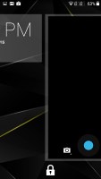
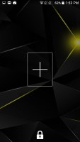
The lockscreen widgets remain unchanged and are full-screen, resizable tiles. One of them is always visible at the top of the main lockscreen, above the padlock icon. The rest are a right swipe away. The widget on the main lockscreen is collapsed to make room for the padlock button, but can be expanded to display additional information.
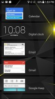
There are a few stock lockscreen widgets: Messages, Calendar, Gmail, Digital Clock, Google Now and Google+. The camera shortcut, just like before, is a left swipe on the lockscreen.
Naturally, you can protect your lockscreen by Face, Pattern, PIN or Password unlock, in ascending order of security.
The homescreen is almost the same as Google's Now launcher but lacks the latter as the leftmost pane by default. You can always install Google Now launcher to get the exact same stock appearance. Another difference is the lack of on-screen buttons on the Archos 50 Diamond but that means that more screen estate is available to the user.
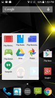
Folders function as expected. A folder is created by dropping an app shortcut on top of another shortcut and can be named by tapping on the "Unnamed folder" label. Opening a folder expands it only as much as needed to show the icons inside.
The notification center and Quick toggles are on board too. They're accessible via an icon in the top right corner of the notification area. You get access to key device settings such as brightness, Wi-Fi, Bluetooth, location, mobile networks and battery. Some toggles are directly accessible shortcuts to their respected functions in the settings menu. The quick settings menu can be accessed by a two-finger swipe down from the top of the screen.
Notifications can be expanded and collapsed with a downward swipe. The top one is expanded by default (if the app that put up the notification supports it, of course).

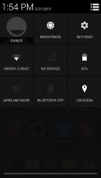
Notification area and quick toggles
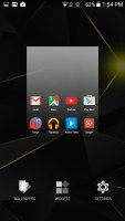
Managing the homescreen is easy. You can add widgets, shortcuts or folders. You can add as many panes as you want. The wallpaper is easy to change too - just pick one of the preloaded ones or choose an image from the gallery.
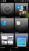
The widgets aren't part of the app drawer. You can access the widget list only by a tap and hold on an empty space on the homescreen and selecting the dedicated Widgets shortcut. We prefer this way of handling the widgets, because they don't get in the way of the day-to-day work with the app drawer.
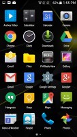
The app drawer consists of 6 rows of icons on side-scrollable pages. The app icons are big and easy to access. The apps are ordered alphabetically and there's no other sorting option. Placing a shortcut on the homescreen works as you would expect: press and hold to grab it and then position it on the homescreen pane of choice. Two more options appear at the top of the screen while you're dragging - Uninstall (to quickly remove apps) and App info, which opens the application's entry in the Manage applications list.
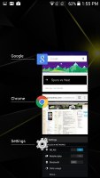
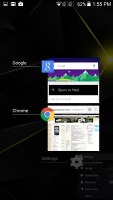
Last but not least, the Recent Apps list has remained virtually unchanged. It would be nice if Google finally adds a kill all/close all option.
Overall, Android 4.4.4 KitKat offers a polished UI and turns in great performance on the Archos 50 Diamond and its Snapdragon 615 platform. Animations are quick and smooth and there were no stutters anywhere to be found. But more on the performance on the next page.
Reader comments
- markifi
- 06 Feb 2016
- nH9
and the lollipop update never came.
- Anonymous
- 17 Aug 2015
- pgP
yes
- AnonD-391398
- 01 May 2015
- msu
they have quick charge 2.0 and didn't give a charger? that's lame.


