Asus Padfone 2 review: Plug and play
Plug and play
Jelly Bean is in the driver's seat
The Asus Padfone 2 launched with Android Ice Cream Sandwich out of the box, but the company has since quickly pushed Android 4.1.1 Jelly Bean to the smartphone and tablet combo. Confused about Android versions? Check out our Android version breakdown.
The Padfone 2 now enjoys the benefits of Project Butter, which keeps the framerate of animations at a constant 60 fps and delivers buttery smooth visuals. Combining the power of the four Krait cores and the latest-generation GPU, the Padfone 2 offers a virtually lag-free user experience.
As usual, we've prepared a video tour of the Padfone 2's interface, including of course both phone and tablet demos. Check it out below.
Asus continues to rely on a nearly stock Android look and feel, keeping the launcher and most of the user interface untouched. Nevertheless, the company has provided some customizations here and there that enhance the experience, which we'll point out to you as we go along.
The lockscreen is a standard stock Android 4.1 Jelly Bean affair. There's a large dotted circle around the center-placed unlock button. You still get the two familiar shortcuts - move the unlock button to the left for camera, and right for unlock. There's a new, third icon above them for jumping straight into Google Now.


The lockscreen provides a shortcut to Google Now and the camera app
The dock at the bottom of the homescreen fits four custom shortcuts or folders. The center one always opens the app drawer, but the other four can be set to any shortcut or even a folder.
As usual, you can pinch to zoom out and manage homescreen panes - add, delete or just reorder them. You can have 7 panes at most, which are enough to fit plenty of content even if you use widgets that cover an entire pane.

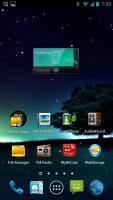

The familiar stock Android lockscreen
In usual Jelly Bean fashion, widgets are resizable and make space for themselves by pushing app shortcuts and folders out of the way to make space for their larger size.
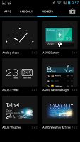
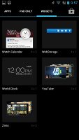
Asus has been kind enough to include some custom widgets of their own including a task manager, number of unread emails, along with Weather and Battery widgets. The latter allows you to switch different power managing modes to get the most out of the battery. From there, you can also choose whether the Padfone 2 is charged when you slide it into the Padfone 2 station.
The notification center has been slightly revamped and looks a bit different from stock Android.
Quick toggles have been added on separate rows giving you access to the settings menu, Wi-Fi networks and the special Asus Audio Wizard feature.
There are also the actual quick toggle buttons themselves, allowing you to toggle Wi-Fi, Bluetooth, Mobile data (more can be added from the Settings menu). Asus is also giving the option to control the brightness and switch between normal and outside modes of the display.
Notifications can be expanded and collapsed with a two-finger swipe, and the top one is expanded by default (if the app that put up the notification supports it, of course).
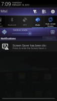
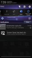
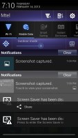
Asus has included quick toggles in the notification center
Folders in Jelly Bean haven't been changed since Ice Cream Sandwich. A folder is created by dropping a shortcut on top of another and can be renamed by tapping on the "Unnamed folder" label. Opening a folder expands it only by as much as is needed to fit the icons inside.
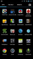
The app drawer on the Padfone 2 consists of four rows of icons and three tabs (instead of the usual two). The new addition is the Pad Only tab, which shows you apps that are run only on the Padfone 2 Station. Unfortunately, the app drawer doesn't allow for custom viewing modes (alphabetical is the only one).
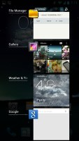
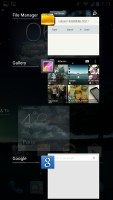
Once you get several apps running, you can use the task switcher to go back and forth between them. It's a Jelly Bean-style vertical list with a screenshot and a name for each app. A sideways swipe removes the app from the list.
Once you slide the Padfone 2 into the Padfone 2 Station you get a full-fledged, 10.1" tablet. It's powered entirely by the smartphone's 1.5GHz Krait monster of a CPU.
Upon unlocking the slate, you're greeted with the familiar Android interface. The homescreen configuration is quite reminiscent of Ice Cream Sandwich and features a top navigation bar which holds the usual three-button Android combo.
However, Asus has added a fourth one - Floating widgets. Floating widgets are small, independent windows that are overlaid over anything else - the homescreen, regular full-screen apps, anything. You can fit two or three of those on the large 10.1" screen and they really improve the multitasking capabilities of the tablet.
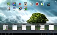
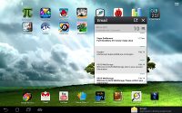
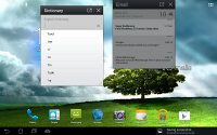
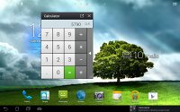
Floating widgets provide true multitasking
Available Floating widgets include a calculator, calendar, email, dictionary, Asus' BuddyBuzz and the AudioWizard. If you don't intend to use any of those apps, you can always hide them.
Anyway, the notification center in tablet mode is the same as the smartphone's and includes the handy quick settings toggles. The number of homescreens maxes out at seven, but that's enough space for all the widgets and app shortcuts you would need.
Reader comments
- TechLord777
- 06 Nov 2016
- 3vx
That camera user interface in the screenshots on page 8 of this review (ID 891) looks very beautiful.
- AnonD-281836
- 09 Jul 2014
- 7sm
Word of advice don't buy anything from Asus. I've bought 3 products (Padfone 2 & Tablet & Laptop) from Asus & all 3 products broke down within the 1st year. On top of it all they offer near zero support & after care. Their warranties ...
- Mike
- 28 Feb 2013
- iyP
Also I forgot to say that the screen of the smartphone, yes it is very bright, but unfortunately black colour is bad, it is never real dark black.
