Asus Zenfone 3 ZE552KL review: More than meets the eye
More than meets the eye
User interface
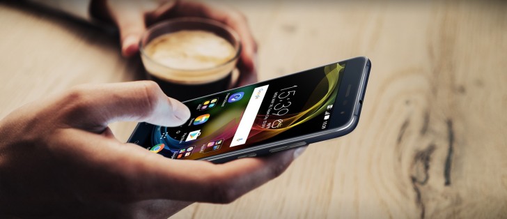
The Asus Zenfone 3 ZE552KL runs Android 6.0.1 Marshmallow with ZenUI 3.0 on top. The customizations reach quite deeply into the standard Android look.
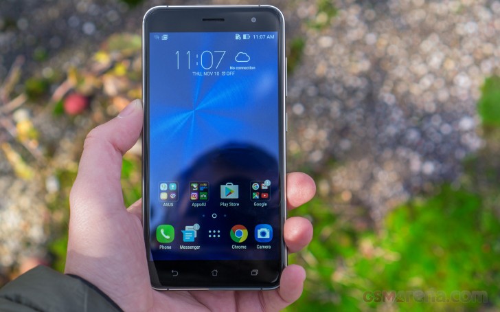
The Power button is comfortable enough to use, but the fingerprint reader is just quicker and more convenient. It's always on and fast too, just place your finger on it, and in an instant, you're dropped on the homescreen.
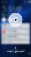
Alternative unlock methods are ZenMotion's touch gestures. You can lock/unlock the phone with a double tap (disabled by default) or draw a letter to launch an app instantly - e.g. "C" for main camera, "S" for selfie cam, "V" for phone and so on.
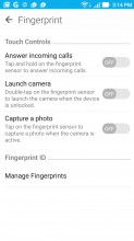
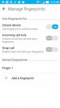
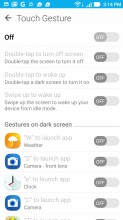
Extra functionality for the fingerprint reader • And more • Gestures on a locked screen
However you launch the camera, the fingerprint reader can be used as a shutter key (this works great for selfies). It can also start the camera with a double tap, so it goes like this: tap to unlock, double tap to launch the camera and tap again to take a photo. With some practice, this can be done very fast.
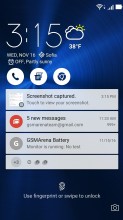
The lockscreen is a typical Asus affair. You're greeted by a time-and-weather widget, but also three shortcuts to the dialer, messaging app and Chrome. They are customizable too, and you can assign any installed app of your choice to either of the three slots.
The list of notifications follows, double tapping on one takes you straight to the app that pushed it. If you have a secure lock set up (e.g. fingerprint or PIN), you'll need to unlock the phone before you continue. We find it quicker just to unlock the phone with the fingerprint reader and go from there.
Beyond the lockscreen is the Android homescreen with four customizable shortcuts docked at the bottom, the app drawer shortcut always in the middle. You cannot add more icons beyond these four, but there is folder support.
There are folders with pre-loaded apps from Google, Asus and "Apps4U", which is more diverse. Going into the app drawer, you'll see that Asus went for completeness rather than barebone defaults.
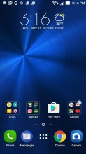
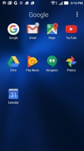
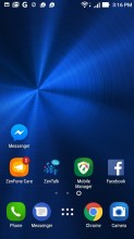
Homescreen • Folder • More homescreen
A pinch zoom reveals very comprehensive tools to edit the homescreen. You can tune the size of icons (from 50% to 130%), the size, color and font of their labels, there's even a tool to help you justify the icons. When you have a homescreen pane set up just the way you like it, you can save that as a preset - next time when you're adding a new pane you have the option to recall one of those presets.
Holding your finger on a homescreen brings further options. You can change basic stuff like wallpapers, customize things further with icon packs and finally change themes.
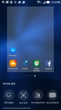
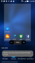
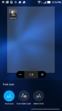
Customizing the homescreen • Changing icon size • Adjusting the font
Themes are the most comprehensive tool to change the look of the interface - they include wallpapers and icons that already match in style. Finding an icon pack that matches the style of your wallpaper can be fun, but time-consuming.
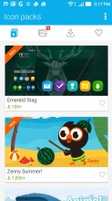
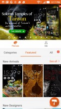
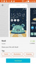
Icon packs • Theme store • A closer look at a theme
The app drawer has plenty of customization options itself. Grid size can be adjusted in the 3x3 to 5x5 range, with the latter making more sense on the 5.5-inch screen. Apps can be arranged alphabetically (the "All" setting), manually, or by frequent use. The Smart group option takes the hassle out of creating folders - it automatically groups apps by category, e.g. Productivity, Communication and so on.
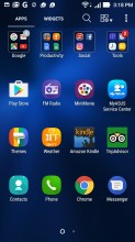
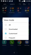
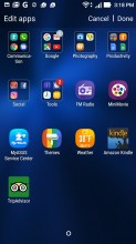
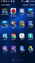
App drawer • Powerful filtering options • Automatic grouping • Locking apps
One useful option you shouldn't overlook is Lock apps. It allows you to put select apps behind a pattern or a PIN lock (but strangely, not behind a fingerprint lock). There are nice options to recover the apps if you forget the PIN too.
The notification area has seen extensive customization as well. A single-finger pull-down only brings up the notifications and no quick toggles. A second swipe reveals the toggles and the brightness slider (which has an Auto toggle to its right, though we missed it at first, it's not very distinct).
A two finger pull-down gets you straight to the toggles. Also here are four tools (top row of toggles, they are a different color too). They are Flashlight and Calculator (no surprises here), Power & Boost (cleans up RAM from latent apps) and Auto-start manager (lets you control which apps launch when the phone boots). We think the last two will be used more rarely, so we tried hiding them, but that didn't work - you need to have at least 4 tools selected, and there are only 4 of them total.
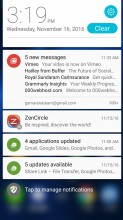
Notification shade • Toggles and tools • Editing toggles and tools
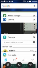
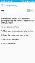
The task switcher is the standard Lollipop style virtual rolodex with a Google search bar on top. There are three buttons here. One closes all apps to free up RAM. Another pins the app to the screen so you can hand the phone to someone and be sure they won't snoop in other apps. Finally, there's a shortcut to the settings of installed apps (if you need to change permissions, restrict their data usage and so on).
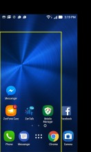
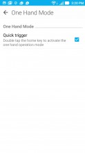
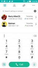
Quick trigger is Asus' answer to the problem of handling large devices single-handedly. It's evoked with a double-tap on the home button, provided you've enabled it first in settings. What it does is shrink the entire interface to a portion of the screen, which is resizable and can be moved around to suit left or right handed use.
Reader comments
- Vahid
- 27 Jul 2021
- M@n
This is so true. My brother and i purchased this one and rear camera broken.
- isti
- 21 Nov 2020
- thw
what phone can change this one in 2020, i'm used this from 2017 until now and i want to retired this one, which one i can choose if i want like this but with bigger batteray, bigger ram and rom, better camera etc ... but not too expensive thanx ...
- Asusneveragain
- 22 Mar 2020
- rRT
I have never hated an electronic device as much as this phone. If for some reason you want a phone from 2016, DON'T BUY THIS ONE! Rear camera focus stopped working at one year of use. Bluetooth shortcut sometimes does not function, underpowered pr...
