Asus Zenfone Max Pro (M2) ZB631KL review
Design
For a phone that comes just about eight months after the launch of the original, the ZenFone Max Pro M2 looks quite different and almost nothing alike.
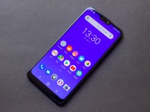
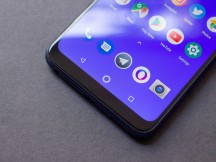
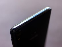
There are a number of design changes here. First of all, the M2 adopts a notched display design instead of having a thick top bezel. This gives the display a much more expansive and edge to edge feel. However, there is still a sizable bezel at the bottom, which somewhat breaks the illusion of being a truly bezel-less display.
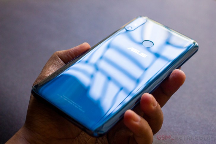
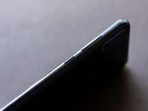
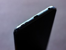
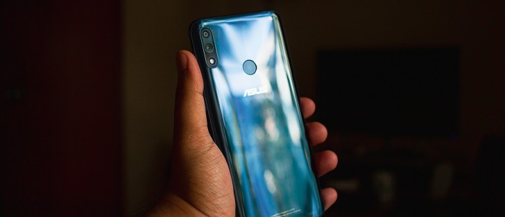
Another major design change is that the back is no longer made out of aluminum. Instead, the M2 just has a glossy aluminum frame but the back is made out of glossy plastic.
When we first held the device before anything was revealed to us about it, we assumed the back was made out of glass. The back material has similar shine and texture as glass, and it even has a shimmer similar to that of some of the glass phones on the market. ASUS has done a great job with the material and it's good enough to fool unsuspecting customers into thinking it's glass.
Of course, this can be seen as a downgrade from the previous model that had an aluminum back. We personally think it looks and feels fine in hand and the material is more durable than actual glass. And none of this will matter once you put the case on.
The new phone is ever so slightly lighter than the previous model, although it's unlikely you are going to notice the 5g difference in weight. Still, despite the gigantic battery inside, the phone feels about as light as any other phone in this segment; in fact, it's lighter than the Redmi Note 6 Pro that has a smaller 4000mAh battery.
Overall, the ZenFone Max Pro M2 is a well-designed and well-built smartphone. It does feel a bit plasticky compared to the previous model but the lightweight and attractive design make up for that.
Display
The ZenFone Max Pro M2 has a 6.26-inch, 2280x1080 resolution IPS LCD. The display has a 19:9 aspect ratio, 94% NTSC color gamut, 1500:1 contrast ratio and 450 nits of peak brightness.
The display on the M2 is physically larger than that on the M1 and it does feel that way as it stretches all the way up to the corners at the top. The notch is also one of the smaller ones we have seen and doesn't take up too much space.
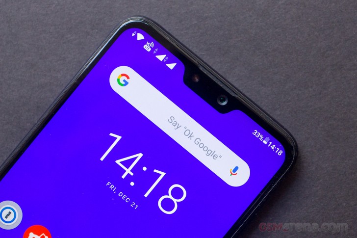
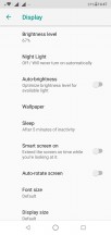
In terms of color performance, however, ASUS could have done better. Out of the box, the display color temperature is set too cold, giving it a bluish appearance, and the colors are all boosted for greater saturation. You can go into the settings and adjust the color temperature but that's pretty much all you can do. We would have liked to see standard sRGB color calibration or at least an sRGB mode for those who like more accurate colors.
Another problem with the display is the permanently enabled backlight dimming feature - sometimes referred to as dynamic contrast - that automatically dims the display when displaying darker content and conversely, increases it when displaying brighter content. There is a good reason companies like Apple, Samsung, and Google, who are known for good display calibration, don't ship their phones with this feature. Automatic backlight dimming is a ridiculously pointless feature that does more harm than good. If the display selectively dimmed parts of the display with local backlight dimming, it would have some value. But dimming entire display when doing something as simple as dragging down the notification shade make the whole thing look jarring because of the constant and large variations in backlight intensity every time something on the screen changes.
It's especially annoying and distracting while watching a video, where the display brightness would constantly change based on differences in the brightness level of the content on the screen. This made darker scenes hard to see and if you raised your brightness manually, the display would suddenly be too bright while displaying a brighter scene. Overall, it's an incredibly annoying "feature" that should just be done away with by now entirely.
Our review unit also had issues with the touchscreen failing to register touch inputs. It's likely this issue is limited to our unit but there's no way to be sure without checking more devices.
Overall, the display on the ZenFone Max Pro M2 is decent for the price. However, we really wish ASUS steps up its display game in the future by providing more color accurate settings and dropping gimmicky features like automatic contrast adjustment.
Reader comments
- Dry
- 12 May 2021
- sxs
My phone newly bought through online, when I opened it, the phone wants to update its system, due to poor of signal in our place, the update s went long until it turns off, when I opened it back the signal and wifi are disabled only the bluetooth are...
- BISWAJIT
- 06 Jun 2020
- U@i
13jun
- Baskar
- 07 Jan 2020
- rK9
Asus zenfone Max Pro M2 Android 10 official release date
