Back to iOS after years of Android use
Two months with the iPhone 13 Pro
More iOS
There are other examples of dumb UI in iOS beyond the ones I already listed on the previous page. The lack of a universal back gesture made for a steep learning curve in my early days on the iPhone. On Android, I was used to being able to back my way out of anywhere and onto the homescreen but that doesn't work here. And it doesn't work for different reasons depending on what kind of screen you're on.
The back gesture, where it does exist, only exists from the left side of the phone. That's actually hardly grounds for complaint in my particular usage since I'm a leftie when it comes to smartphones, and it happens to be on the convenient side. I can imagine I'd have been salty about this too though if I used my phone with my right hand.
So... long-time iPhone users probably know all of this instinctively, but let's quickly break down the different types of 'get me out of here' actions you need to use. Once you've run out of steps to go back within an app, your path to the homescreen is an upward swipe from the bottom - that is, at least, a universal straight-to-home solution.
If you've pulled down the control center or any other UI element that has a blurry background, tapping somewhere on the blurry areas will get you out of there. If you're in any sort of image viewing scenario and have a photo on your screen, swiping down on the image is 'back'.
Then there are certain windows you can only get out of with a tap on a 'close' button, and that button is always at the far end of the screen. Ah, just how I remember it on my 3GS ten years ago. Mind you, that one had a 3.5-inch screen.
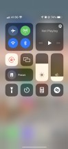


Types of 'back': Swipe in from left edge • Tap on blur • Tap on buttons at the top • Drag photo down
Having said all that, navigation isn't entirely crap. The task switcher is really slick, the animations are pleasingly fluid, the side swipes on the bottom bar work fine for switching between recent apps. Not groundbreaking stuff, but at least not stuff that's been deliberately kept outdated, unintuitive, or counter-productive.
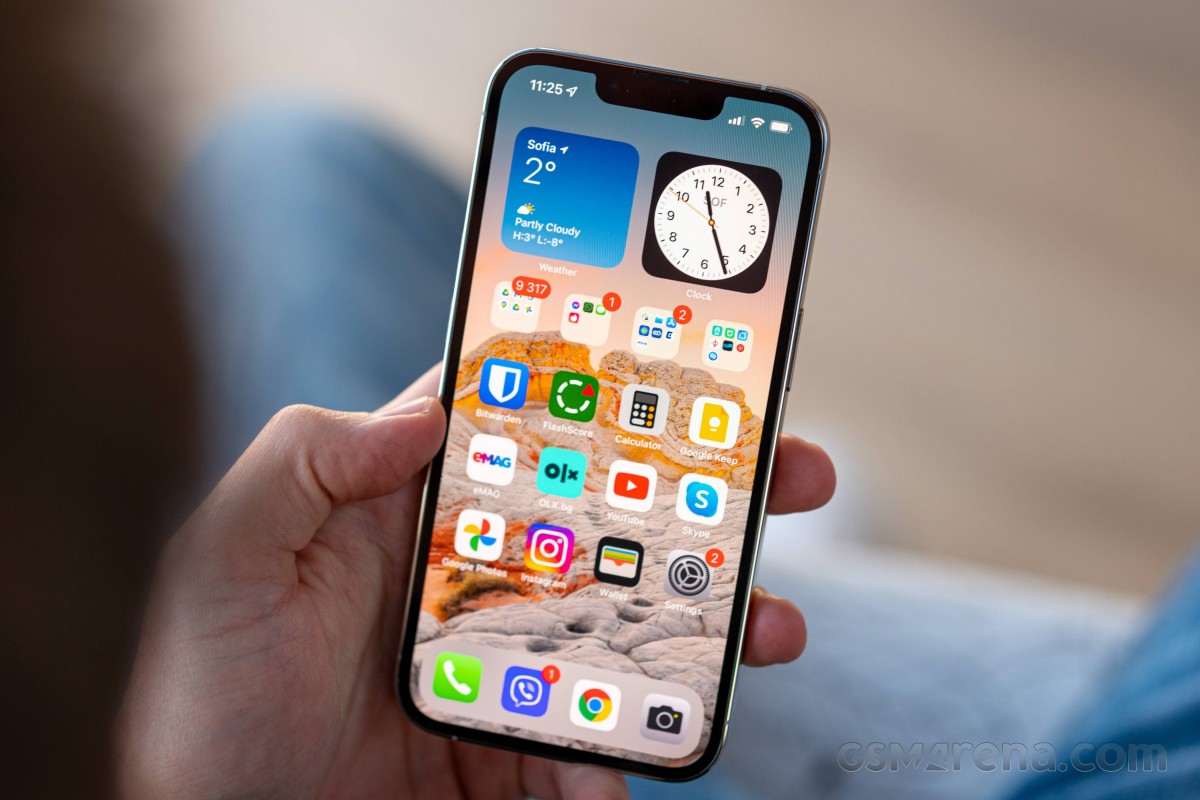
Belonging in all of those categories at once is the homescreen icon arrangement. Aligning the apps towards the top is a remnant of simpler times when screens were smaller, but it is so out of touch nowadays. With the advent of widgets on iOS 14 in 2020 (is there really any point in making fun of that timely development?), you can stuff some of those on top of your homescreen to get the extra padding needed to bring your icons lower, but come on.
I was used to having all the apps I use in a single row of folders above the 'dock' (the bottom-most row of icons that doesn't change as you swipe sideways between homescreens) and keeping the rest of the screen empty, so I can admire my daily wallpaper and, really, to have a clutter-free homescreen. I can't do that here - I either have to pack widgets up top, or just spread the apps I use more often and stick the rest into folders. In either case, I wouldn't be seeing much of my wallpaper anyway. Then again, there's no straightforward solution to automate daily changing wallpapers, so I might as well just cover it with icons and forget about it.
Moving on, one thing I've been missing on the iPhone 13 Pro is always-on display functionality. I had come to rely on this functionality on Android for quickly checking the time or notifications without waking up the phone, so not having it here required some adjustment.
I guess there's a silver lining to this as I'm now probably less anxious about getting new messages and only check for that when I do grab my phone, as opposed to constantly keeping an eye on it. While I probably would have stuck to my bad habits of continuously checking for notifications and replying instantly if I had AoD, I'd argue that having the option for it is better than not having it.
In the end, as expected or, more accurately, as planned, I'm no fan of iOS. I've learned to live with it, and there are certainly bits about it that I like. Ultimately, however, I enjoy my iPhone, and I am sticking to it in spite of the operating system. Because it really has its positive sides. Follow along on the next page for my account of those.
Reader comments
- Positive
- 02 Sep 2023
- Nue
What phone does my favorite "Will" use Hey what's up guys,am will for GSM arena 🥰😍
- Onimisi1
- 16 May 2022
- Nu6
I was searching for a genuine pro and I found nothing.... Lol guess I will have to say away from Apple now....
- Baldilocks73
- 20 Feb 2022
- 49Y
I’ve always been able to put the cursor at any point on a word in iOS, it’s not that difficult. You can also hold down on the space bar abs slide the cursor anywhere you want. I guess you just need to learn about how the software works - like tapping...