Back to iOS after years of Android use
Two months with the iPhone 13 Pro
Battery life
I was used to charging daily, whether it was the Galaxy (any of them, really) or the Mi 11 Ultra. The Galaxy S21 would, on occasion, struggle to make it to bedtime, while the Mi 11 Ultra fared a lot better, but I still wouldn't feel comfortable starting the next day in the low 30s in the battery percentage indicator.
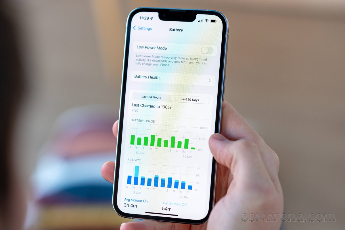
The iPhone has taken battery anxiety out of the picture almost completely. It lasts longer than anything I've used in recent years (no iPhone in there, but Apple says it should be better than previous iPhones, and our tests seem to confirm it) and does so regardless whether I've played with it a lot or it's just sat quietly in the corner. I have no overnight charging routine in place now, and it's morphed into more of every-other-day charging at random times of the day, which works fine for a desk job.
Another anxiety-reducing aspect of iPhones is that they simply don't like telling you how much battery they have unless you specifically ask. If it was an Android phone, I'd have the battery percentage showing in the status bar as well as on the AoD. On the iPhone, neither is a possibility, and I now live a better life, not knowing precisely how much battery I've got left, but not worried it won't be enough either. It may look like I'm trying to make light of missing features by spinning their absence as a feature in itself, but I'd like to call it just sharing my experience.
I have to admit I haven't really traveled anywhere since I got the iPhone, so it hasn't been tested in a tourist type of scenario - constant navigation and picture-taking, all at max brightness and away from the comforts of an always accessible charger, so I can't be sure how it would handle those, but I don't doubt it will be just fine. I might never find out, though - tourism isn't exactly encouraged these days, is it?
Display
Speaking of maximum brightness, the iPhone 13 Pro's display has a lot of it. It's one of few phones that can go above 1000nits in our standardized test (plenty can do it for small patches when showing HDR content - that's different). It manages to maintain spectacular accuracy throughout the brightness range.
I don't do anything color-critical on my phone, so the accuracy bit isn't a top priority, as long as the display doesn't have a cold tint (which it doesn't). I have True Tone enabled, something I would have made fun of people doing before I got the iPhone. Now that I'm on this side of the argument, I'm still struggling to defend its use with rational reasoning. It's on by default, I've kept it that way, and I've never been unhappy with the results. So I guess it just works?
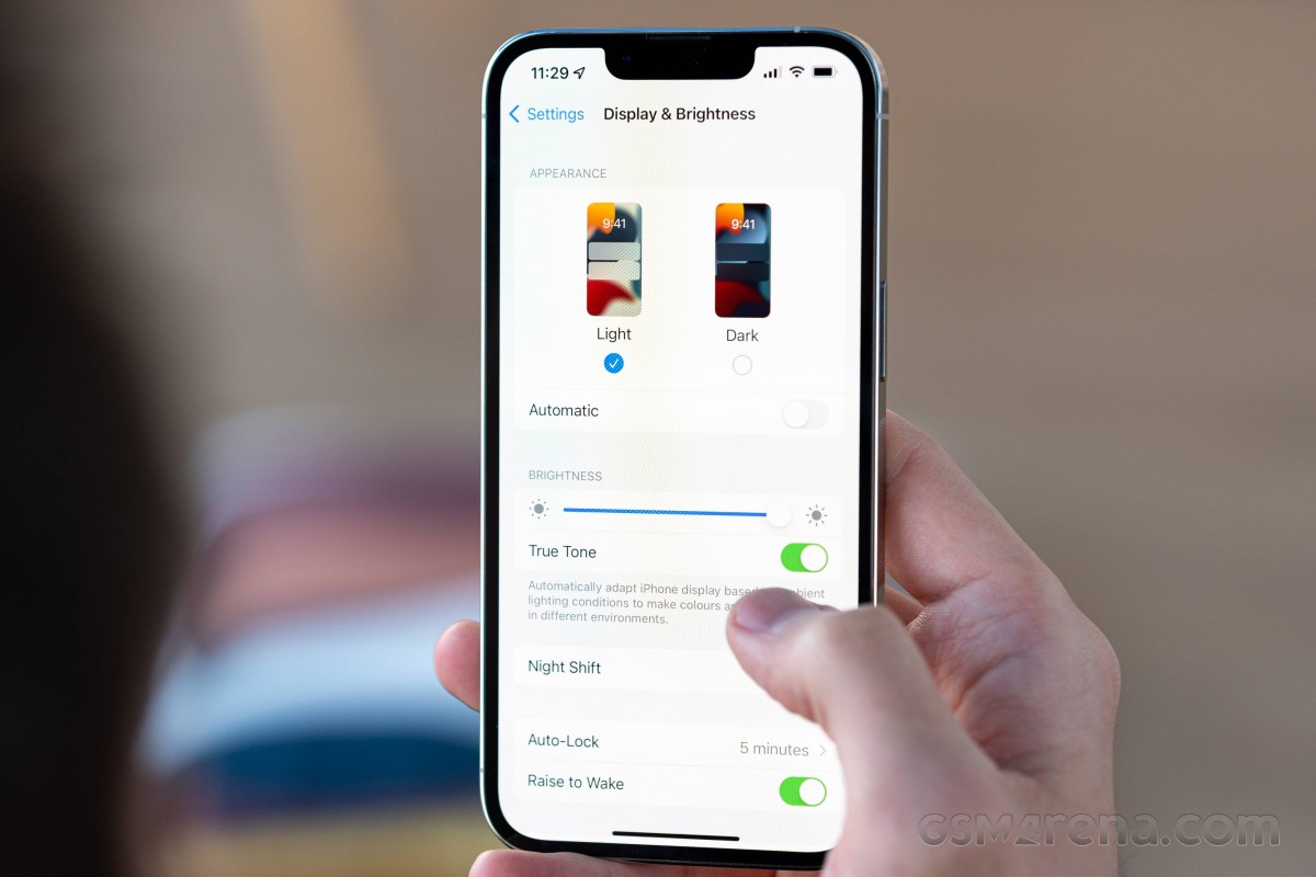
I'm very pleased with the auto-brightness behavior, which always appears to keep the screen shining as bright as I'd want it to and makes its adjustments with nearly invisible subtlety. In particularly dark situations, it might require a touch of manual intervention to lower the brightness further, but I've been told I keep my screen too dim, so the issue could very well be my perception. Perhaps the phone will eventually learn from my input and dim down as low as I'd like. Or not, it doesn't happen often enough for it to be a big deal.
The 120Hz refresh rate, a first for iPhones this year, is a welcome and overdue development but hardly something to rave about - I am no stranger to using HRR screens on the other side of the OS divide. Apple fanboys may insist it's the best implementation, but I have no horse in this race - I'm just enjoying the smoothness and responsiveness of mine.
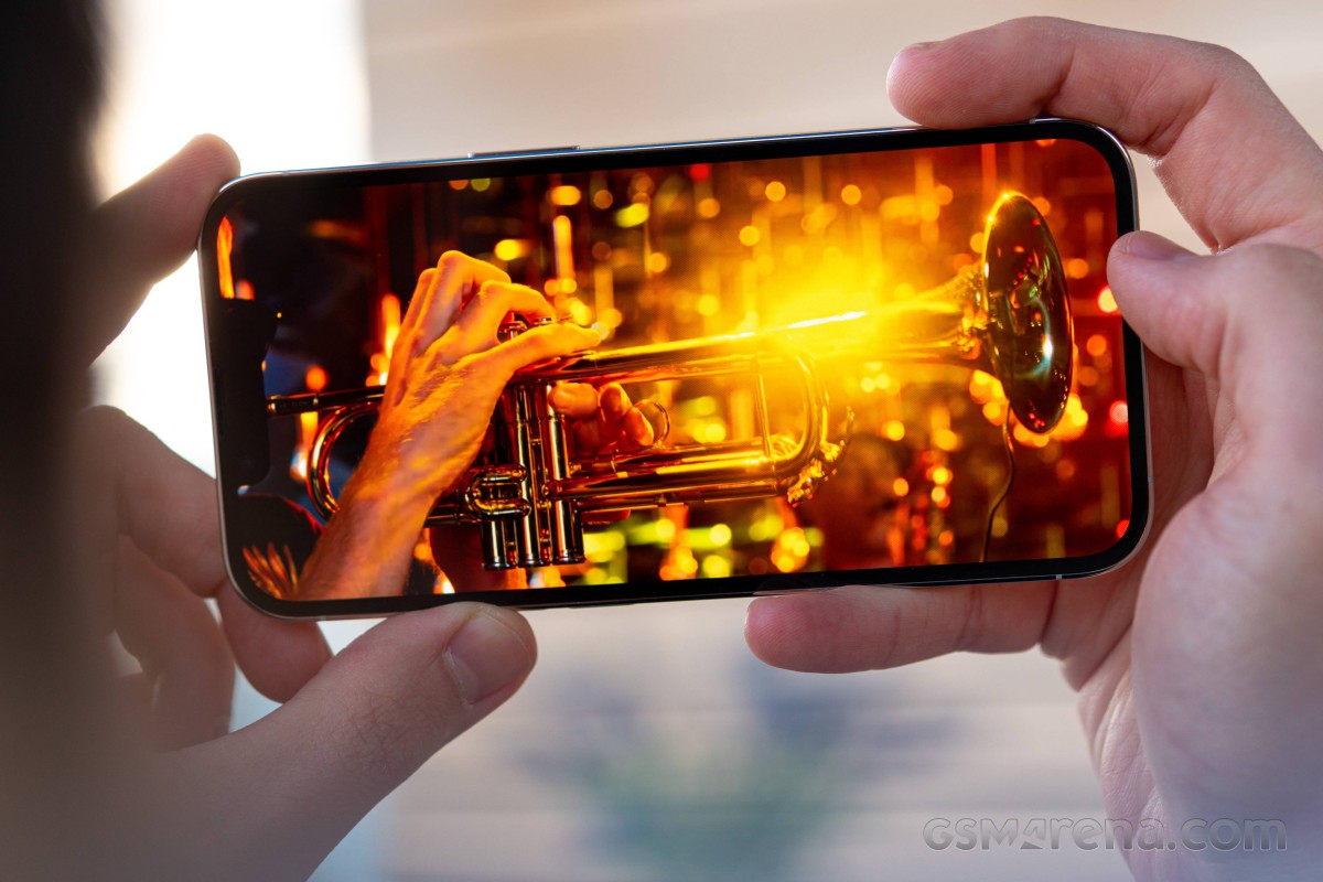
I have stronger feelings about the notch, but not really from the standpoint of looks or usability - you're staring at your phone for hours every day, and the notch barely registers. The sentiment is more along the lines of 'they should have found a workaround by now'.
FaceID
I am a fan of what it enables, however. I never really understood the appeal of FaceID when looking from my Galaxy perspective, but now that I've actually used it for a while, I'd rather not go back.
Sure, facial recognition is something Androids have had too, and some even employ a similar 3D mapping technology to Apple's. But I always seemed to prefer the 'tactile' experience of a fingerprint scan, with the Galaxies' ultrasonic implementation a particular favorite of mine. Warnings that facial recognition wasn't as secure on those didn't help, even if I don't really have any sensitive stuff to protect on my phone.
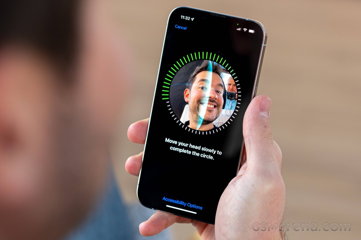
Not given the option to use fingerprints now and forced to rely on my mug for authentication, I've come to enjoy the immediacy of FaceID and its always-works quality. I'd certainly appreciate an under-display TouchID solution in addition to FaceID, whenever they feel the technology is 'mature' and 'ready', but I'd probably still stick to FaceID. Then again, they may very well scrap FaceID when TouchID comes back... I'll be happy the notch will be gone, but I'll miss FaceID for sure.
Magsafe wallet
The appeal of the tiny not-even-a-wallet snap-on Magsafe accessory was one of the driving factors in my decision to switch to iPhone. I hate carrying unnecessary stuff around on me all day and have been on a constant quest for minimizing keys and wallet contents. The Magsafe 'Wallet' helped immensely in that latter area.
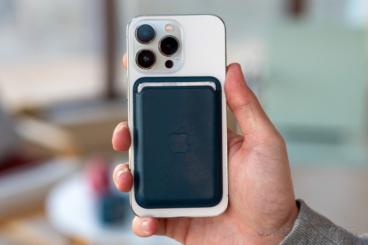
Its capacity is small, true, and I've had to find ways to fit into its 3-card limit. Some loyalty cards had to stay in the car together with my driver's license (contextual storage - only with me when I have use for them), while others remain at home unless I know for a fact I'll be needing them that day. Cash got the back jeans pocket, coins I try to avoid carrying anyway. Some will say that's too much compromise, but these are my pockets, and for my needs, the iPhone+wallet combo has worked beautifully.
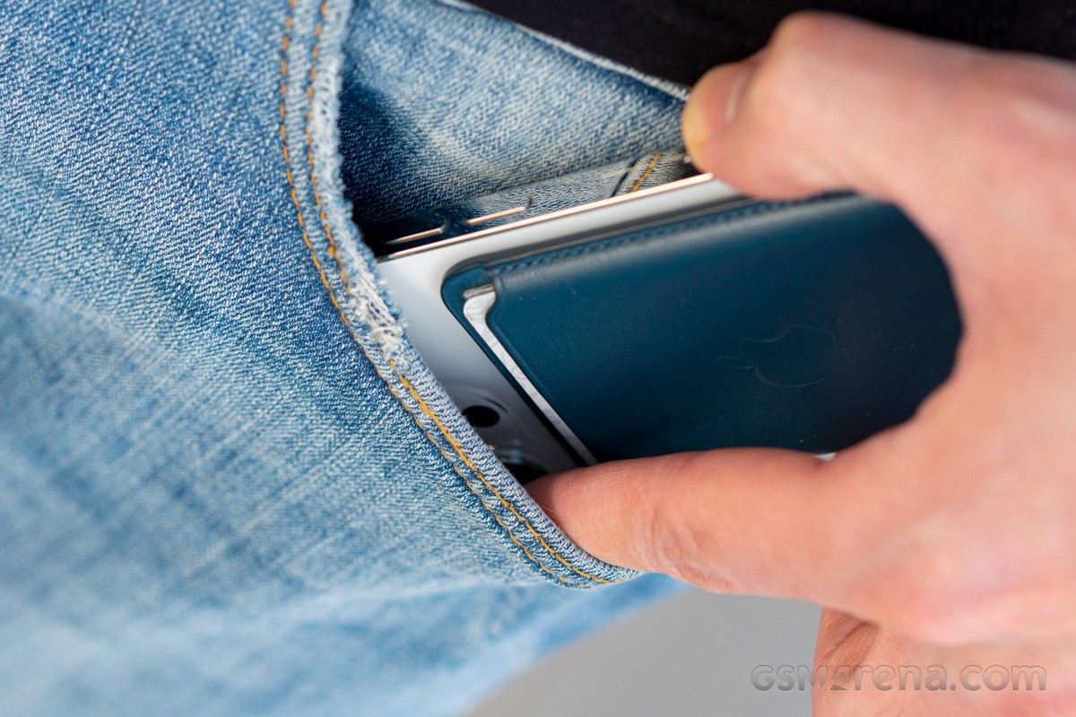
I have no interest in arguing with people on the internet, so I'll just use this opportunity to state that the wallet attaches with just the right amount of force. It's never once parted ways with the phone by accident, and it doesn't catch my pocket when I'm putting the phone away. I do, admittedly, have the habit of widening the pocket with my index finger, wallet or no wallet. I can also easily remove the wallet from the phone inside my pocket and only take out the wallet itself if the situation calls for that.
Other perks of having a magnet wallet include the ability to slap it to the side of the steel cabinet next to my desk in the office or attaching it to the steel basket I have by the door at home. Additionally, the wallet serves as a form of protection when placing the phone on a hard surface, without being a 'case', per se. It also all but disappears in the palm of my hand when it's on the phone - it's there, but it doesn't really make the phone feel thicker.
It's perfect. I don't know how I've lived without it.
iOS
I've tried to make it clear that I dislike iOS - almost hate it with a passion. That's not to say I don't enjoy some bits of it. If my complaints about it sounded petty, the things I like would feel even more trivial, but here are a few.
Airplay just works. I've never been able to cast things to my TV from any app this easily on my Android phones. It could be that I never bothered looking into it, but even that in itself is a win for Apple's implementation - it's so simple that I don't have to think about it.
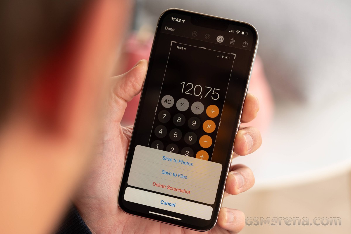
Screenshots don't have to be saved - imagine that! You take a screenshot, crop it, annotate it, send it whichever way you were going to send it and delete it, all from the same screen. I have countless useless screenshots from my Android past just sitting on servers cluttering my Google Photos - but not anymore.
Google Chrome has its navigation bar on the bottom. Safari may be nice and everything, but it doesn't sync with my desktop, and that's essential functionality for me, so I'm using Chrome. The good thing is that Google has tailored its browser's iOS version to resemble Safari and its navigation bar is on the bottom. This was an experimental option in the flags menu on Chrome for Android every now and then, but all it took was an update for the flag to be switched off, or removed entirely (as Google likes to do), and it was still missing on Android last time I checked. I really wish they would bring it back because, from my experience on iOS, it works great.
Reader comments
- Positive
- 02 Sep 2023
- Nue
What phone does my favorite "Will" use Hey what's up guys,am will for GSM arena 🥰😍
- Onimisi1
- 16 May 2022
- Nu6
I was searching for a genuine pro and I found nothing.... Lol guess I will have to say away from Apple now....
- Baldilocks73
- 20 Feb 2022
- 49Y
I’ve always been able to put the cursor at any point on a word in iOS, it’s not that difficult. You can also hold down on the space bar abs slide the cursor anywhere you want. I guess you just need to learn about how the software works - like tapping...