BlackBerry KEY2 review
Design and hardware
The BlackBerry's form factor is instantly recognizable whether it's facing up or down. Let's think back to the pre-smartphone days to when we began to see full QWERTY keyboards on feature phones. You could say that feature phones were emulating the sleek look of legacy BlackBerries. In fact, before Samsung started making phones that (allegedly) mimicked the iPhone, the BlackBerry's design inspired a bunch of Samsung's handsets.
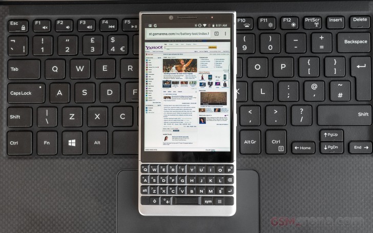
Fast forward to 2018, some phone makers have become comfortable copying the iPhone's looks which is why the BlackBerry is so refreshing to see - it is uniquely and unapologetically a BlackBerry that tries to emulate no other manufacturer.
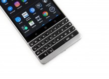
The KEYOne's hardware certainly stood out. It combined several materials into what some might consider a "busy" looking handset. The KEY2's design is refined and simplified while still keeping a sophisticated and attractive look that will definitely intrigue anyone who sees one in public.
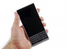
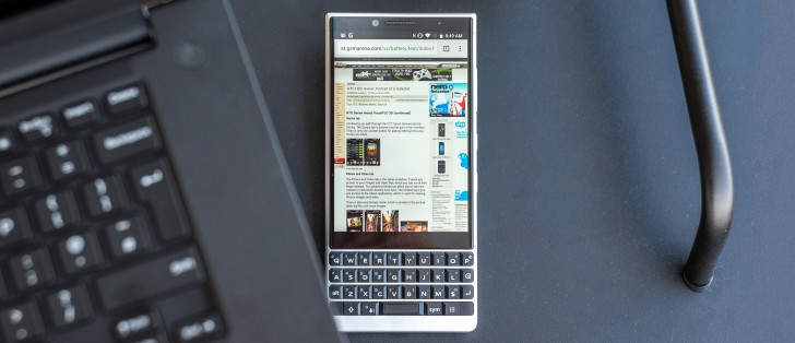
The first difference you'll notice is that the display on the KEY2 has a much cleaner look. The KEY2 gets rid of the forehead bar at the top and integrated the upper-display cluster behind the glass. There's an 8MP selfie camera just to the left of the in-call receiver and a RBG LED for notifications to the right. Android's Ambient Display is also featured here if you think the LED is not bright enough.
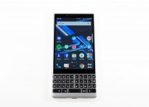
The display on the KEY2 shares the same size, resolution, and aspect ratio as the BlackBerry KEYOne's. There are some improvements with this screen though, which we'll cover in the next section. Below the screen is a row of capacitive navigation buttons and we really like how they illuminate during use and hide away when the phone is asleep to keep the display of the phone looking mysterious.
Now we're taking a look at the KEY2's keyboard, which is no longer surrounded with Chrome. This keyboard now has matte keys and the plate surrounding the keyboard has a matte silver finish (on our silver model). We really like how the keyboard and its metal plate make sleek lines in the hardware.
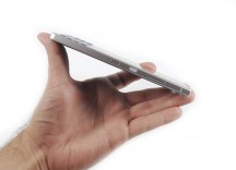
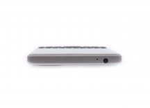
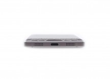
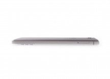
The KEY2 has four flat edges. Starting at the top: there's a 3.5mm headphone jack and a noise-cancelling microphone. The power key is no longer on the left side; all that's here now is the SIM/microSD card tray. Heading down to the bottom of the phone are symmetrical grilled (mic and loudspeaker) with a USB-C port to charge the device.
Heading up the right side of the handset are all of the phone's essential keys. The power key sits just above halfway up the phone's length, so it's not too high or too low. A volume rocker sits above the textured power key. Below the power key is another identically sized key, which BlackBerry calls the Convenience key. It's a multi-functional shortcut key with contextual features. More on this in the software section.
Though we said there's no more chrome on this phone, the volume rocker and Convenience key are both polished to a near-mirror finish. The power button is textured to make it easy to tell it apart from the others. We have to say that these buttons on the side feel excellent when pressed, just like the keyboard keys.
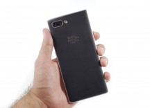
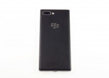
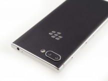
Around back is a newly redesigned textured backing which improves grip and adds a unique aesthetic. BlackBerry integrated these materials into the hardware like it did on the KEYone and the BlackBerry Motion and we can't get enough of this. More manufacturers should do this.
The BlackBerry logo is embedded right into the backing of the phone and carries a matte silver color on our silver unit. The black version of the phone has a black icon in a black body, so it doesn't stand out as much from far away. Finally, here is the new dual-camera setup with two 12MP sensors. We expect the camera to be just as good as the KEYOne's if not better.
Although we are sure that the BlackBerry KEY2 will dent if dropped on one of its metal corners, it's a device that doesn't "feel" so delicate that it needs a case. In fact, we might even like some kind of bumper-style case around it. We believe that more smartphone makers should start designing phones in a way that doesn't force the consumer into buying an overpriced case out of fear.
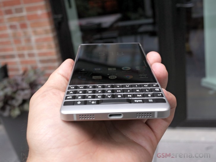
The overall feel of the KEY2 is great in the hand. Its weight is also balanced well enough that it doesn't tip forward when you're holding it at keyboard level. Manufacturing tolerances are tight and the KEY2 is a sturdily built smartphone.
We want to remind you that the KEY2's keyboard makes it almost impossible to seal up for water resistance. We don't think we'll see a fully water resistant QWERTY BlackBerry anytime soon, but you never know.
Reader comments
- Abo King
- 22 Sep 2023
- Kig
She doesn't want you to sleep. So, I'd suggest you, don't sleep, otherwise she'll suicide again as always... :V
- MD1
- 15 Jul 2022
- mFd
I done buy one but it give headec i don't know why when it sleep it off itself but i'm really like the phone what the solution?
- Kamal
- 24 Mar 2021
- Hkr
I am Going to bye one
