BlackBerry Storm 9500 review: Berry-go-round
Berry-go-round
User interface
Now this is a critical aspect of every touchscreen device. The BlackBerry Storm 9500 runs on a touch-optimized version of the BlackBerry OS, which is pretty attractive at first sight. The icons are nicely drawn and finger optimized and there are some pretty decent transitions here and there too.
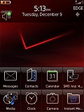
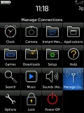
The BlackBerry OS is very decently looking at first sight
However, once you dig deeper you come across some pretty late nineties-looking text only submenus. Those are not too much of an issue but still we cannot help noting that it wouldn't have been such an effort to perk them up a bit.
Compared to any of the other touch UIs on the market (TouchWiz, Apple's portable OS X, the upcoming S-class and even the S60 5th edition) those parts of the menu look well dated.
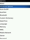
The masks are off when you go deeper in the menu
In addition, it isn't too rare for a menu item or a setting to be buried too deep in the menu making it a real problem for novice users to locate. For example the file manager is in the media submenus, which surely isn't the first place to look.
Still, none of the items in the Storm 9500 user interface is so out of place that you wouldn't get used to. After a few days every user will probably be well familiar with the layout. But that doesn't really solve the problem with the too basic looks of the deeper UI levels.
Other than that, the interface is pretty consistent with the specific display action, which is put to the best use on most occasions. Touching an item usually brings its whole name to the top of the screen while pressing the screen down confirms your selection.
The homescreen is also pretty well organized with 8 large shortcut buttons placed at the bottom and all status icons at the top. The clock and the profiles can also be accessed straight from here, as well as two other features that you choose to assign to the convenience keys.
The main menu gets launched via the menu key or - that's nice - by flipping the phone landscape. This means that unlike virtually any other part of the BlackBerry Storm interface the homescreen cannot appear in landscape mode.
In other menus the changing of modes is done by flipping the phone to its side, thanks to the built-in (and seemingly very precise) accelerometer. However, the actual screen rotation is a bit slower than the best examples on the market.
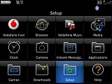
Turning to landscape mode is as simple as flipping the phone to its side
The menu structure of the BlackBerry Storm 9500 is quite different from some of its competitors. The Apple iPhone fans are used to seeing all the options available in any moment on the screen and pressing the desired one. With the Storm you have a good number of the options only revealed when you press the menu key.
That won't be a problem for experienced Crackberries but if you convert form soft-key based navigation you might find it strange that a touchscreen mobile still requires massive use of the menu key.
This means that you will have to spend a bit longer studying the available options if you are a first time user. On the positive side, it enabled RIM to add more options on some of the screens, without the need to oversimplify them.
You are able to use any of the built-in keypads or the QWERTY keyboard in almost every menu and submenu (it is available everywhere where typing is needed in any case). We will come back to the text input a while later but for now we are just going to say that this is one of the most impressive parts of the handset.
A cardinal sin though of the BlackBerry Storm 9500 UI is the fact that it tends to lag now and then. It's not too bad to make operating it impossible but it gets on your nerves at times. And in the touchscreen world lagging is a curse, big time.
Comparing the Storm interface to the other offerings on the market we have to admit that RIM's multimedia flagship simply doesn't cut it. It has some potential and the new approach to touchscreen sure works in its favor but at this stage it has neither the snappiness nor the eye candy of its competitors.
Precision is important but usually it is not what a multimedia handset is all about. And when we are talking touchscreen and multimedia it's mostly about the eye-candy, responsivness and features. The BlackBerry Storm fails to truly excel in any of those at this point.
Spartan phonebook
The phonebook is one part of the interface of the BlackBerry Storm 9500 that won't get a wow out of users. Looks are rather basic reminding us of older Windows Mobile versions but the virtually unlimited capacity and good organization make it a pretty decent performer.
The contacts get listed alphabetically in one of those black and white lists that we warned you about. You can search a contact by gradually typing the desired name like on almost any other phone you can think of but this time you get a choice of the three different keyboard layouts that the Storm offers.
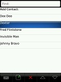
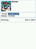
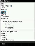
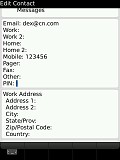
The phonebook isn't much of a looker but does its job
Editing a contact gives you a vast number of fields which are organized in several sub-groups. You can also replicate some of the fields (those that you are going to need to anyway) as many times as you like.
Reader comments
- Douglas
- 06 Jun 2012
What I dislike about the 9500 is that it is sometimes a struggle to open things on the phone as you have too tap it constanly before it opens and I would allso like to know is it just my blackberry that times out anytime it wanta to or are all blackb...
- Myk
- 19 Oct 2011
- fmD
Very wors fone, battry life, very bad.....I regret laying ma hand on this fone...
- Rahul Jagani
- 29 May 2011
- vwe
blackberry is nice but wifi is not available
