BlackBerry Torch 9800 review: Living the Olympic creed
Living the Olympic creed
User interface
Now this is probably the most interesting part of our review. With the level of user-friendliness of the BlackBerry OS 5 being…well… basically rubbish in touchscreen terms, a major overhaul was in order for the 6th version to have a shot at wider appeal. And for a company that has limited experience in the area, the challenge is as formidable as it gets.
Knowing that OS 6 would set the course for the future generations of BlackBerry phones, they put in quite a lot of effort and the end result isn’t bad at all. The BlackBerry OS 6 isn’t going to rival Android or iOS just yet but those insulting monochrome menus are finally getting some color and a few extra icons, and have become more thumbable.
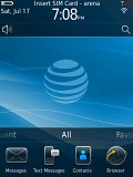
The Torch is the BlackBerry OS 6 pioneer
Sweep gestures are enabled all over the thing too. Kinetic scrolling has been around since the Storm2 so it doesn’t really count as a novelty.
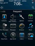
The app tray has been modified and now you can pull it out to show between one and four rows of icons. Scrolling it sideways reveals your favorite (manually added) or most frequently used apps (auto generated).


You get lists with frequently used and favorite apps
There are also Media and Download sections now so there is more than one way of sorting your apps.
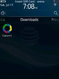
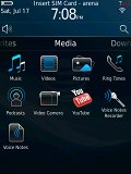
Media and downloaded app also have their own sections
The status area of the homescreen is clickable and allows quick toggling of Wi-Fi and Bluetooth, as well as quick access to the alarm clock and settings menu.
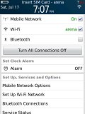
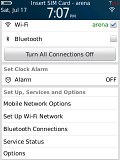
Pressing the status area allows you to fiddle with the connectivity
A search button has been added below the status area, allowing you to quickly search the content of your Torch. It even let’s you initiate quick searches in the BlackBerry App World or YouTube.
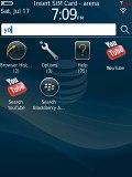
The universal search is quick and comfortable
On the opposite end is the profile selection shortcut, while the area in between is reserved for notifications.
All in all, RIM has done a good job of improving the experience with the BlackBerry OS 6. The speed and response are likely to please users too, although some animations aren’t buttery-smooth yet.
We still don’t think however that the user-friendliness is up with the best.
Even if you aren’t great fans of flat menus and the what-you-see-is-what-you-get approach and even if you don’t mind pressing the Menu button all the time to see all available options. It’s just that some UI elements are somewhat illogically placed and you will need some time figuring it out. Oh, and some widgets for that homescreen wouldn’t have hurt either.
Phonebook got a boost
The BlackBerry devices phonebooks have always been functional and all but until now they have been… well let’s say not that nice to look at. Not that BlackBerry 6 has blessed the Torch with the best contacts manager on the market but it’s certainly way better looking than before.
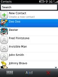
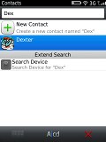
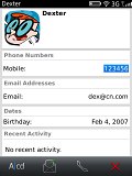
The phonebook is a bit easier to look at this time
Plus it’s things like unlimited capacity, adding custom fields and having SNS (well, at least Facebook) integration that matter the most. You can search for a specific contact thanks to the kinetic scrolling or by just entering a part of their name with either the hardware or the virtual keyboard.
The contacts get listed alphabetically by first, last name or company and you can pick which of their recent activities to get displayed when checking out their profiles.
Like previous BlackBerry devices, the Torch lets you put your contacts in one of two categories - personal and business and then filter your phonebook accordingly. There is also grouping available this time and you can create as many custom groups as you like.
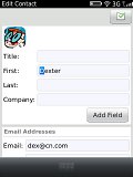
Editing a contact gives you a vast number of fields which are organized in several sub-groups. You can also replicate some of the fields and add custom ones easily so it’s all cool.
Reader comments
- Anonymous
- 30 Aug 2021
- 61s
cool
- Medyo Bastos
- 31 Jan 2018
- Nyj
It was good while it lasted. Bragging rights are gone, it's weak compared to the most cheapest touch screen phone out there. The resolution is chump, the design is a tad crikey. My Torch, while it still works - is obsolete. no support. no apps woul...
- wahab
- 02 Jan 2017
- uZa
BB is amazing phone really

