Doogee Mix review: Dress to impress
Dress to impress
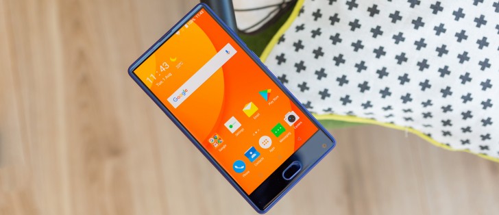
DoogeeOS, based on Android 7 Nougat
From what we manged to gather, Doogee is undergoing some major restructuring in the software department. The Mix is the first device to ship with its new DoogeeOS. It is a tailor-made ROM, based on something called FreemeOS, which apparently is originally developed by another Chinese company.
On the plus side, the ROM is based on an up-to-date Android 7 core, with June 2017 security patches. It also offers a fair bit of customizability.
On the other hand, it is clearly geared towards the company's local market, which is often painfully obvious. There is plenty of bloat, including all sorts of little animations and cute characters popping up here and there, which kind of ruins any chances of taking the OS seriously (unless you're into this sort of stuff, we don't judge).
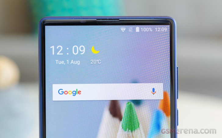
The English translation is just horrendous and was probably relied on machine translation to some extent. That is hard to live with, but harder still is the poor overall OS optimization, which really takes its toll on perceivable performance.
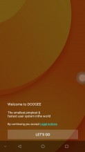
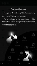

A few translation "gems". There are plenty more
In its current form, DoogeeOS simply does not offer a smooth user experience. Stutters and slow-downs are frequent. Granted, this is an early version of the OS and things might improve in time. Then again, the Doogee Mix doesn't really come with any formal promise of frequent OTA updates and support, so we'd advise you to take it for what it's for and not expect much in this respect.
DoogeeOS welcomes users with a fairly inconspicuous lockscreen. Nothing is out of the ordinary, really: a notification area, swipe up gesture to unlock and two quick shortcuts. The microphone shortcut opens up a quick search interface that conveniently enough can scour through pretty much the entire phone for your query.
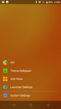
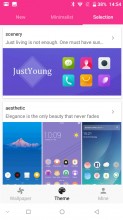
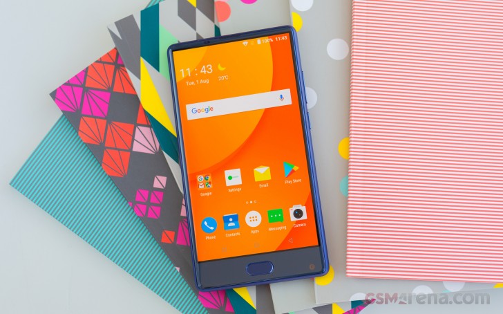
So with that gentle easing in out of the way, the DoogeeOS launcher pretty much slaps you in the face instantly the moment you unlock the phone. Out of the box, it is dressed in the extremely punchy Orange-yellow color scheme that frankly devours any and all white texts instantly. Away with it then. Changing it is a pretty straight-forward deal. Just hold down a finger anywhere on the empty homescreen and get to the Theme options.
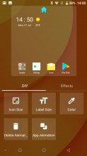
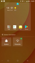
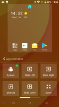
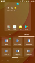
The Theme engine is actually pretty impressive. You get a lot of control to tweak the UI yourself or alternatively, download something from the online library. We can't help but note the same interface reveals more than a few other interesting customization options. In what looks like a very Android Icecream sandwich interface, there are options for adjusting icon and text sizes, as well as colors and even transition animations. Those are a clear throwback to the older days of Android custom launcher chic as well.
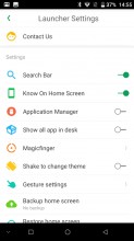
And there are even more custom visuals to enjoy or, you know, instantly disable and return to depending on your taste. Most of these are housed within the Launcher Settings menu. Here's a quick rundown of the options here, since the option names are have seen some bad times in the translation process.
Search bar is Doogee's custom search interface. The one we mentioned earlier in the lockscreen.
"Know On Home Screen" toggles an interface we can only describe as a second notification shade that only houses a few lines of text and just happens to have a kitten or smartphone icon dangling from it down to the home screen.
"Application Manages" spawns a little orange circle icon, with an Android on top within the app drawer that opens an app manager when clicked. If you don't like using an app drawer, "Show all app in desk" is the option for you.
"Magicfinger" is nothing short of "fabulous" in every internet-infused sense of the word. It allows you to set a custom tap animation and have hearts, starts or even a mix of the two fly out every time you touch the screen!!! YES, for real.
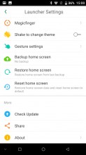
You can also back up your unique flashy launcher setup once you are finished with all the tweaks for safekeeping. And last, but not least, we get the first taste of gestures from this interface. The emphasis on "first" was no coincidence, since Doogee pretty much went all out in this department.
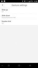
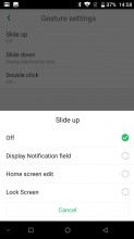
The options here pertain to the launcher itself, so it does make some sense to have them here, instead of within the main settings menu. You can choose to display notifications, edit the homescreen or lock it by either sliding up or down or double tapping the home screen. The double-tap-to-lock one is actually useful, since the Doogee Mix also supports double-tap-to-wake. Just don't try to use it together with fingerprint unlock, as it leads to some weird behavior and you could find yourself locked out of the device.
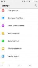
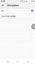
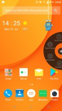
While we're on the topic of gestures, we might as well dive straight in and briefly introduce the rest of the rich selection. "Float gesture" spawns a draggable circle that can only snap to corners. In it are a Game and Reading mode, as well as shortcuts to a few floating small apps - Music and Video players.
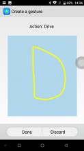
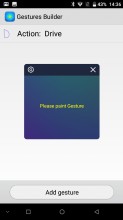
There is also a drawing input window for triggering gestures, These can be defined within the "Gestures Builder" where you are free to pretty much map any pattern you like to a quick app launch.
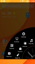
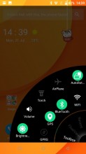
The "One Hand FloatView" is mostly meant as an alternative to the "Float gesture" interface. You can bring it up by swiping from the bottom right corner of the UI (not the display, but just above the on-screen navigation bar, because that makes sense...). It is a mix of floating app shortcuts, quick toggles and settings and even has some recent apps thrown in. We guess it could be useful to the right user crowd.
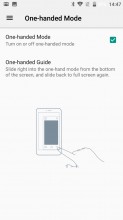
Just be sure not to confuse it with the One-handed interface mode, which is still a thing and can be triggered by sliding horizontally near the bottom of the screen.
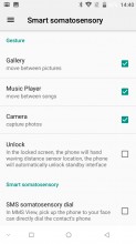
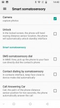
"Smart somatosensory" is definitely something you don't really see in a smartphone settings menu that often. Weird naming aside, the menu actually houses some interesting options. These leverage the proximity sensor of the Doogee Mix and enable things like waving across the screen to light it up or to switch between photos. They are definitely cool to play around with, but not really reliable enough to use on a daily basis.
Telephony motion and System motion enable a few other gestures around the UI. There is also a gesture unlock interface that can be used to quickly land you in any application you choose, provided you can memorize the gestures you set up.
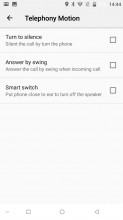
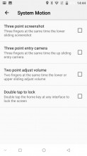
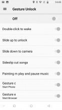
Telephony Motion • System motion • Gesture unlock
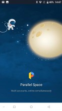
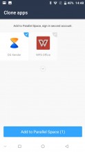
Parallel Spaces is a nifty little app. It lets you operate two instances of certain application, so you can be logged into a pair of accounts. Most manufacturers seem to have some sort of solution for this nowadays.
We might have just drifted a bit too far into the oddities the Doogee Mix has to offer. There are quite a few standard and expected parts of DoogeeOS as well. The app drawer is a pretty plain vertical interface, complete with a search bar. Perfectly convenient, if you choose to use it. Since the Mix only has a single physical key for the "back" command that doubles as a fingerprint sensor, there are also on-screen controls. Naturally, these can be reversed or even hidden at will.
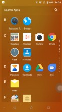
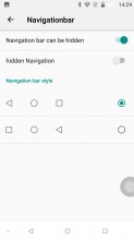
App drawer • On screen controls
The notification shade is pretty standard as well. All the basic editing options for the toggles are there and there is a pretty extensive notification access control feature as well.
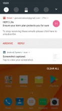
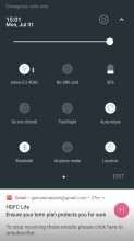
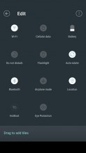
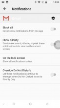
Notification shade, quick toggles and notification manger
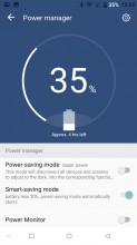
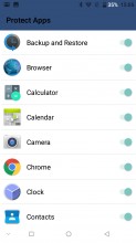
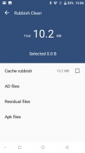
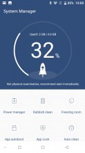
If fine-tuning and per-app tweaks are your thing, the System Manager app is pretty in-depth in its feature set. That being said, its translation is particularly rough around the edges, so you might just have to experiment with some of the features.
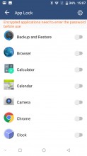
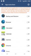
The "Application freeze", "App Lock" and "App autoclean" functions are particularly perplexing in their relation to one another.
One thing to note about the otherwise stock rolodex-style recent apps interface are the pair of buttons on the bottom. One clear the list, while the other lets you whitelist certain apps to be spared from this process. It is a rather odd place to put the manager and comes off as an afterthought, to be honest.

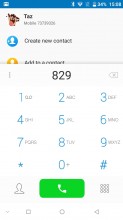
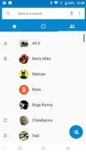

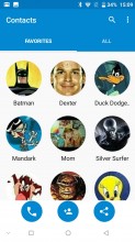
Dialer and dedicated Contacts app, for some reason
But to be perfectly frank, the entire UI seems like an oddly spliced together mix of dated-looking AOSP applications, sprinkled with custom, over the top features here and there. For instance, there is a separate contacts app, even thought the default dialer also offer that feature.
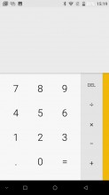
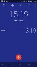
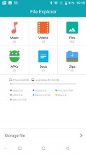
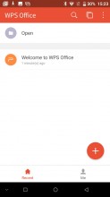
A few other numbers from the Doogee app package include the basics - calculator, calendar, clock, file manager and WPS office is pre-loaded for all your document needs.
Having a proprietary core app package is fine and dandy, but the odd thing is that Doogee still loaded Google Play services on to the Mix, along with a lot of Google's app that duplicate most of the same basic features. Now, this might not be the case with all ROMs and ours could very well be an exception, since it is a Chinese unit, rather than international and still has Play Services installed.
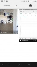
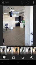
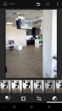
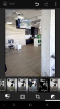
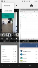
We can only assume that units meant for the home market won't get the benefit of Google Photos or Play Music and their corresponding free cloud services. Instead, those users will have to live with the default Gallery app, which looks a little bland on the outside, but is actually fairly feature-rich in the editing department.
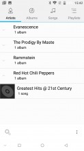
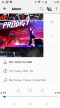
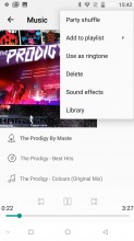
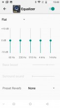
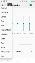
The situation is pretty identical with the Music player. The standard Doogee one is pretty basic, but still has most popular sorting options and should get the job done. There is an equalizer, but fiddling with it is kind of a lost cost. Spoiler alert for the following section - the audio quality of the Doogee Mix is really bad.
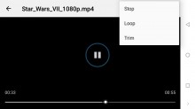
The video player is incredibly barebone as well, but we've seen way more reputable manufacturers and expensive devices get away with worse, so we won't complain too much. You do get a trim function for quickly cropping clips.
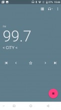
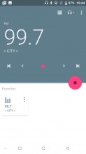
On a more positive note, the Doogee Mix has an FM radio receiver. It even comes with RDS support, so no corners cut there.
Reader comments
- Muppet
- 20 Apr 2021
- myL
Got this phone after an iphone5, had it nearly 4 years and it's never missed a beat. Been dropped loads of time, no damage. Picture quality is a bit hit and miss, but not the worst I've used. Charging is getting slower, but battery lasts ag...
- Tirock
- 21 Dec 2020
- n67
Don't get fooled by the name ISOCELL. The S5K3P3 is a patently garbage toy camera image sensor. Other phones with that image sensor model, such as the Ulefone Armor 2, also produce noisy images in perfect daylight! No co-incidence. Ima...
- Justin Bieber
- 25 Mar 2020
- 3Sq
I don't have Doogee Mix.


