Galaxy Z Flip4 vs. Find N2 Flip: Our long-term Flip review
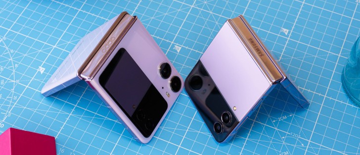
Outer screen
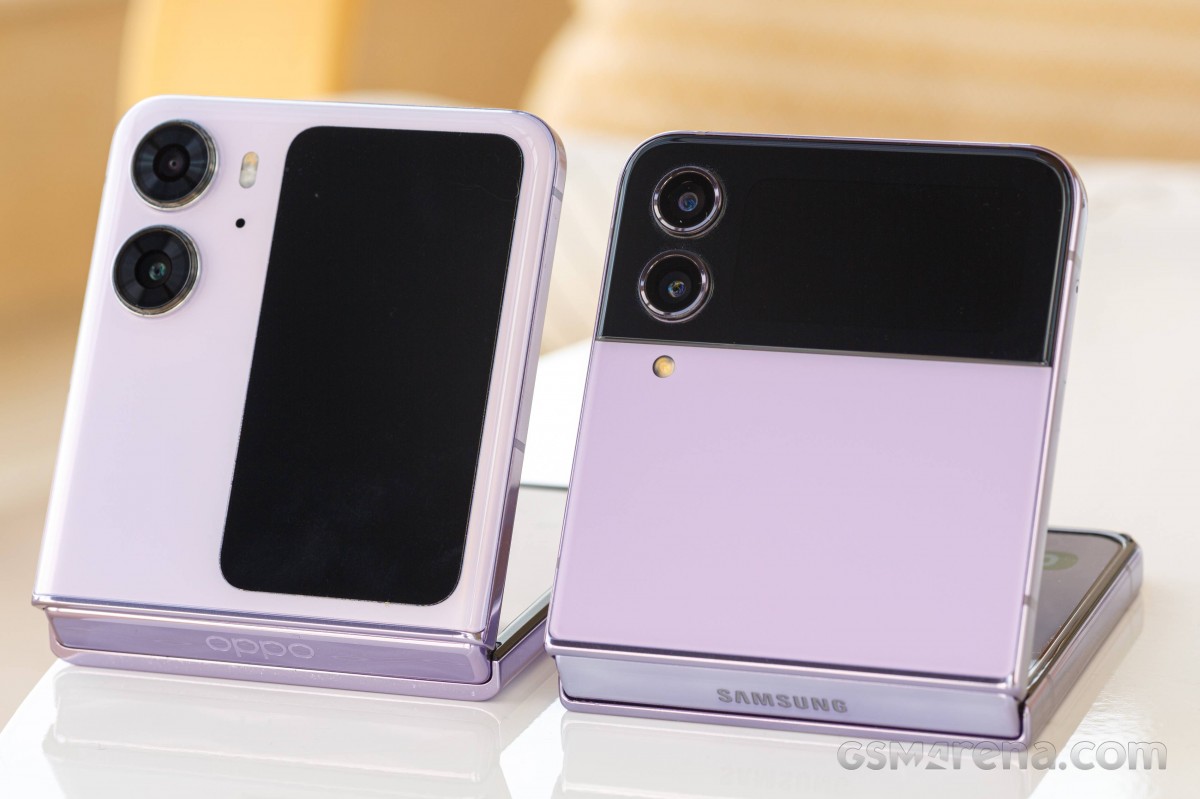
The Flip4's outer screen is tiny, and as such it can only be used to scroll through a few widgets. You can see a clock on it, of the analog or digital variety, and your notifications. Needless to say, interacting with them isn't great on such a small surface, but in a pinch, it will do. You can read messages and emails, for example, which is good, but - as last year with the Flip3, think of this outer screen more like the screen of a not particularly smart 'smartwatch' and you'll get the picture of what to expect.
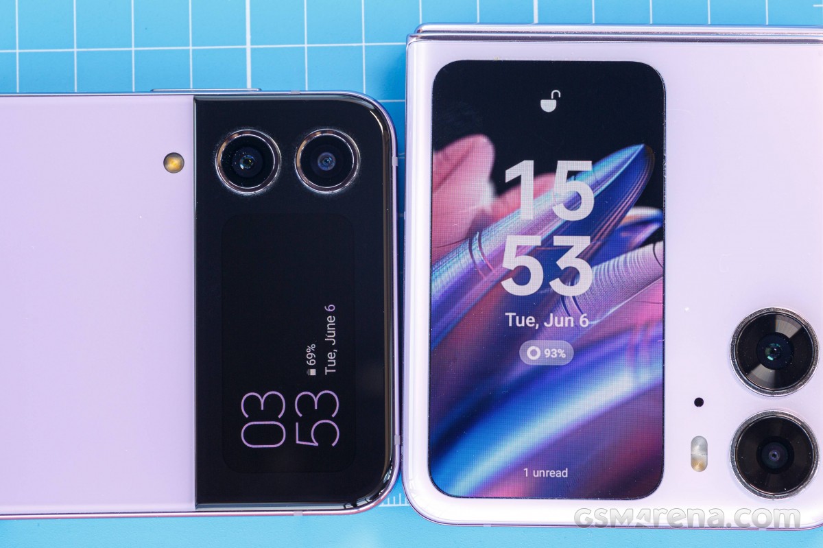
There are 12 'basic' clock styles to choose from, nine more with images or graphics, and you can select your own image if you want. The colors used can be customized, and there are a grand total of nine widgets to pick from: Music, Weather, Today's schedule, Next alarm, Steps, Voice Recorder, Timer, Calendar, and Direct Dial. You swipe right through this from the clock view (swiping left is for notifications). That's it, and, as we already mentioned, it isn't much, although the limited functionality kind of makes sense considering the size of the thing.
On the other hand, the N2 Flip has no excuses for basically having initially gone exactly the same route as Samsung, with a limited number of widgets, on a screen that's much larger, and is also in the correct aspect ratio to possibly show the entire phone UI. But it doesn't do that, instead you're stuck with widgets: Camera, Weather, Timer, Recorder, Pocket Player, Event reminders, and Wireless Earphones (and this one only supports "some Oppo and OnePlus" models, so it's kind of useless for most people).
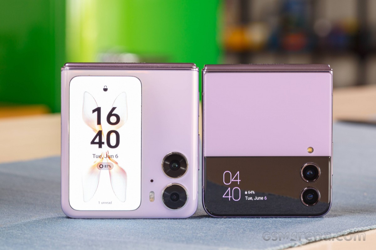
Recently, a Spotify widget has been added, which gives you playback controls and displays album art, and there's also a new experimental WhatsApp widget which makes us hope for more like it arriving in the future, since it's basically the full app on your outer screen. It's still a bit rough around the edges - you always need to tap on the widget to enter the app, for example, and gesture navigation is a no go. But if this is a sign of things to come, then we're pleased. Then again, it looks like Oppo has left all the outer screen-related heavy lifting to third party developers, so it's not a given that any others will take the plunge.
This outer display is also more customizable than the Flip4's, with "interactive pets" that react differently every time you tap the screen, to animated GIFs. Then again, for some reason Oppo only gives you digital clocks to put on the outer screen, 16 of them to be exact. Why no love for analog clocks? Who knows. You can also have a Bitmoji on there or some text of your choosing.


N2 Flip: Cover screen settings
That's hardly enough to justify the bigger screen size. Overall this just feels like a missed Opportunity (excuse the pun). Perhaps the main obvious differentiating feature compared to the Flip4 is exactly this display - everyone can see how much bigger it is from the get-go. And thus, people might develop expectations regarding its usability, but those would be in vain.
The outer screen category is a tie, therefore. Had the N2 Flip made more use of it, it would easily have won this, especially as it's also got slightly more customization options. But as it is, the extra size doesn't really give you too many extra functions.
Cover screen usability winner: Tie.
Performance, smoothness
The Flip4 uses last year's Snapdragon 8+ Gen 1 SoC, which should be perfectly adequate for a high-end device even now. And yet, this doesn't feel like any other 8+ Gen 1 we've ever used, and that's because of the throttling that's required due to space constraints in this form factor. The chip is fast, don't get us wrong, and the phone performs very well. It does, however, suffer in terms of smoothness.
Upon booting for the first few minutes it's very laggy - think lower-midranger levels of lag. Then it settles, but there are bouts of lag all day every day, randomly occurring stutters too. It's not too bad, as they don't happen very often, and it's definitely not as bad as lag and stutters used to be on high-end Samsung devices a few years ago, but all of this is definitely noticeable and does not make for a top of the line user experience.
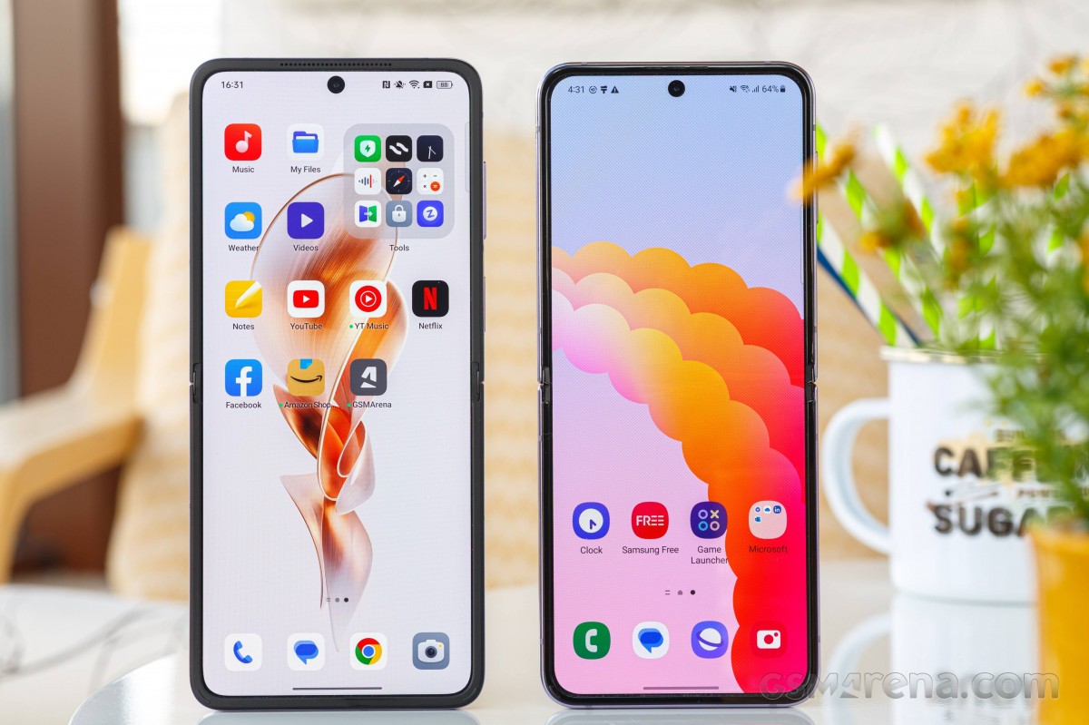
It basically feels like an upper-midrange handset that isn't optimized particularly well for smoothness, and that's not great. In smoothness, we found the Flip4 very close to the Nothing Phone (1) we recently reviewed. A bit better than that one, but only a bit - and the Nothing Phone has a mid-range chip.
If you're coming from a lower-end Samsung device, this will unfortunately feel familiar to you, but if you're coming from an S22 Ultra or S23 Ultra or the likes, it will be ever so slightly disappointing. And if you're switching from the likes of a OnePlus flagship, for example, the disappointment will be rather huge when it comes to smoothness.
Things are definitely better on this front with the N2 Flip. It's way smoother than the Flip4, but it's not perfect either - far from it, in fact. Upon startup it too gets very laggy for a while, and the lag returns every single time you are updating a bunch of apps from the Play Store. We've also had a few freezes during our time with it - once every few days, pressing the power button simply wouldn't wake the phone at all. It would only come alive after 10+ presses of the button, and that's not great.
The theme with both of these handsets seems to be a level of lack of reliability when it comes to smoothness, and thus, performance in general. They're great some of the time (more so the N2 Flip), but fall over way more than any comparatively priced slab-style smartphone. The N2 Flip overall feels a tad higher-end than the Flip4 in terms of smoothness, but when you update apps and that goes away you're practically left feeling you're owning a mid-range Samsung. The same goes for the Flip4, only there's more of that feeling. We're not sure the unique form factor is worth the tradeoff, but obviously a lot of people seem to disagree.
In terms of smoothness then, the N2 Flip wins, even if it's not amazing either. In terms of raw, benchmarkable performance, the Flip4 has the upper hand, but it throttles much more and to a much higher degree than the N2 Flip, so in the end you aren't really going to take advantage of the extra raw power very much.
Performance and smoothness winner: N2 Flip.
Battery life, charging
The Flip4 has the smaller battery of the two, and unsurprisingly that means it has the worse battery life. And yet, it might be surprising to hear that while it is worse, it's not that much worse - at least not as much as the capacity delta would have you believe. Perhaps that means the Snapdragon 8+ Gen 1 is a more battery friendly chip than the Dimensity 9000, but many other things could contribute to the discrepancy - the screens for example.
Anyway, with our usual use case, we generally barely made it to the end of a 12-16 hour day off the charger with the Flip4, and we didn't always make it. Sometimes we did have to top up during the day. A battery champ, this is definitely not. Keep in mind that our use case involves mostly Wi-Fi 6 connectivity, about an hour on mobile data, an hour or two of phone calls and an hour or two of listening to music or podcasts via TWS earbuds, location always on with Bluetooth and Wi-Fi scanning, and about half an hour of navigation via Waze.
This one is either for people with light usage throughout the day, or those who don't mind topping it up midday at least once - but if you have a much heavier use case than ours (say, with much more mobile data connectivity, perhaps in areas with low signal too), then it wouldn't be out of the ordinary to have to top up twice in one day, even if you start off full.
Needless to say, that's not ideal. Things get even worse when you factor in the slow charging. Fast charging would have made those midday top-ups less of a hassle, but no - Samsung keeps being Samsung and as such a 0 to full charge on this phone takes one hour and 15 minutes, which for that a battery of this size is simply ridiculous. Not to mention that you don't even get a charger in the box.
Clearly then, the N2 Flip wins this one: in battery endurance and in charging speed, but also since it actually has a charger in the box. It's no competition really. That said, the N2 Flip's battery life is still lagging behind traditional slab-style phones, and is only marginally better than the Flip4's.


N2 Flip: Battery life snapshots
At least we generally (though not always) managed to finish all our days with it without the need for any midday top-up, and even when we did require that, the faster, under an hour charging speed made it more of a breeze (again, comparatively - there are much faster charging phones out there, but none of them fold in this way). And keep in mind that this device fills its battery faster while having a higher capacity cell.
Even so, we still wouldn't recommend the N2 Flip for people with moderate to heavy usage, since it will eventually become frustrating that you can't depend on it more, endurance-wise. With light use and the charger always with you, you'll be able to live with it, but for us, if we can be honest, that's no way to live.
Charging speed and battery life winner: N2 Flip.
Reader comments
- Lavkesh k singh
- 09 Oct 2023
- 7kk
Super disappointed in Samsung Flip. Screen broke at the fold junction, and needs repair. Turns out an overwhelming number of users have the same issue. This is just a cool looking hardware with no durability
- Fliplife
- 16 Jun 2023
- vCL
I’d prefer the Samsung. That’s just me. I like how it’s more discreet design.
- Dali
- 16 Jun 2023
- IbG
Exactly. This is why i take phone reviews with a grain of salt. Same with all Xperias except the 10s you can use your main cameras for selfies. That's why Xperias with dedicated camera button trumps all. So versatile. You can take pictures...


