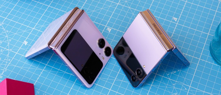
Galaxy Z Flip4 vs. Find N2 Flip: Our long-term Flip review

Software skins
These two phones have very different skins on top of Android 13, but they're similarly heavy skins, even if they look nothing like each other. In an interesting design decision, ColorOS 13 has a lot fewer top-level entries in the Settings menu than One UI 5.1, which makes it feel more airy and less bloated. In contrast, the Flip4's top-level Settings list is seemingly never ending, and on both phones, reaching into second-level items opens up new worlds of options upon options left and right.
Neither of these, then, will be found very palatable by those who are into the Apple-like mantra of having as little customization as possible (though even Apple has constantly been slipping in this regard in recent years). Fans of tweaking things in their software experience will love both of these skins, however. Overall, One UI 5.1 does feel just a tad more customizable than ColorOS 13, but the latter is no slouch in that area either. Then again, One UI is also the skin that requires more initial tweaking, at least it did for this reviewer.
Neither of these 'just works', but ColorOS 'just works' a tad more than One UI is what we're saying. That is, of course, if you're baffled (or simply don't approve of) some of Samsung's default choices, like us. If you love them, or they're what you've been used to if you're coming from a different Samsung device, then you'll be just fine.

We can't really declare an overall winner here since it's a matter of personal taste which skin's design you like better, and how you feel about the different customization options (and the amount of them you get). We will go into details next, and there we'll let you know which UI 'wins' for us in every case, but the point isn't to say that makes it better objectively - again, it's all a matter of taste. We'll detail features for both, call out our favorite, and let you be the judge of whether that works for you as well or it doesn't.
Launcher, Recents
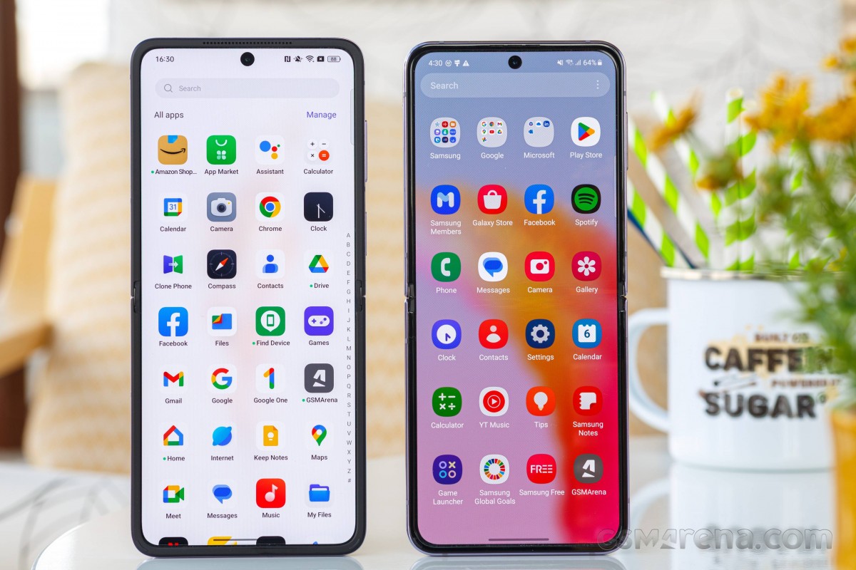
The Flip4's launcher is the standard Samsung fare, which seems like it hasn't changed in years. It does pack all of the functionality most people might want, however, so maybe that's fine. We've never had any issues with it throughout our usage, by the way - not that we expected any different, but it was good not to have our expectations unmet.
There's an app drawer, as well as the option not to use one, you can have Google's feed to the left of your leftmost home screen if you want to, and you can even pick Samsung Free for that spot instead, if you're the one person who figured out how it's useful. All the basics are covered very well, and there's not much else we can say - other than a word of warning if you're coming to the Flip4 from an Android device not made by Samsung: if the app drawer looks weird to you, make sure you switch it to show apps alphabetically. Unfortunately there's nothing you can do about the horizontal scrolling, though.


Flip4: Launcher and its settings
On the N2 Flip, things are actually quite similar - without the strange app drawer shenanigans. This launcher too has all the basics covered, like the choice between an app drawer or none, personalization of the number of icons shown on a home screen, that sort of thing. You can set a swipe down on a home screen to show the notification drawer, which is what we picked, or the OnePlus-sounding Shelf, or the Global Search function, depending on what you use most. For us it's definitely the notification area, especially since, unlike the Flip4, the N2 Flip doesn't have an option to swipe on the fingerprint sensor to bring it down.


N2 Flip: Launcher and its settings
The N2 Flip wins the launcher game, by a hair, simply thanks to the fact that the scrolling is vertical and the sorting is alphabetical by default in the app drawer. This is a technicality, though - they're both similarly good and bug-free.
Recent apps are displayed quite similarly on the two phones, and yet each has a different trick up its sleeve. The scrolling here is horizontal as it is in most handsets these days, the difference comes in what each skin chooses to do with the space under the apps' screenshots. The Flip4 shows you four app icons that dynamically change - it's basically trying to guess which app you're trying to get to, and while the algorithm in use isn't perfect, it's actually pretty good. Only about 20% of the time was the app we were going to switch to not part of those four, and we call that rather impressive.
The N2 Flip, on the other hand, displays each app's icon under its screenshot, and the point here is that you can scroll very fast on these icons, much faster than you would on the screenshots themselves. This is very handy for getting to an app that isn't among your latest 4-5 used, and once you get the hang of the speed, the system works very well. We can't decide which of these two unique functions is more useful, so we'll call Recents a tie, but it won't be that for you if you have an obvious preference for either the four guessed apps or the fast scrolling.
Dark theme, gestures
Both phones obviously have dark modes, but the N2 Flip is the clear winner in this space simply because its dark theme is much more customizable. You get to pick from three darkness levels, and the "adjust icons to Dark mode" and "Reduce contrast in low light conditions" options are very good in aiding the overall dark theme experience and making the display less eye-straining.
That said, "Dark mode for third-party apps" is a joke, seemingly a remnant of past software versions where it actually did something. Out of our 200+ apps, none were listed here, so this is pretty much pointless these days (and before you say it - no, not all of our apps have automatically-triggered dark themes of their own).
The Flip4 has a very competent dark theme of its own, but it's simply not as customizable, which is why it loses out. Of course, if you're happy with the one option, you don't really need three different darkness levels and all that. Unsurprisingly, both dark themes are schedulable.
Gesture navigation is a tie, since it works very well on both phones, with zero issues to report, and that's definitely a sigh of relief on the Flip4, since in the past we did have problems with the 'going home' gesture on Samsungs not being sensitive enough and triggering a scroll before actually taking us to the home screen. Nothing like this happened in the months we spent with the Flip4, so it's all good.


Flip4: Gesture navigation settings
There are minute differences in settings when it comes to gestures, but again, the overall experience is tied. On both devices, you can thankfully choose to hide the white pill-shaped abomination that Google wants to show at the bottom of the screen constantly. On the Samsung there's a setting to keep its functionality intact even when it's gone, while on the Oppo there's no such setting but it still works fine.


N2 Flip: Gesture navigation settings
The N2 Flip takes quick switching to another level by allowing you to enable swiping from the sides and then pausing in order to accomplish the same thing. That's an extra bit of flexibility right there, but we're not sure many people would even be aware that this is a thing, and that's why we aren't saying the N2 Flip wins this one.
Software features winner: N2 Flip.
Reader comments
- Lavkesh k singh
- 09 Oct 2023
- 7kk
Super disappointed in Samsung Flip. Screen broke at the fold junction, and needs repair. Turns out an overwhelming number of users have the same issue. This is just a cool looking hardware with no durability
- Fliplife
- 16 Jun 2023
- vCL
I’d prefer the Samsung. That’s just me. I like how it’s more discreet design.
- Dali
- 16 Jun 2023
- IbG
Exactly. This is why i take phone reviews with a grain of salt. Same with all Xperias except the 10s you can use your main cameras for selfies. That's why Xperias with dedicated camera button trumps all. So versatile. You can take pictures...


